Brand Color Psychology: How to Choose Colors
By David Herskowitz, Founder and Creative Director
Brand color psychology: what brand colors commonly mean, and how to choose a palette for your audience, category, and real use.
Key takeaways
- Color psychology in branding is a set of common associations plus a practical test. It is not a formula with a proven percentage.
- Choose a short palette for the audience, the category, and the surfaces the brand actually uses.
- The line that color increases brand recognition by up to 80% is widely repeated and rarely tied to a published primary study.
- Text and interface contrast follow WCAG. A logo is treated differently from body text.
- Brand identity at Splash Creative is from $15,000. A website is from $15,000. Brand and website together is from $30,000.
Branding
A brand should make the business easier to understand.
We help businesses work out what they stand for and give that thinking a recognizable form. Positioning, identity, language, and application are developed as one connected system.
Brand identity from $15,000.

By David Herskowitz, Founder and Creative Director, Splash Creative. Updated November 4, 2026.
Color psychology in branding is the practice of choosing colors for what they commonly suggest, and for the places a brand actually appears. There is no single best color. You choose by naming who the brand is for, looking at the colors the category already uses, and testing a short palette on the logo, the site, and anything a person holds.
The table further down is a set of conventions used in branding. It is not a lab result. The projects are real Splash Creative work. Each note stays inside what that case study says.
Why color psychology matters in branding
People meet a color before they meet a sentence. A logo, a package, a button, and a social avatar all carry it. Brand color psychology is the habit of treating that choice as a decision: what the color commonly signals, where it has to function, and what happens when the same color is used every time.
A consistent palette makes a brand easier to recognize because the same combination shows up again. That is a design fact. It is not a promise that a particular hue will raise revenue, trust, or recall by a fixed amount. The useful question is narrower. Does this palette fit the audience, survive the category, and stay readable on the surfaces you actually use?
Brand identity is where that decision gets written down: logo, color, type, art direction, and guidelines. Color is one part of that system. It does not do the job of the position, the name, or the words.
What brand colors commonly signal
These are associations marketers and designers reach for often. They vary by culture, by category, and by the person looking. Use the row as a hypothesis. Then check it against your buyers and your competitors.
The swatches are labels so the row is easy to scan. They are not recommended hex values, and they are not colors from a Splash Creative project.
| Color | What it commonly signals | Where it tends to fit | Watch-outs |
|---|---|---|---|
| Red | Energy, appetite, urgency, and, in much of China, luck or celebration | Food, retail promotions, sport, and brands that need to be seen quickly | Easy to read as a sale or a warning. Hard to own if the category is already red. |
| Orange | Warmth and a friendlier version of red | Food, youth-facing brands, and a single accent on a neutral system | Can feel inexpensive if it is the only color and the type is thin. |
| Yellow | Optimism, attention, and caution | Short accents, children's brands, and highlights on a darker field | Small yellow text on white usually fails contrast. A full yellow field gets tiring. |
| Green | Growth, health, nature, and, in US finance shorthand, money | Food, outdoors, and wellness claims you can actually support | A green leaf is the default in wellness and cannabis. The color alone does not set you apart. |
| Blue | Calm, competence, and trust in a lot of Western business | Finance, healthcare, technology, and other B2B categories where buyers expect it | It is the most common corporate color. A blue logo does not create trust by itself. |
| Purple | Creativity, and sometimes luxury, when the category is full of blue and red | Beauty, some premium products, and brands that need to sit apart from blue competitors | The meaning shifts by culture. Do not assume it reads as luxury everywhere. |
| Black | Seriousness, restraint, and a fashion or luxury cue | Fashion, editorial brands, and systems built on type rather than illustration | A black mark disappears on dark photos and dark screens. Plan a light version. |
| White | Space, simplicity, and cleanliness in much of the US and Europe | Backgrounds, healthcare, and systems that need room around the mark | In parts of East Asia, white is associated with mourning. Do not treat it as a universal ceremonial color. |
Brown, cream, and other earth tones work the same way. They often signal craft, food, or the outdoors, and they disappear when every competitor in that aisle already uses them. Neutrals (a text color, a background, an off-white) are part of the palette even when nobody argues about them. Most of what people read sits on a neutral.
Does color increase brand recognition by up to 80%?
The sentence "color increases brand recognition by up to 80%" is widely repeated in marketing articles. It is rarely traced to a published primary study. Treat it as directional, not proven. A consistent color can make a brand easier to pick out. That does not make 80% a number you can put in a deck.
This page used to state that line as fact, including for the search "color increases brand recognition by up to 80% true or false." The honest answer is that the claim is unproven as a general rule. Use it as a reason to be consistent. Do not use it as evidence.
Two other lines belong in the same category. "Purchasing decisions within 90 seconds" and "consistent color usage can increase revenue by 23%" also circulate in marketing articles without a primary source this page can point to. They are not findings. If you cannot open the study, leave the number out of the guidelines and the sales conversation.
How to choose your brand colors
Work in this order. Skipping to a color wheel produces a palette that looks decided and fails on the first real surface.
- Write the position. One or two sentences: who it is for, what the brand should feel like, and what it should refuse to look like. How to write a positioning statement is that sentence. Color comes after it.
- Look at the category. Open the sites and packages a buyer already compares you with. Note the colors they share. A shared color can be a useful signal, or a way to disappear. Decide which one you are doing.
- Give each color a job. A lead color for the mark. A color for text. A color for backgrounds. Sometimes one accent. If a color has no job, it does not belong in the palette.
- Check contrast and culture. Text and controls have to meet a contrast standard. A meaning that holds in one country can misfire in another. Both checks are in the next sections.
- Test it where it will actually appear. A logo on a white artboard is not a test. Put the palette on a webpage, a social image, a one-color version, and one printed piece if you print.
- Write the values down. Hex for screens. CMYK or a named swatch for print. Put them in the guidelines with the backgrounds each color may sit on. Brand guidelines examples is what that page looks like when someone else has to use it.
A short palette is easier to keep consistent than a long one. There is no correct count. Four named colors can be right when each one has a job, as on The Shuk. One lead color can be right when the type and the packaging carry the rest, as on Pressed Miami.
Color meaning is not the same in every market
The table is written from conventions that show up often in US marketing. They are not universal.
Red is a common urgency and appetite cue in American retail. In much of China it is also a color of luck and celebration. White reads as cleanliness and weddings across much of the US and Europe, and as mourning in parts of East Asia. Green can mean nature in one category and money in another, and it can carry religious meaning that a US wellness brand did not intend.
You do not need a chart for every country. You need a check for the markets you actually sell in. Show the palette to people who live there and ask what it suggests, before you print the packaging. If the brand only operates in one city, the local reading matters more than a global list.
Personal history matters too, and you cannot design for every biography. The cultural check is about the market. The personal exception is a reason not to treat any color as a guarantee.
Contrast and accessibility
Feeling is not the same as readability. WCAG 2.2 Success Criterion 1.4.3, Contrast (Minimum), is the usual standard for text. It asks for a contrast ratio of at least 4.5:1. Large text, defined there as 18 point or 14 point bold and up, can be 3:1. Text that is part of a logo or brand name has no contrast requirement under that criterion. Body copy, buttons, and form labels do.
Success Criterion 1.4.11, Non-text Contrast, asks for at least 3:1 between a user interface component or a meaningful graphic and the colors next to it. A pale button on a pale page can fail even when the logo is fine.
Success Criterion 1.4.1, Use of Color, says color cannot be the only way you communicate. A red error with no words, or a chart that uses color alone to separate two series, fails that test. Add a label, an icon, or a pattern.
A practical split: the brand color can live in the logo and in large fields. Text on the website should be a color that passes 4.5:1 on the background it sits on. Check the pairs you will actually publish, not a swatch against a swatch. The W3C's contrast understanding page is the source for the ratios above.
Test the palette before you commit
Run these checks before the guidelines are finished.
- Put the lead color behind the logo, and the logo on a photograph. If the mark vanishes, you need a second version.
- Set a paragraph and a button in the real type, on the real background. Measure the contrast.
- Reduce the palette to one color. Embroidery, a stamp, a fax, and a lot of packaging only get one.
- Set it next to three competitors. If a buyer cannot tell which is yours at a glance, the palette is still a category default.
- Ask a few people in the audience what the color suggests. Do not tell them the intended meaning first.
- If you print, print it. Screens are brighter than paper, and a color that looks rich on a laptop can go dull in CMYK.
Write down what failed. A palette that only works in the presentation is not done.
Elivate
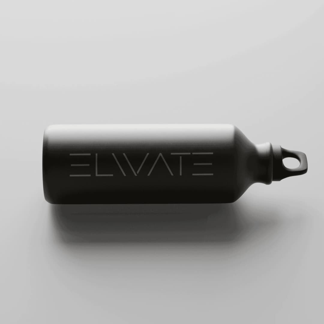
Elivate is a personal training brand centered on movement and progress. The identity needed to communicate direction without relying on familiar fitness imagery. The published work is a custom wordmark with an upward arrow built into the letterform, so the idea sits in the name. The case study does not name a palette. The published scope is logo and visual identity.
Bloodshot Farms
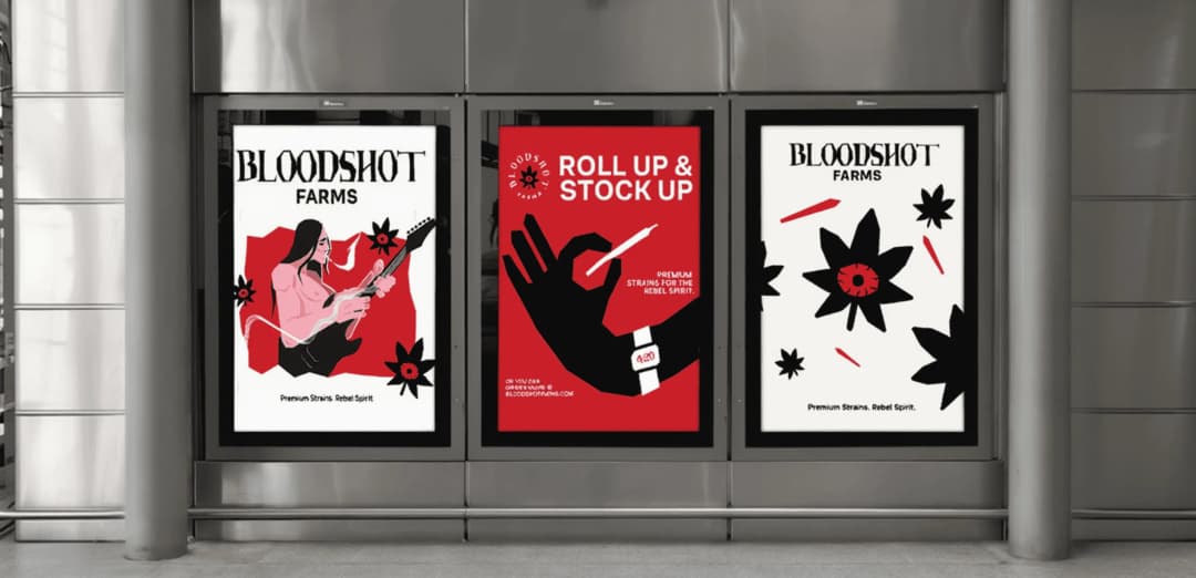
Bloodshot Farms is a premium cannabis brand with an unapologetic point of view. The identity needed to express that attitude and still carry the craft expected of a premium product. The published direction uses counterculture references, bold typography, and a visceral interpretation of the cannabis leaf. The published scope is visual identity, typography, and color. The case study does not publish the color values, and this article does not invent them.
The Shuk
The Shuk is a creative community and arts marketplace in Englewood, New Jersey. The brand needed to work across a physical space, merchandise, print, and digital communications. The published palette is midnight blue, burnt orange, sage, and warm cream.
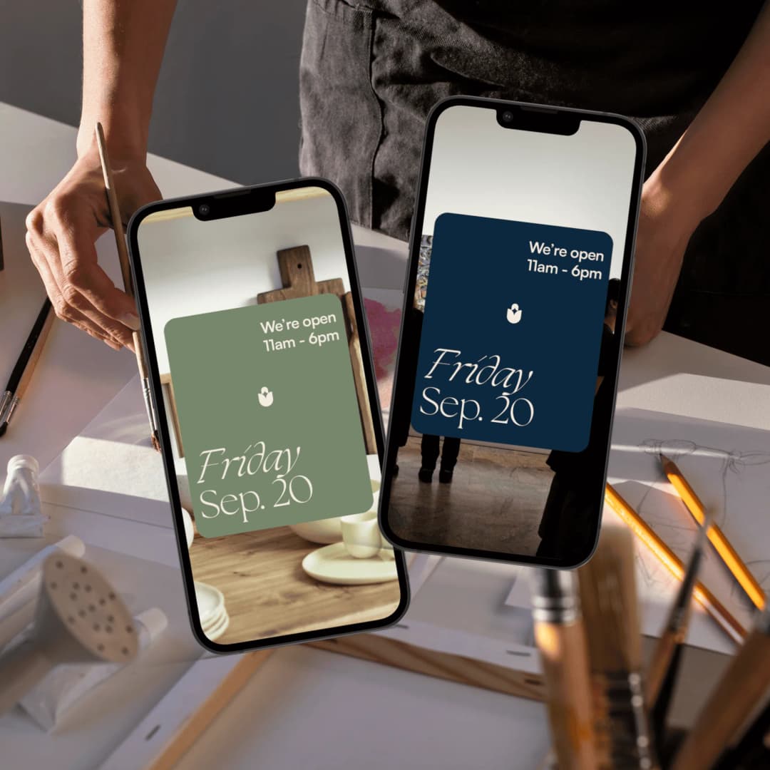
The mark is a tulip-form symbol with a negative-space star at its center. It works as a standalone mark, an image mask, a repeating pattern, and a dimensional object. The system extends into stationery, merchandise, signage, social templates, and newsletters. The published scope is identity, guidelines, merchandise, signage, social templates, and newsletter design. Four colors, each with somewhere to go, is the lesson. The case study says a single visual idea supports a broad family of applications.
Pressed Miami
Pressed Miami serves bold food in Miami, Florida. The identity needed enough personality to travel past the storefront and into the packaging customers carry away. The system is built on bold red, chunky typography, and an animated sandwich mascot. All-over pillow box packaging makes the identity part of the order, using the surface as a full expression of the brand rather than a small logo placement.
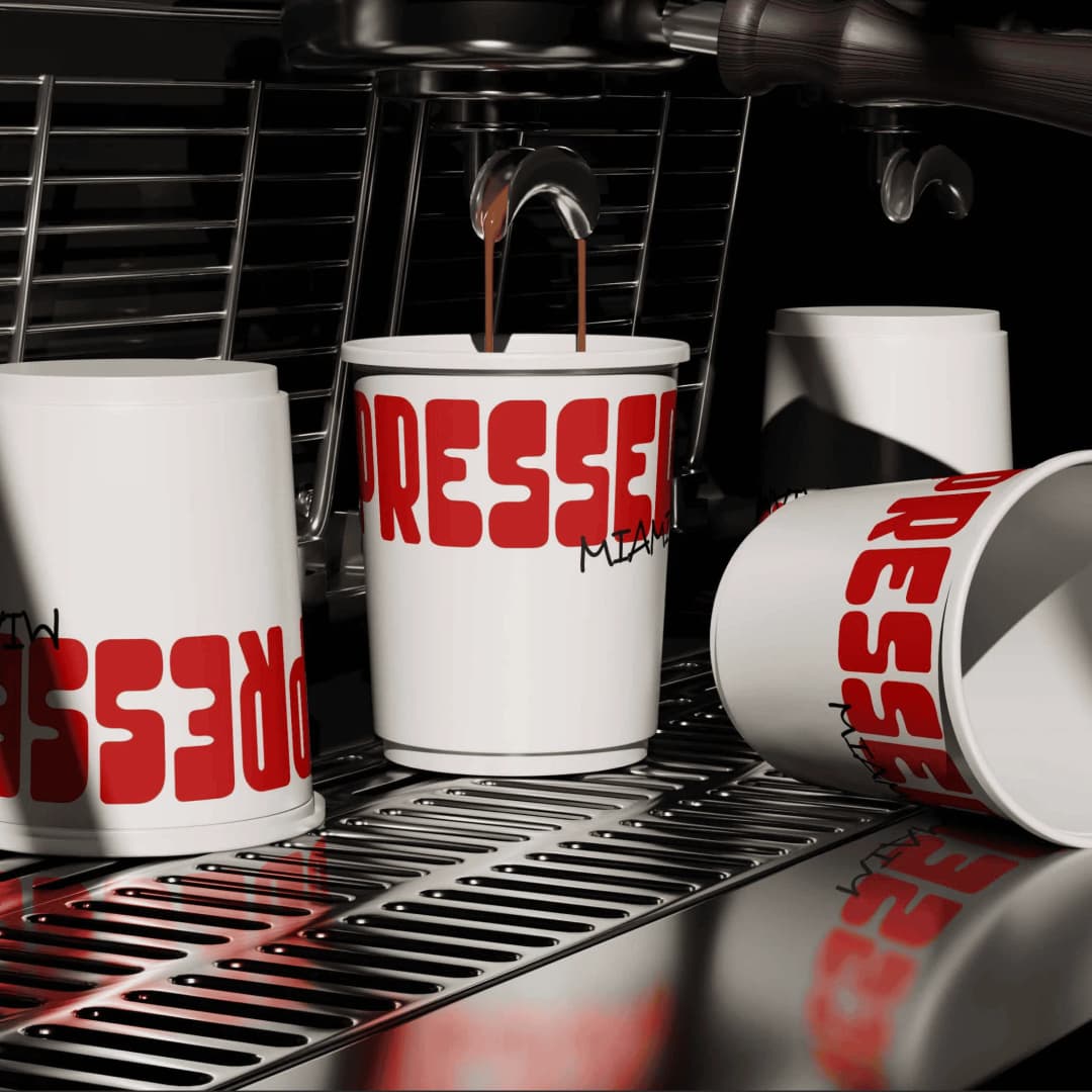
The published scope is visual identity, brand guidelines, and packaging. The case study says the shop has a flexible visual language and a distinct character to carry across packaging and other brand materials. One lead color can do that when the type and the object give it enough surface.
What a palette engagement includes
On a brand identity project, color is delivered with the rest of the system: a logo system, typography, art direction, brand guidelines, and the templates or applications named in the proposal. For the palette, that means the colors, the values someone else can match, the backgrounds each color may sit on, and a one-color version. The guidelines are for the people who were not in the room.
How much branding costs is the longer page on fees. The starting points published here are the same ones on pricing. Brand identity is from $15,000. A website is from $15,000. Brand and website together is from $30,000. These are starting points. The proposal sets the fee for the scope. The fee is a fixed scope and a fixed fee, agreed in writing before the work starts.
A focused brand identity takes 4 to 6 weeks. Full brand strategy and identity takes 8 to 12 weeks. How long a brand identity takes walks the phases. How we work is the sequence: understand the business, put the scope and the fee in writing, agree the direction, then make the work.
Splash Creative is in Englewood, NJ. There is no New York City office. David Herskowitz leads the work. Branding is the wider practice when the position and the language are part of the same project as the palette.
If you want the colors decided with the rest of the identity, book a call and tell us what you are working on. We will help determine whether there is a useful project to explore.
Frequently asked questions
What is color psychology in branding?
Color psychology in branding is choosing colors for what they commonly suggest and for where the brand has to use them: a logo, a site, packaging, and anything that has to match later. It is a practical decision, not a proven formula that raises recognition by a fixed percent.
What is the best color for a brand?
There isn't one. Blue is common in finance and healthcare because buyers expect it, which is also why it is hard to own. Choose the color that fits the audience and the category, then check that the mark still works in one color and at small size.
How many brand colors should you have?
Enough for the jobs, and no extra. A lead color, a text color, a background, and sometimes one accent is a workable set. The Shuk publishes four named colors, each with a place to go. Pressed Miami is built around one lead color, bold red, with type and packaging doing the rest. If a color has no job, drop it.
Does color really increase brand recognition by up to 80%?
Treat that line as unproven. It is widely repeated in marketing articles and is rarely traced to a published primary study. Consistent color can make a brand easier to recognize. The 80% figure is not a result you should cite as fact.
How do you choose colors for a logo?
Start from the position, not a color wheel. Pick a lead color the mark can survive in, plus a one-color version for embroidery, stamps, and dark backgrounds. Put the values in the guidelines next to the files. Brand identity is the engagement when the logo, the palette, the type, and the guidelines are one project.
What does an agency deliver for a brand color palette?
At Splash Creative, a brand identity can include a logo system, color, typography, art direction, brand guidelines, and the applications named in the proposal. For color, that is the palette, the values someone can match, where each color may sit, and a one-color version. Brand identity is from $15,000. A focused identity takes 4 to 6 weeks. Full brand strategy and identity takes 8 to 12 weeks. How much branding costs explains the starting points. The proposal sets the fee.
What contrast should brand colors meet?
For ordinary text, WCAG 2.2 asks for at least 4.5:1 against the background. Large text (18 point, or 14 point bold) can be 3:1. Logos are exempt from that text rule. Buttons and other interface parts still need at least 3:1 against what sits next to them, and color cannot be the only way you communicate a state.
Have a related question?
Tell us what you're working on. We'll help determine whether there is a useful project to explore.
“Splash delivers powerful brand ID, slick websites and UX, beautiful graphic design, and intelligent software solutions. Great team, great experience, great creative partners.”