The context
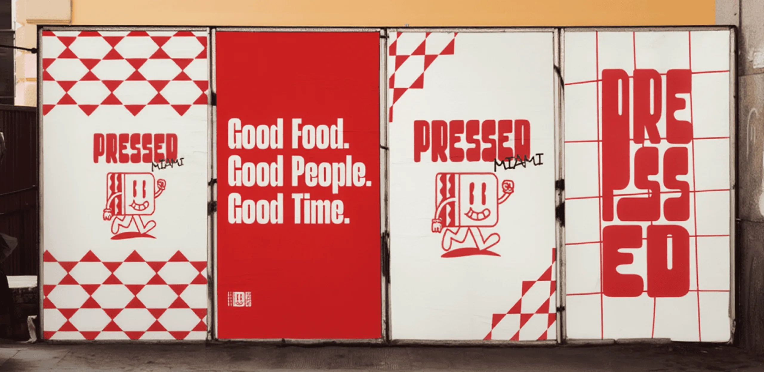
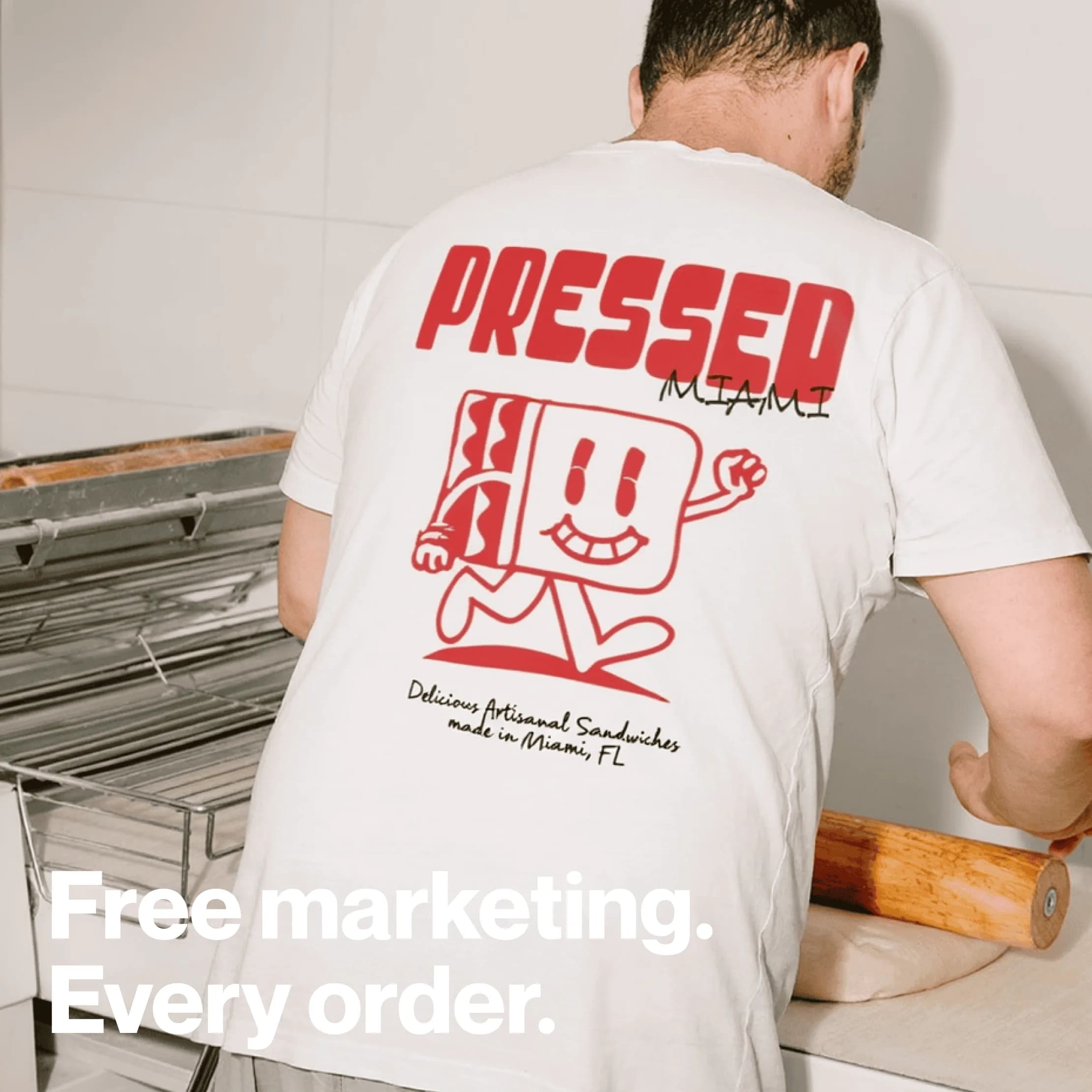
Pressed Miami serves bold food in Miami, Florida. The identity needed enough personality to travel beyond the storefront and into the packaging customers carry away.
The question
How could the brand be immediately recognizable across small, everyday encounters?
The decisions
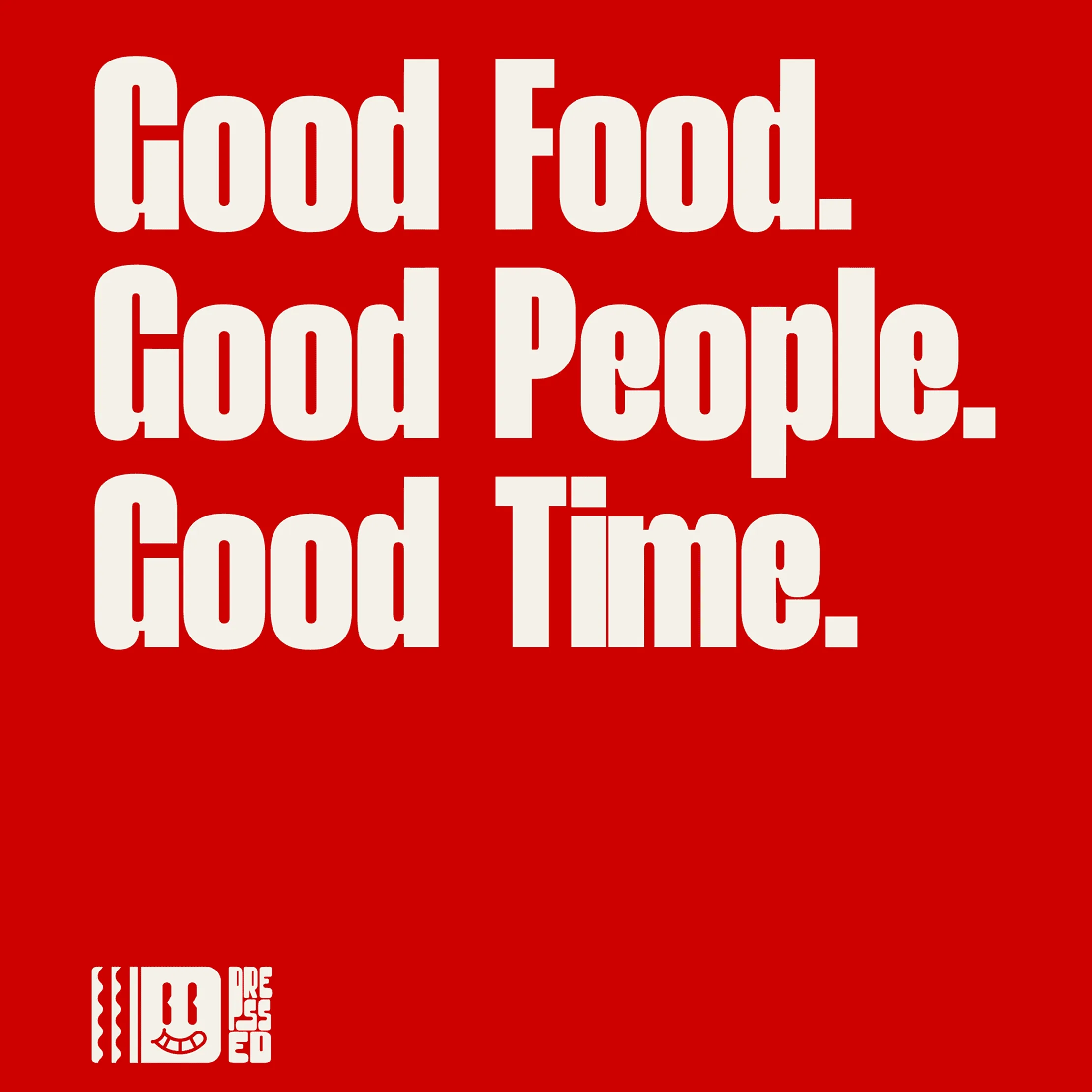
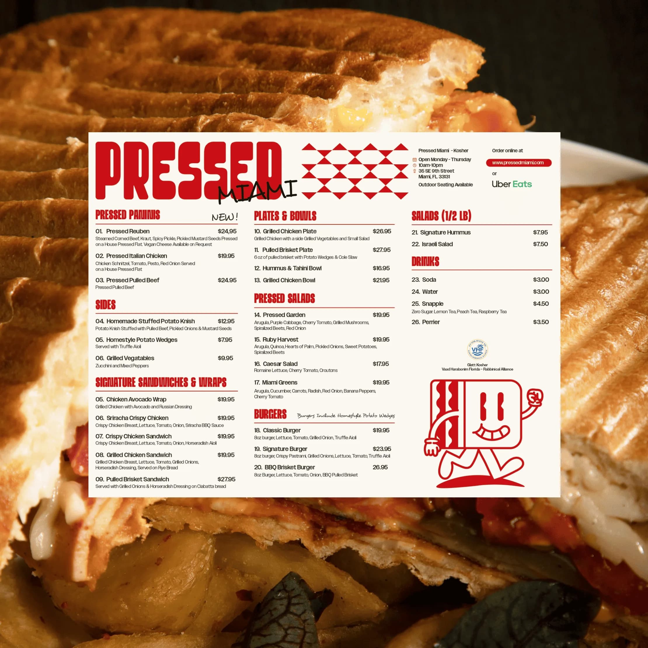
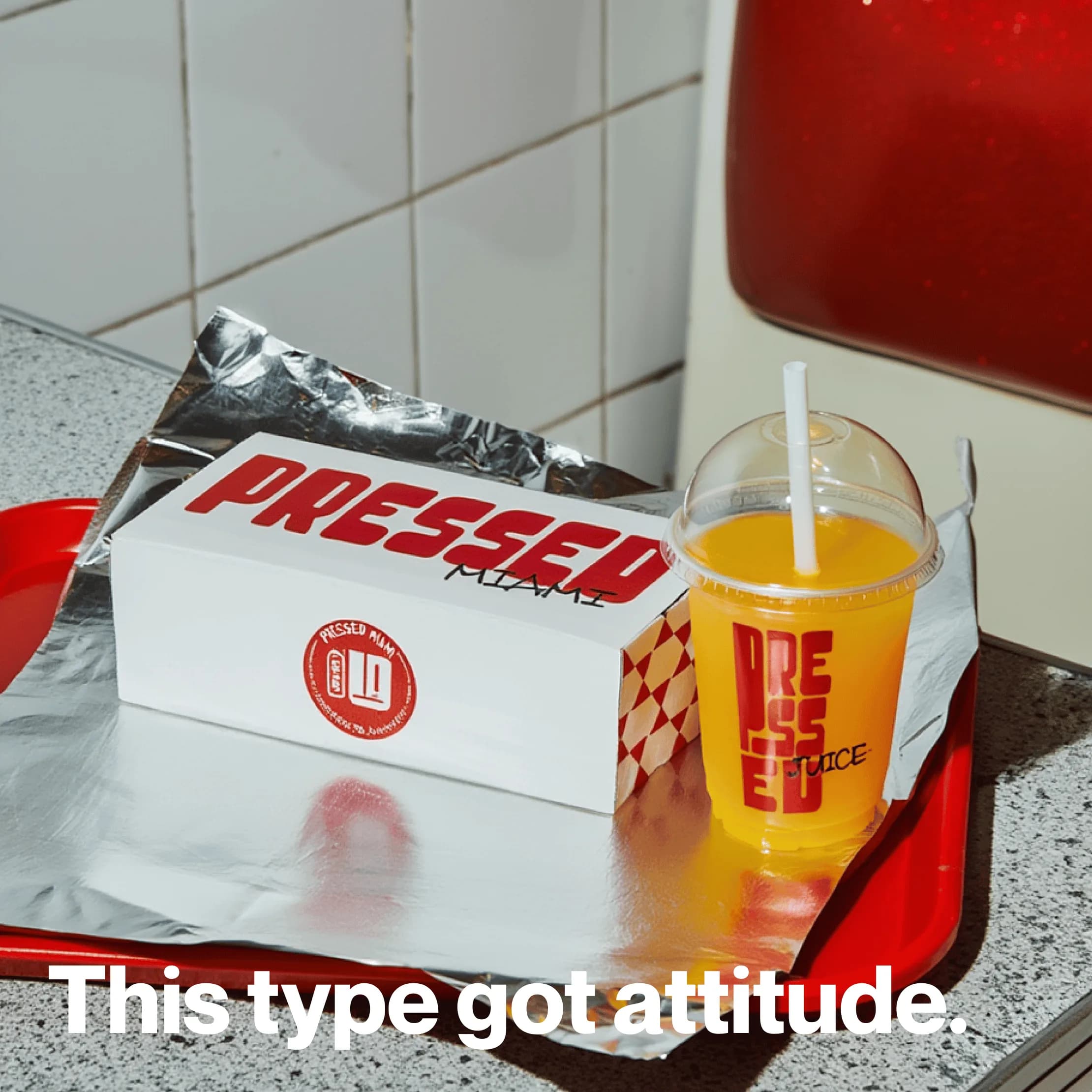
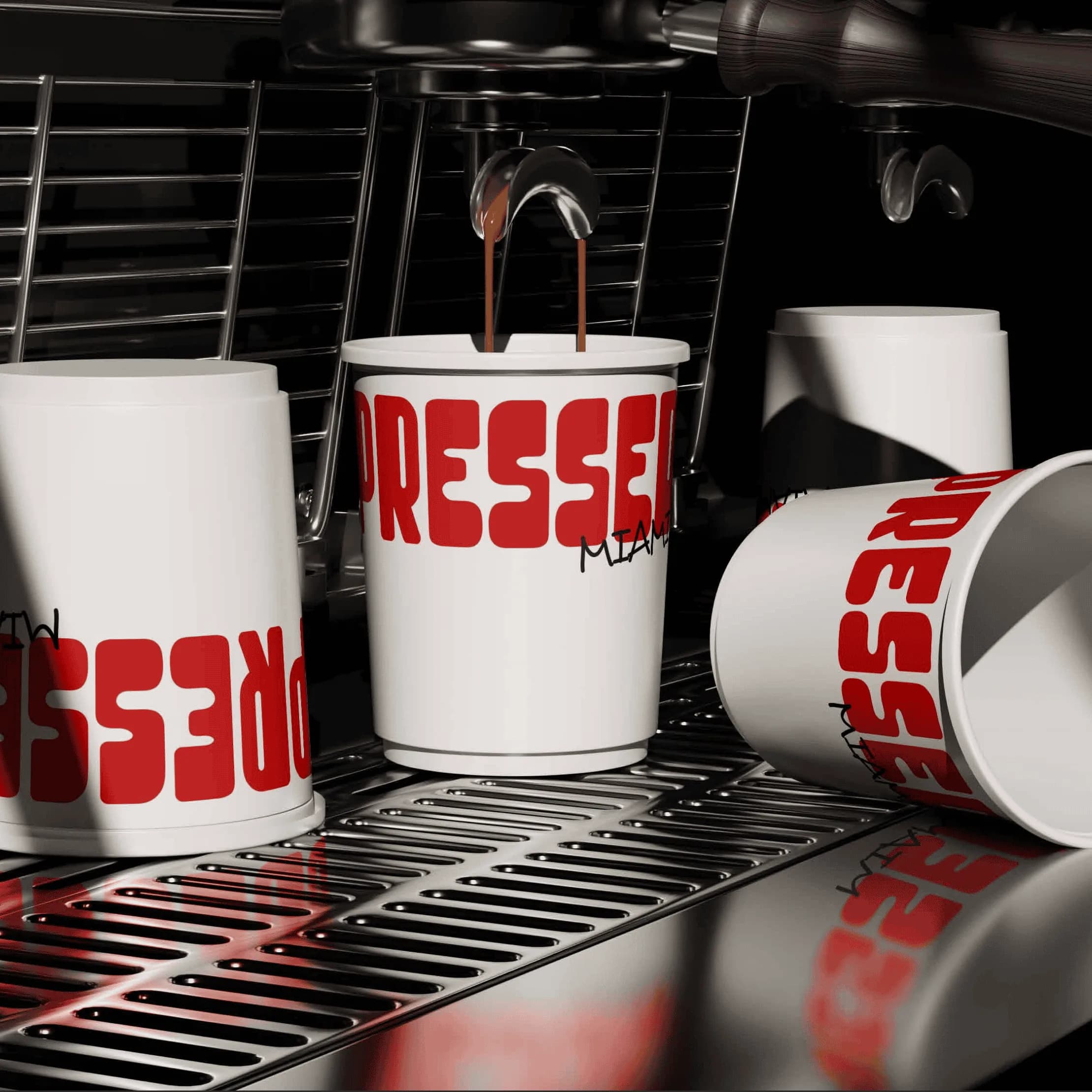
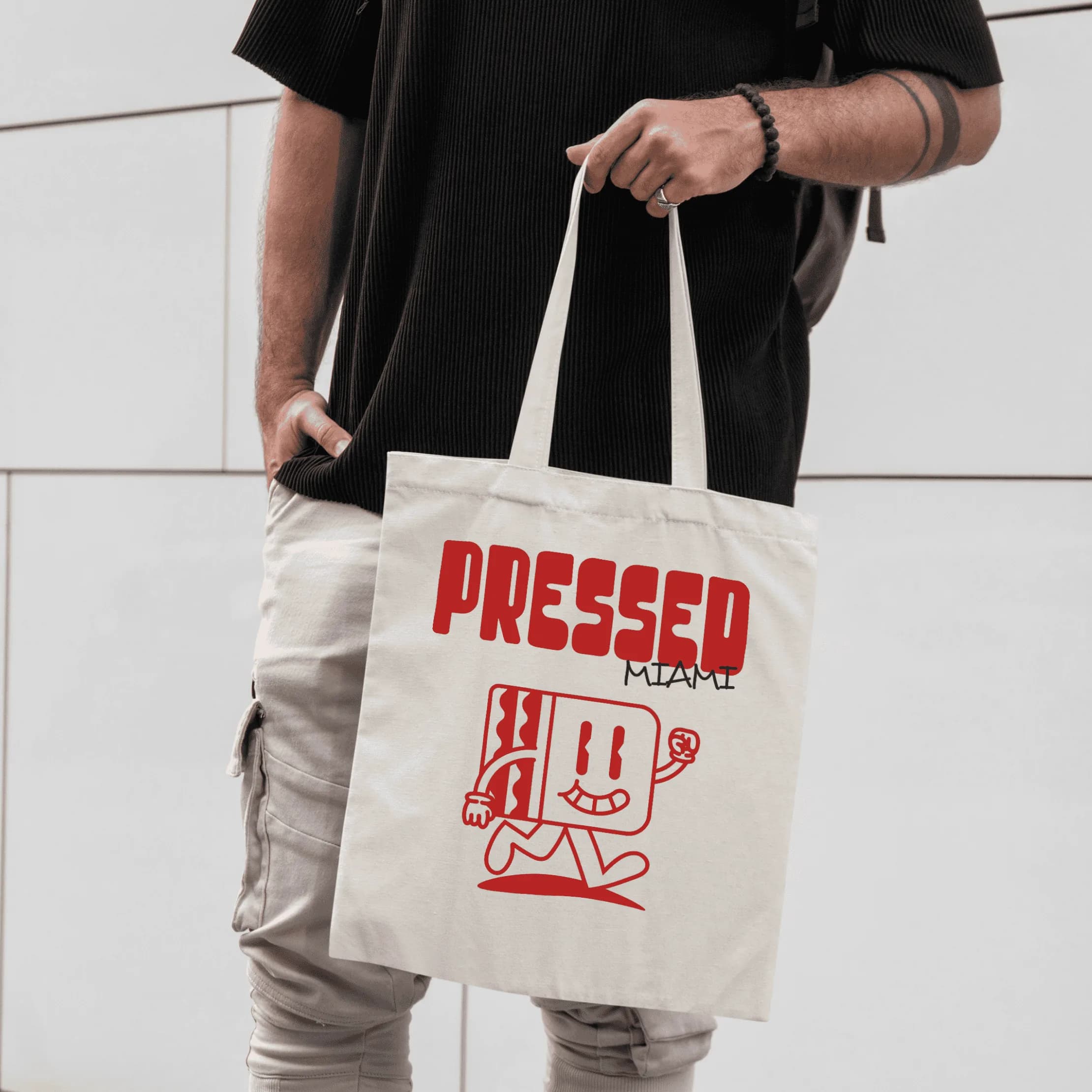
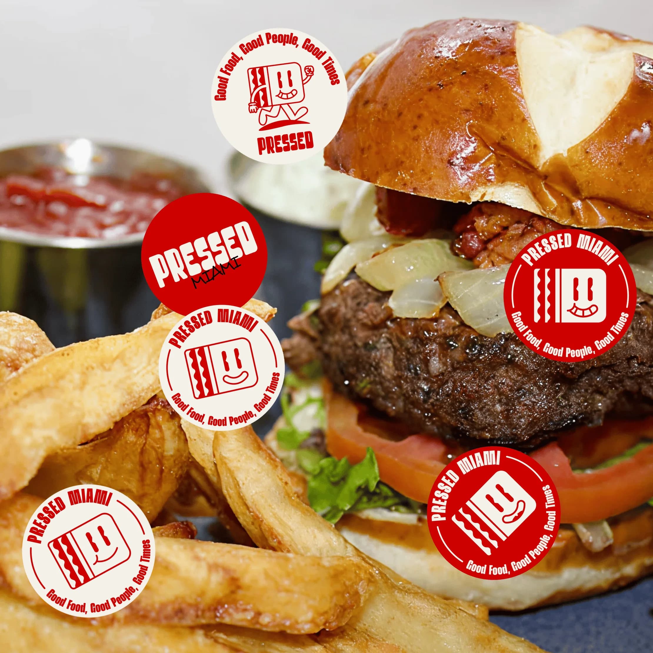
We built the identity around bold red, chunky typography, and an animated sandwich mascot. The character gives the shop a face that can move between formats. All-over pillow box packaging makes the identity part of the order itself, using the surface as a full expression of the brand rather than a small logo placement.
What changed
The shop has a flexible visual language and a distinct character to carry across packaging and other brand materials. The design makes the physical product part of how the identity is encountered.
More work.
All work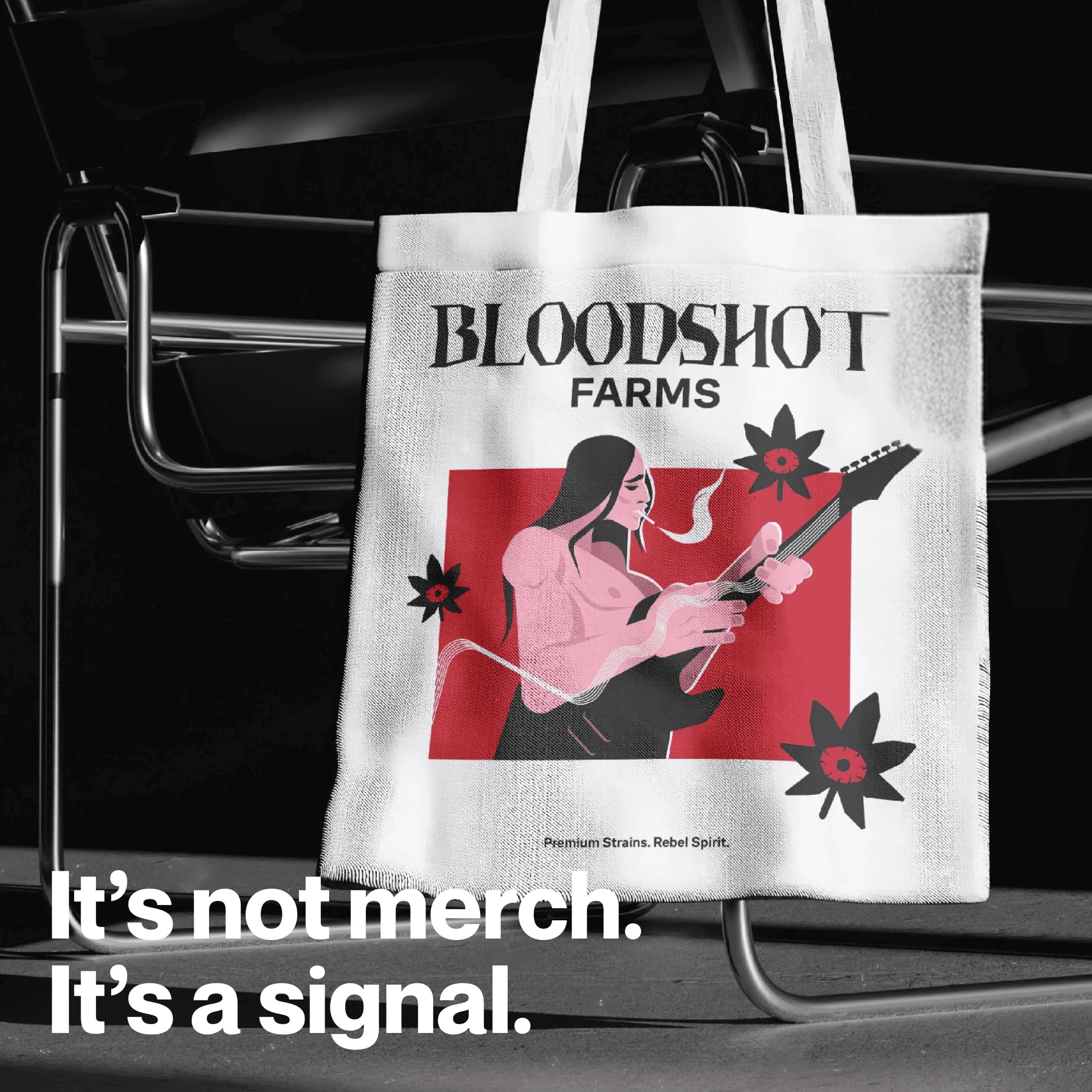
Bloodshot Farms
Color + Typography · Logo + Visual Identity
Bloodshot Farms