Color + TypographyLogo + Visual Identity
The context
Bloodshot Farms is a premium cannabis brand with an unapologetic point of view.
The question
The identity needed to express that attitude while retaining the craft expected of a premium product.
The decisions
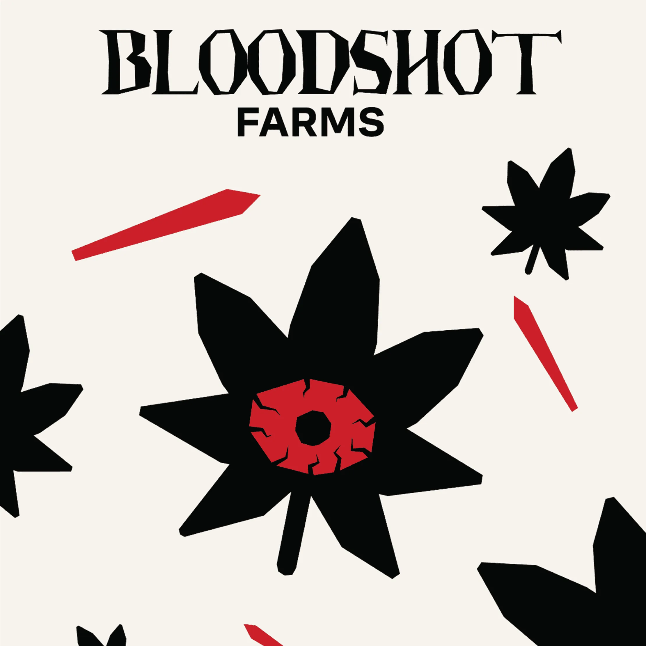
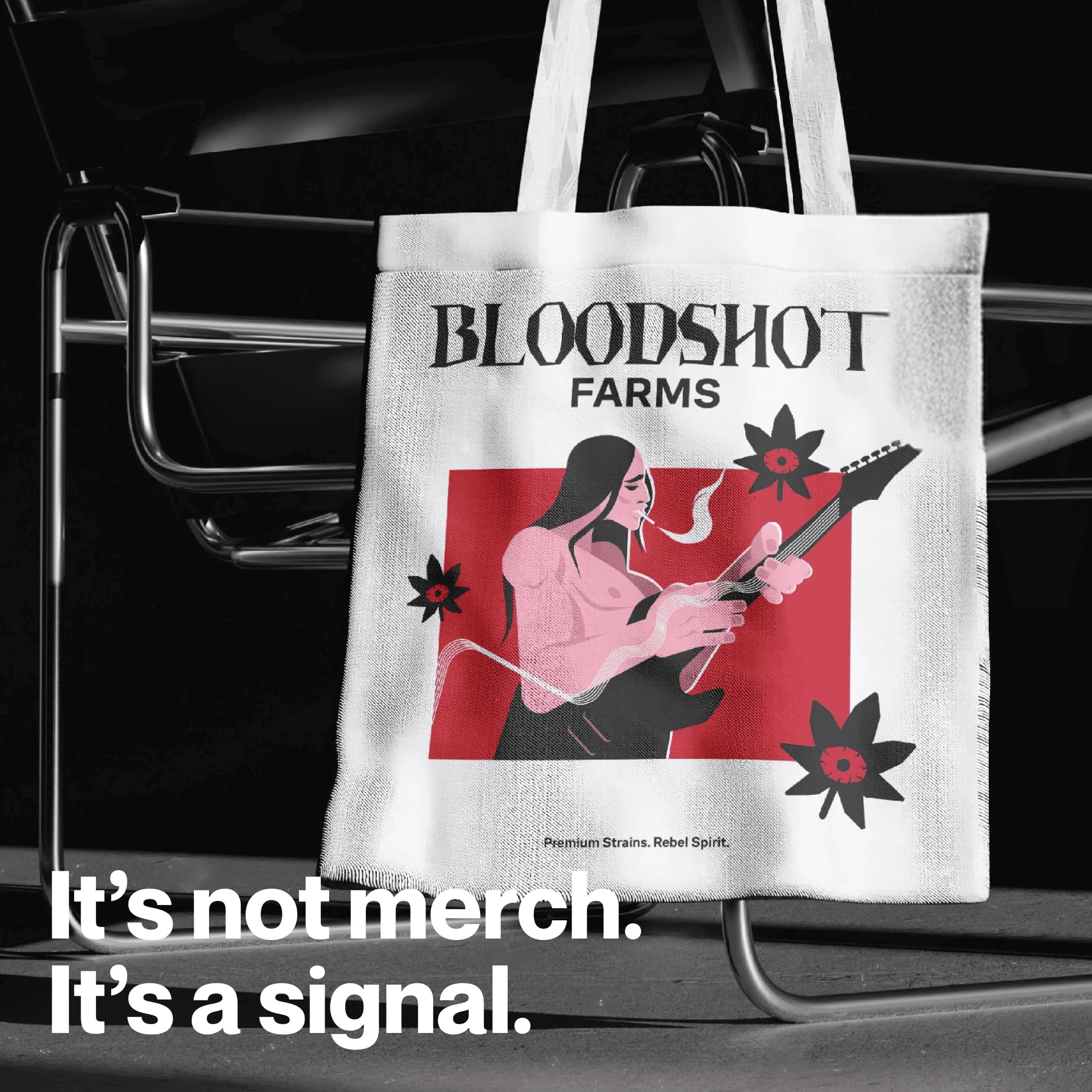
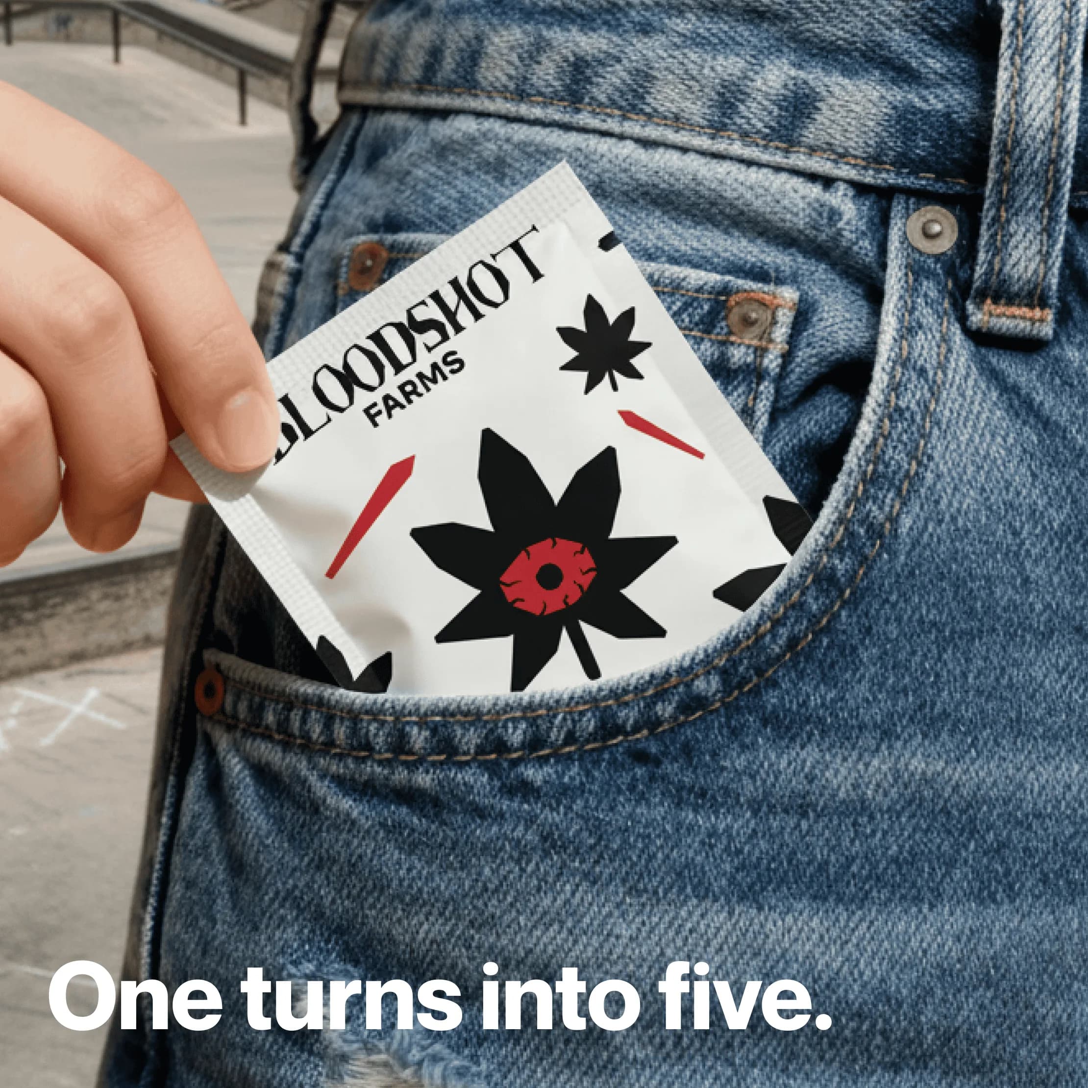
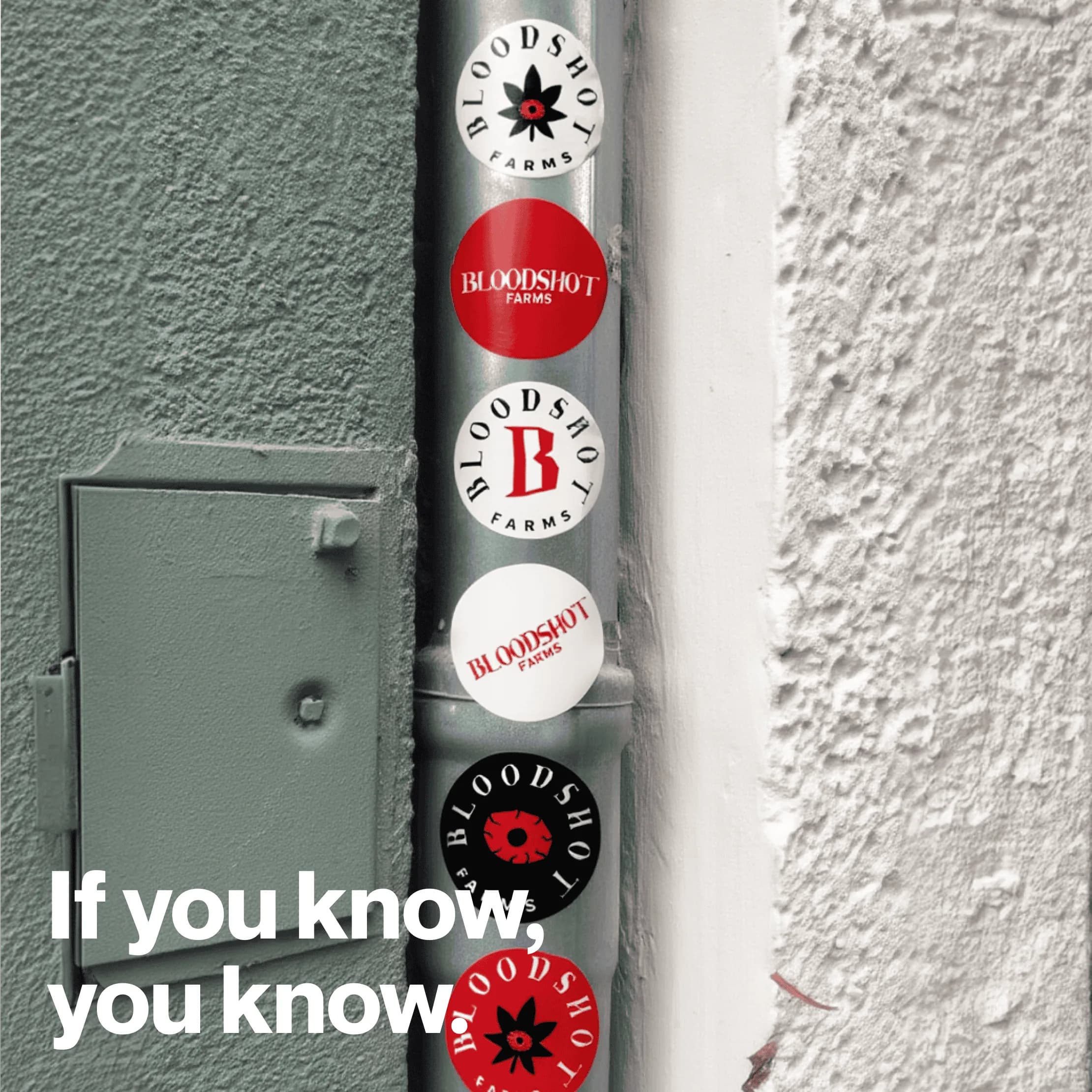
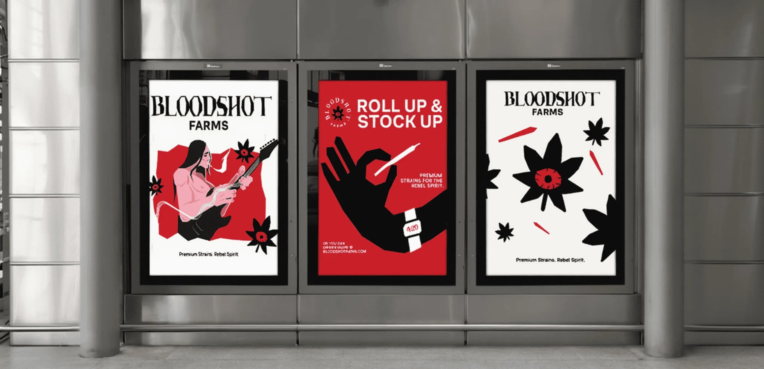
We used counterculture references, bold typography, and a visceral interpretation of the cannabis leaf to establish a distinct visual direction.
What changed
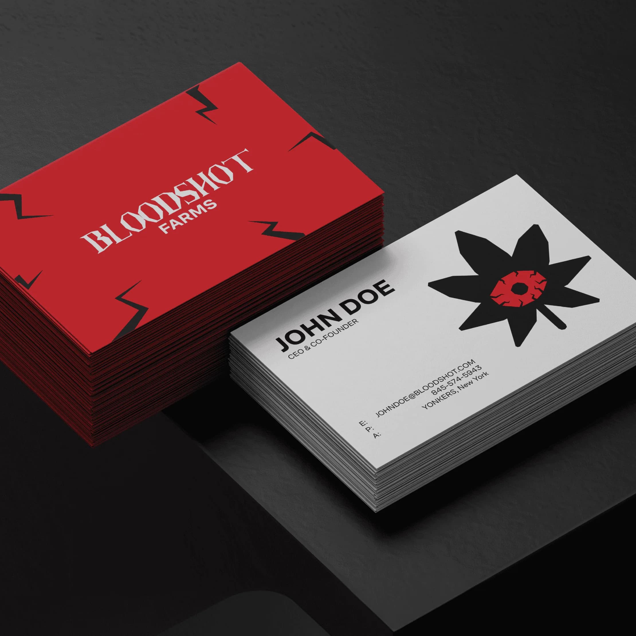
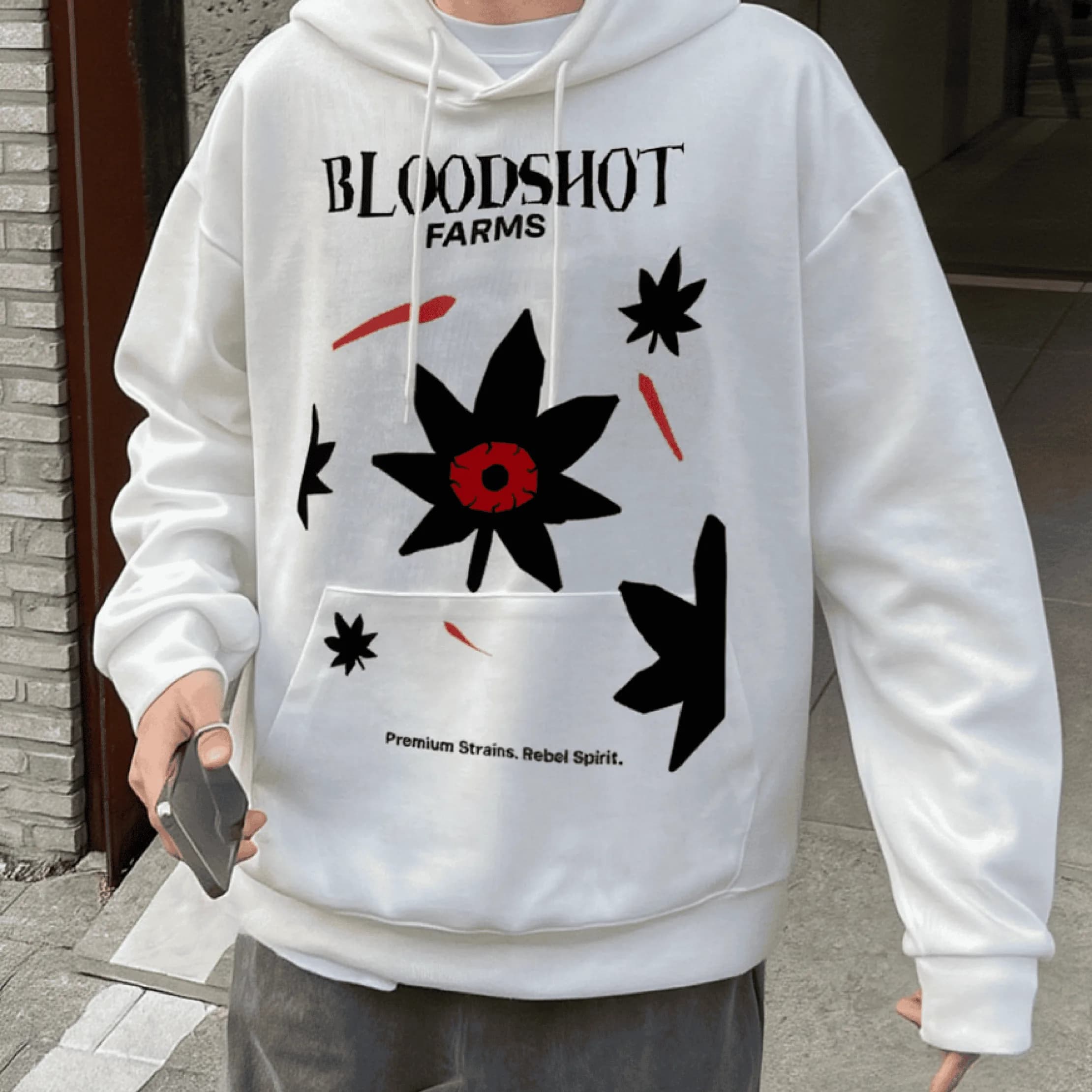
The identity gives the brand a coherent way to express intensity across its visual materials.