

Ecommerce design
 Ecommerce design
 built around where the sale actually happens
We design online stores for consumer brands: collection pages, product pages, cart, and everything after the order. Whatever the platform, the job is the same: help someone choose, and make them glad they did.
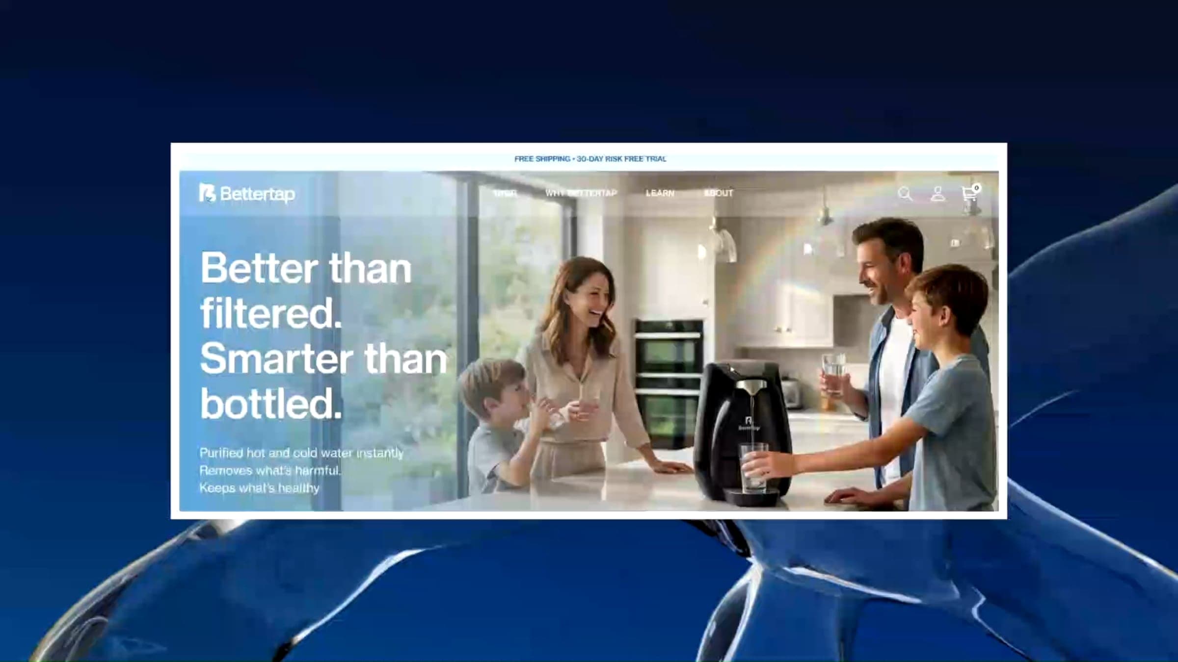
Trusted by founders and teams at





Sound familiar?
Traffic comes. Sales don't.
People land, browse, and leave. The analytics tell you where they drop off but not why, and more ad spend into the same store won't fix it.
Shoppers can't tell your products apart.
Similar items, unclear variants, and no help choosing. So they email you to ask, or they pick nothing.
The store still looks like the old company.
The brand has moved on. The storefront is the theme you picked at launch with a new logo on top.
Every app fixed one thing and slowed down everything.
Reviews, upsells, pop-ups, bundles. Each one was a quick fix, and together they've made the store slower and busier on a phone.

Our view
 Our view
Most ecommerce design is judged by the homepage, but very few people buy from the homepage. Sales are won or lost on the collection page, the product page, and the cart. A store that looks great in a portfolio screenshot but leaves shoppers guessing about fit, shipping, or which variant to pick isn't a store. It's decoration.
What we do instead
We design the store around the buying decision. How do people browse, compare, choose, and commit? We find where they stall and fix that page first, whether it needs a better image order, a clearer variant selector, trust signals next to the button, or fewer steps to checkout. Structural problems get fixed before cosmetic ones.
Where we've done it
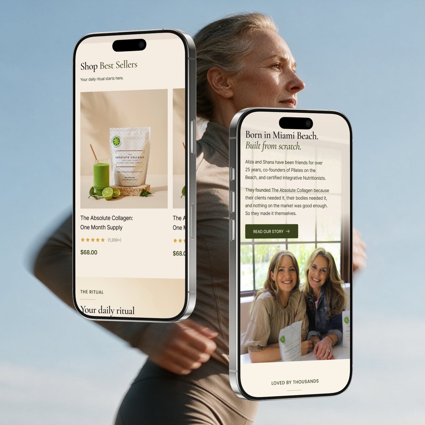
HUUG sells intimates in styles and pack sizes, so its store is built around choosing. Mazza by Marlene takes weekly orders against a cutoff. The Absolute Collagen sells one product that has to explain itself, and Bettertap launched a countertop water system with its own app. Each store was designed around how it actually sells.
Featured project
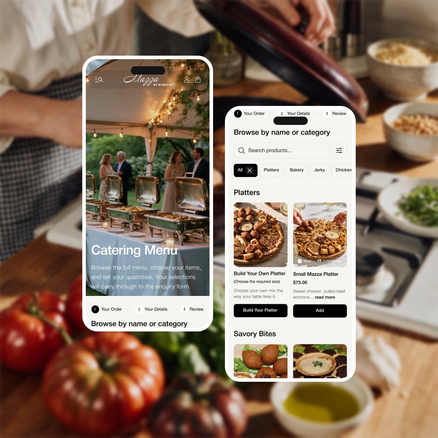
Mazza by Marlene
A family kitchen's weekly Shabbos, holiday, and catering orders, brought online without losing its warmth. We built the store around how customers already order: set menus, a clear cutoff, pickup or delivery.
- The challenge
- How do you bring a family kitchen online, keep its warmth, and still make weekly ordering fast?
- What changed
- Mazza by Marlene has one site for every way customers order, at both locations, with the weekly routine made quicker and the family story up front.
More ecommerce design work
All work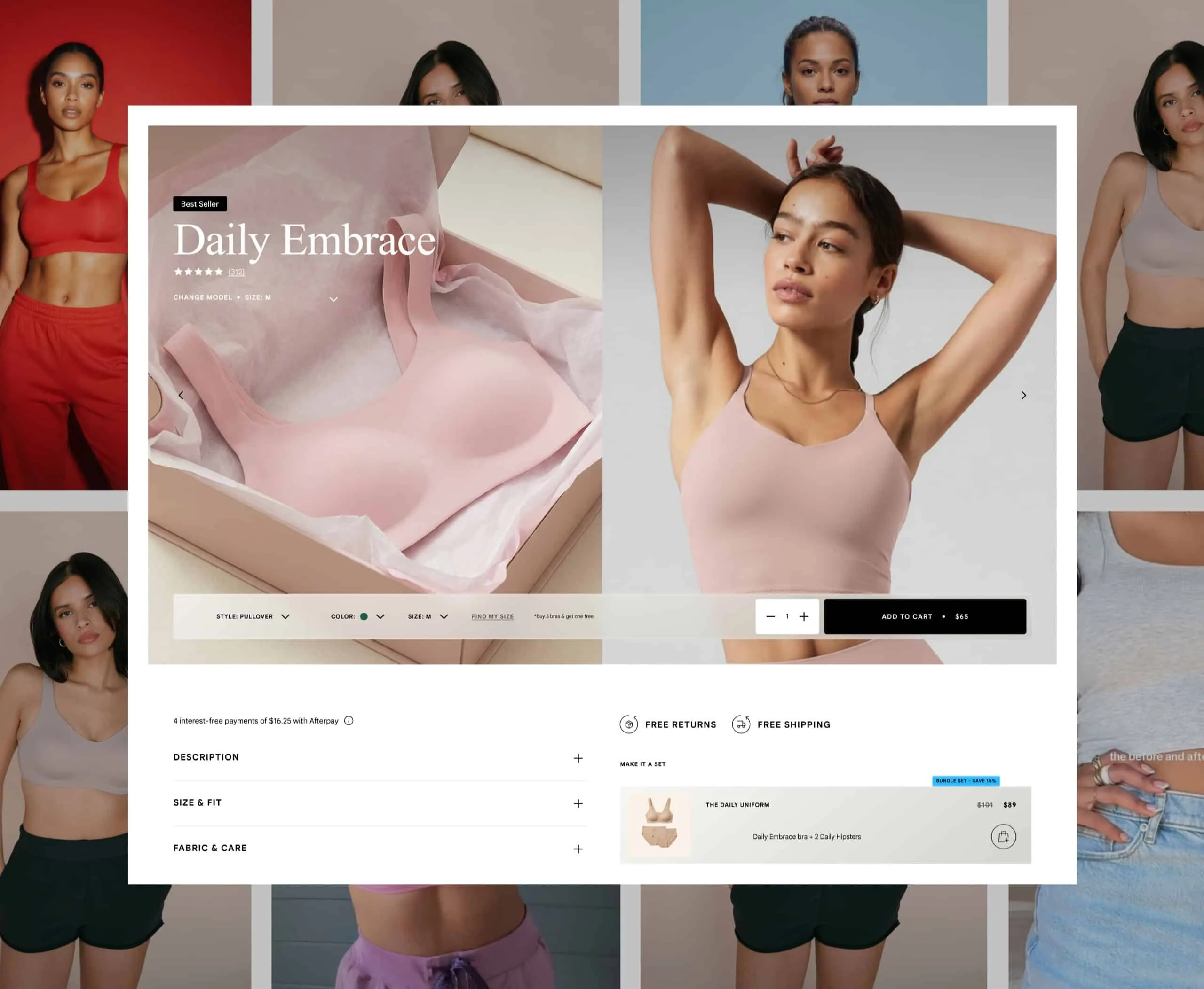
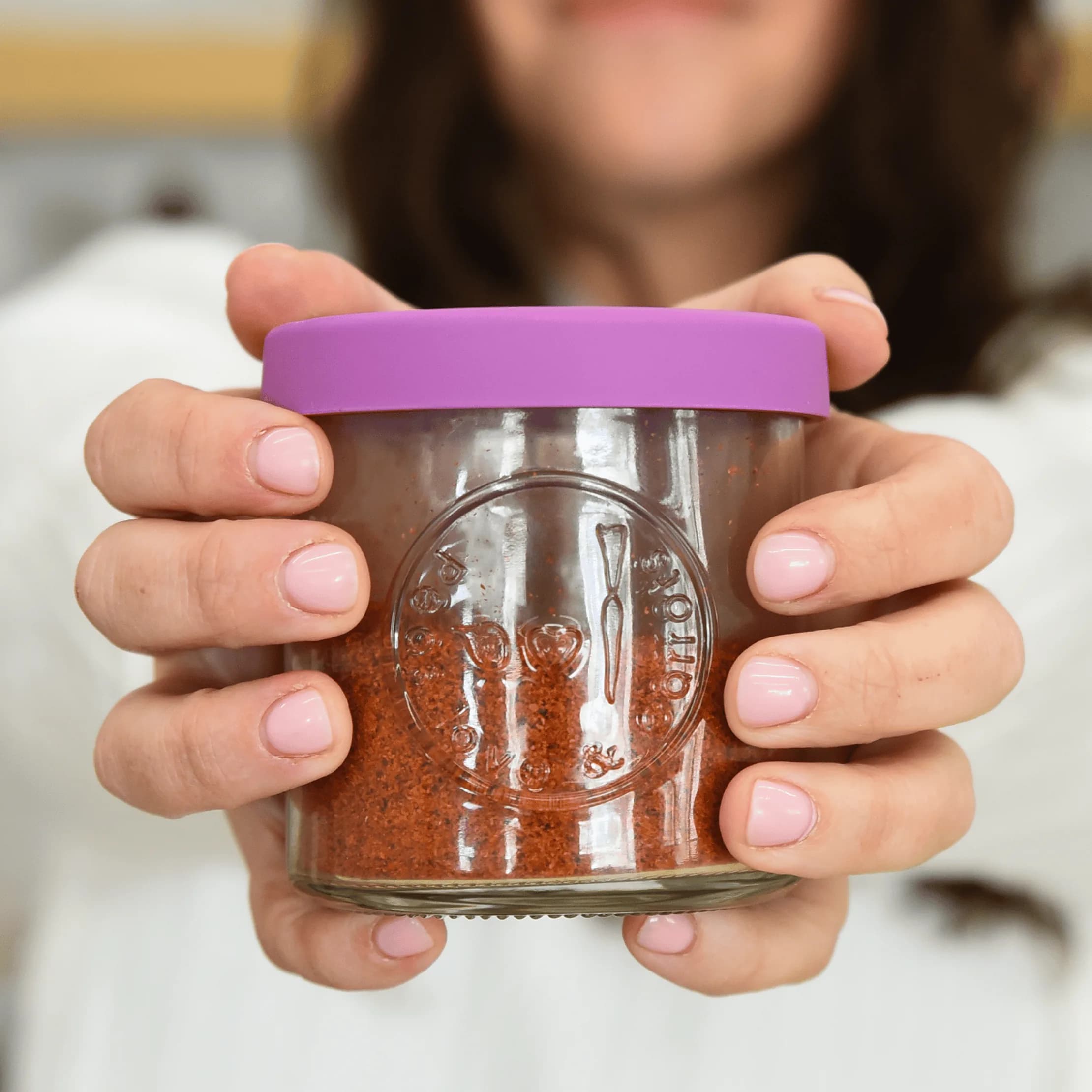
“Working with the Splash team has been a joy. They carry a true can-do approach to every project, at every angle of the process. From start to finish, they provide seamless and thoughtful experience, taking the time to understand your brand's needs from the inside out. Definition of a true partner.”
Every page where a sale is won or lost
- 01
Navigation and collections
Menus labeled the way customers shop, not the way your warehouse is organized. Collection pages with filters that match the decisions people are actually making: size, use, price, material.
- 02
Product pages
The product page is where the sale actually happens. We redesign it around image order, copy that answers real questions, variant selection, reviews, and the friction that quietly kills a purchase.
- 03
Cart and checkout
Surprise shipping costs, forced account creation, and missing payment options send people away at the last step. We design the cart so upsells help instead of getting in the way of finishing the order.
- 04
Mobile first, for real
Most of your shoppers are probably on a phone, so that's where we design first. Tap targets, image weight, sticky buttons, and scroll length are design decisions, not cleanup for the developer.
- 05
Custom shopping tools
Bundle builders, quizzes, style selectors, sample requests, and comparison tools. We build them only when they make choosing easier, never as a gimmick.
- 06
After the order
Order confirmation, shipping updates, and the welcome email are part of the store too. A welcome email that only hands out a discount isn't a welcome, it's a bribe. Give people a reason to come back.
How we work, for free
Five checks we run on every store before we redesign anything.
Most stores lose sales in the same few places. You can run all five this week, and none of them need a redesign to start.
- 1
Buy it on a phone, off Wi-Fi
Turn off Wi-Fi, tap one of your own ads, and buy your best seller with one thumb. Note every moment you waited, zoomed, or went looking for something. That's the store most of your customers are actually using, and it's rarely the one you approve on a laptop.
- 2
The image order check
The first image sells and the rest answer questions. Lead with the product, clearly, then show it in use, then scale, detail, and what comes in the box. If people keep asking about size or fit, the answer belongs in the images, not in a tab nobody opens.
- 3
The variant check
Every choice a shopper has to make should be visible, labeled in their words, and update the image and price when they pick it. Show sold-out options as unavailable instead of hiding them. If customers email to ask which one to get, you need a better selector, not more copy.
- 4
The no-surprises rule
Shipping cost, delivery timing, and the returns policy belong on the product page, right next to the button. Shoppers who find out at checkout feel tricked, even when the terms are fair. Say it early and say it plainly.
- 5
The search log
Read last month's on-site searches and customer service emails side by side. The words people type are your filter labels, and the questions they ask are your product page copy. Your customers have already written the brief. Most stores never read it.
How an ecommerce design project with us works
- 01
Audit
We study the analytics, the catalog, and how customers move from landing page to checkout. You see exactly where people drop off before we propose a single design change.
- 02
Strategy
We set page priorities, the key buying moments, and what we'll measure. You sign off on what we're fixing and why before design starts.
- 03
Design
The full storefront in Figma with real product photography and copy, every key page and state, mobile first. You approve it before any code is written.
- 04
Build and launch
We build on the platform that fits, with redirects, analytics, and conversion tracking in place before go-live. We don't push and pray.
- 05
Optimize
After launch we keep working: testing, iterating, and updating for the season. A store is a living system, and we treat it like one.
Why not a freelancer, a big ecommerce agency, or a theme and some apps?
Each one can get you a store. The difference is whether anyone owns the question of why people aren't buying.
Splash Creative
- Where it starts
- An audit of where shoppers hesitate and drop off, before any design
- Design and build
- One senior team designs and builds, so what's designed is what ships
- Helping people choose
- Custom selectors and product pages built around how you sell
- Beyond the storefront
- Cart, post-purchase, and email designed as one journey
- After launch
- The same team keeps testing and improving
Freelancer
- Where it starts
- Usually the brief you hand over
- Design and build
- Design or development, sometimes both
- Helping people choose
- Depends on their skills
- Beyond the storefront
- Usually out of scope
- After launch
- Depends on their availability
Large ecommerce agency
- Where it starts
- A discovery phase, often long and separate
- Design and build
- Often separate design and development teams
- Helping people choose
- Yes, with a heavier process
- Beyond the storefront
- Often a separate team or contract
- After launch
- Often a new scope or retainer
Theme and apps yourself
- Where it starts
- A theme demo that looked good
- Design and build
- Theme settings and app installs
- Helping people choose
- Whatever the theme and apps support
- Beyond the storefront
- Separate apps, set up one by one
- After launch
- You, with app support
We're a good fit if...
- Your store gets traffic, people leave without buying, and you don't know exactly why.
- You're rebranding and the storefront still looks like the old company.
- You're launching a new product line or brand and want the store right from day one.
- Your catalog has grown and customers can't find what they came for.
- You care about conversion, average order value, and repeat purchases, not just how the homepage looks in a deck.
- You're weighing a platform move and want a straight answer on whether it's worth it.
Not a fit
We're not the right fit for a theme tweak dressed up as a redesign, or for a vendor to execute someone else's spec. We do our best work as the partner that decides what to change and why.
In short
Splash Creative designs ecommerce experiences for consumer brands, from navigation and collection pages to product pages, cart, checkout, and post-purchase email. We start by finding where customers hesitate or drop off, then redesign the pages and interactions causing it, on Shopify or whatever platform the store runs on. Design and development are handled by one senior team, so what gets designed is what ships.
- Who it is for
- Consumer brands that want the store to express the brand and make choosing simpler
- What it covers
- Navigation, collection pages, product details, variant choices, cart, and follow-up communications
- Who does the work
- A senior team led by David Herskowitz, Founder and Creative Director
- How it is priced
- Shopify store from about $20,000; website from $15,000. Scope and fee confirmed in a written proposal
Questions, answered.
Do you only design Shopify stores?
No. Shopify and Shopify Plus are where we do most of our ecommerce builds, but the design thinking applies to any platform, including headless setups. If your platform is holding you back, we'll help you weigh whether a migration is worth the disruption.
Can you redesign just our product pages?
Yes. The product page is often the most valuable place to start, and we can scope a focused project around it without rebuilding the whole store.
How do you decide what to change first?
Data first, then judgment. We look at where customers drop off and what questions they keep asking, fix structural problems before cosmetic ones, and agree on what to measure so we can tell whether a change worked.
Will a redesign increase our conversion rate?
We won't promise a number, because traffic, pricing, merchandising, and seasonality matter as much as design. What we will do is fix the problems we can see, measure the result, and keep improving from real data.
How long does an ecommerce design project take?
Redesigning a whole storefront usually runs 10 to 16 weeks. A focused project, like the product page alone, can usually move in 4 to 6. We set the timeline in the proposal so it matches the actual work.
How is ecommerce design priced?
A Shopify store build starts at about $20,000. A website starts at $15,000. By scope: how many page types we redesign, whether we build as well as design, custom features, and any platform migration. You get scope, timing, and fee in a written proposal before kickoff. Share your budget and we'll tell you where it does the most good.

Let's find where your store loses the sale.
Send us your store link and tell us what isn't working. We'll come back with what we see, where we'd start, and a written proposal if we're the right fit.
- 01
You tell us what needs to change
An unfinished brief is welcome. The business situation matters more than a list of deliverables.
- 02
We talk it through
A first conversation about the business, what's already in place, and what should happen next.
- 03
You get a written proposal
Scope, responsibilities, timing, and fee, agreed before any work begins.

Rather talk first?
Book a call with DavidTell us about the project