Healthcare
BioNurture
A specialist practice for cancer and blood health, given a calm and consistent brand.
The context
BioNurture is a physician-led oncology and hematology practice founded by Dr. Arisha Patel. Members have ongoing access to a board-certified specialist for cancer prevention, survivorship, and blood health, alongside the doctors they already see.
Membership is limited each year. Most people only meet this kind of care after a diagnosis, so the practice has to explain itself to people who are well.

The question
How do you introduce specialist cancer and blood care to people who are healthy, in a way that feels reassuring and clear?
The decisions
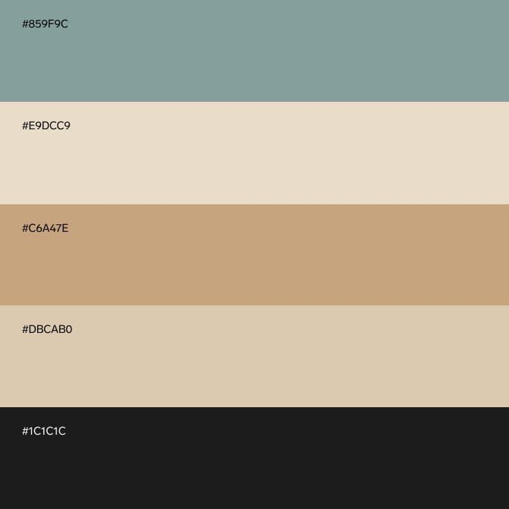
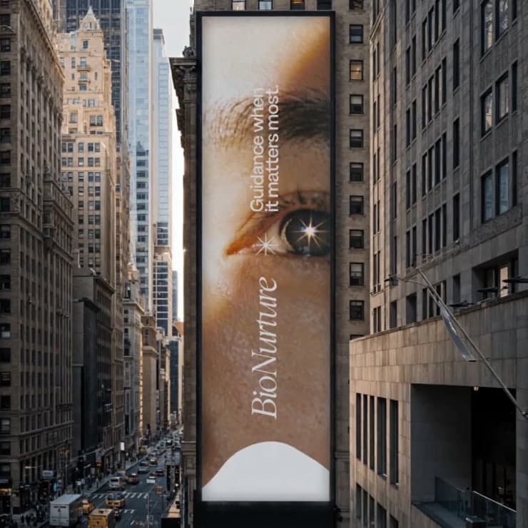
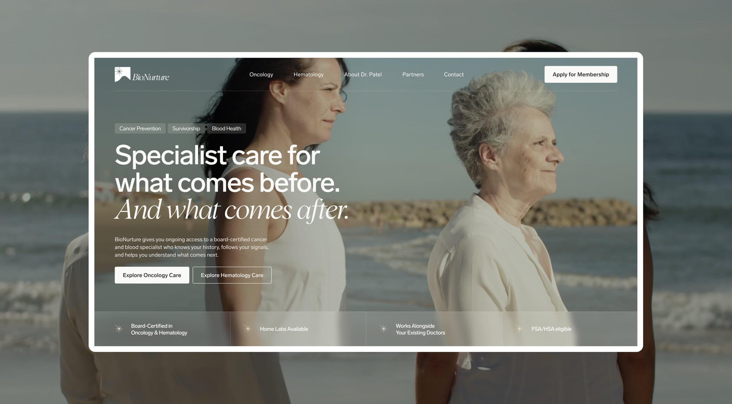
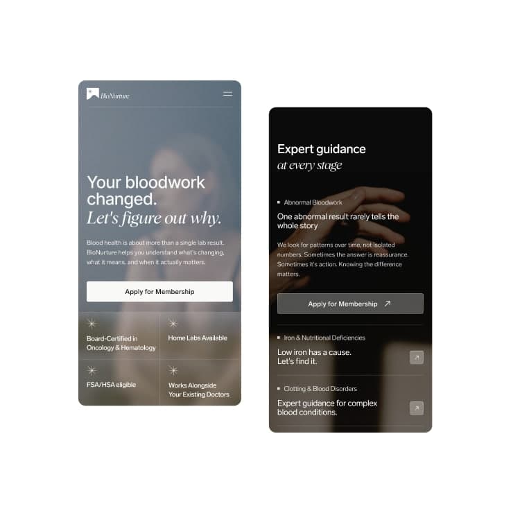
We built the identity around care and continuity. Sage, sand, and warm neutrals, a light serif italic paired with a clean grotesque, and a star mark used across signage, merchandise, and the website.
The website explains the model before it asks for anything: what the practice covers, how it approaches testing, and what membership includes. The copy is plain and careful, so a first visit feels steady.

What changed
BioNurture launched with one identity across its website and physical spaces, and a site that takes a new visitor from understanding the practice to applying for membership.






More work.
All work
Etz Chaim The Englewood Shtiebel
Brand Guidelines · Brand Messaging · Color + Typography · Copywriting
Etz Chaim The Englewood Shtiebel