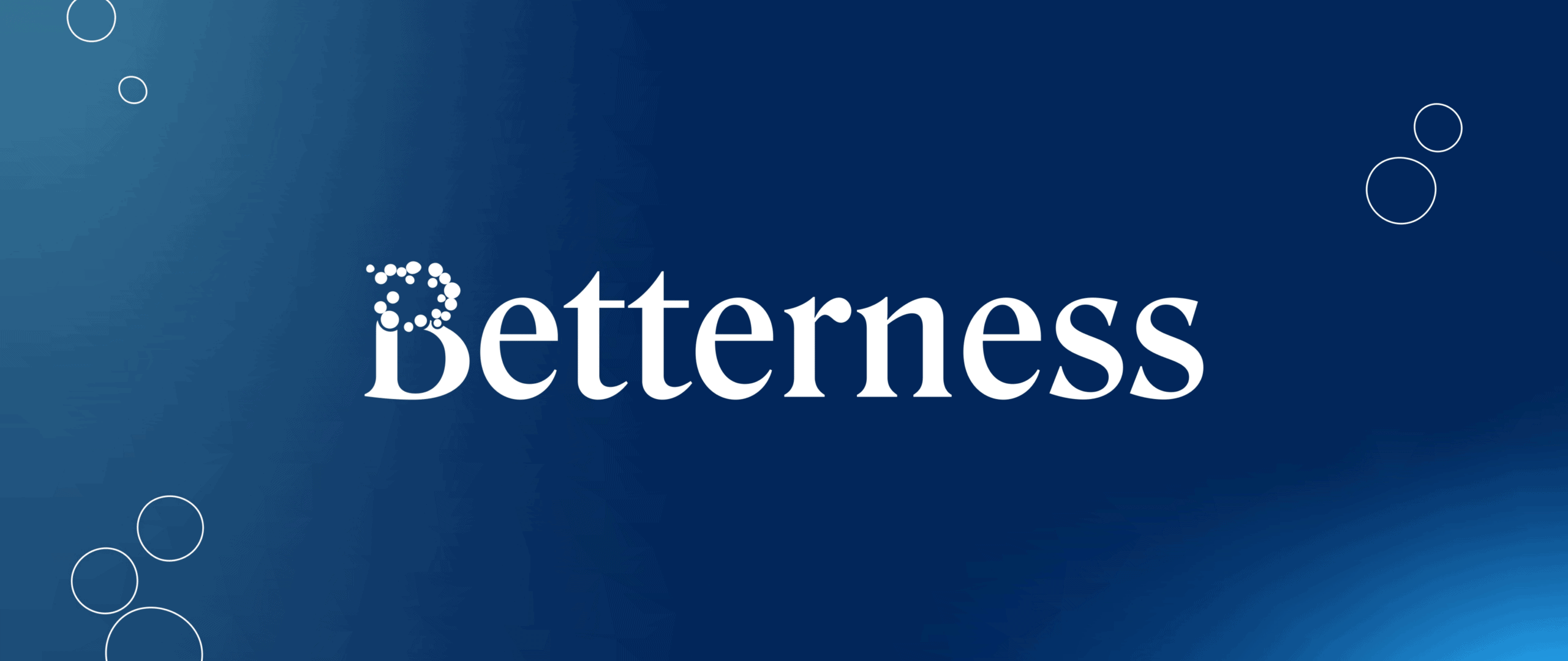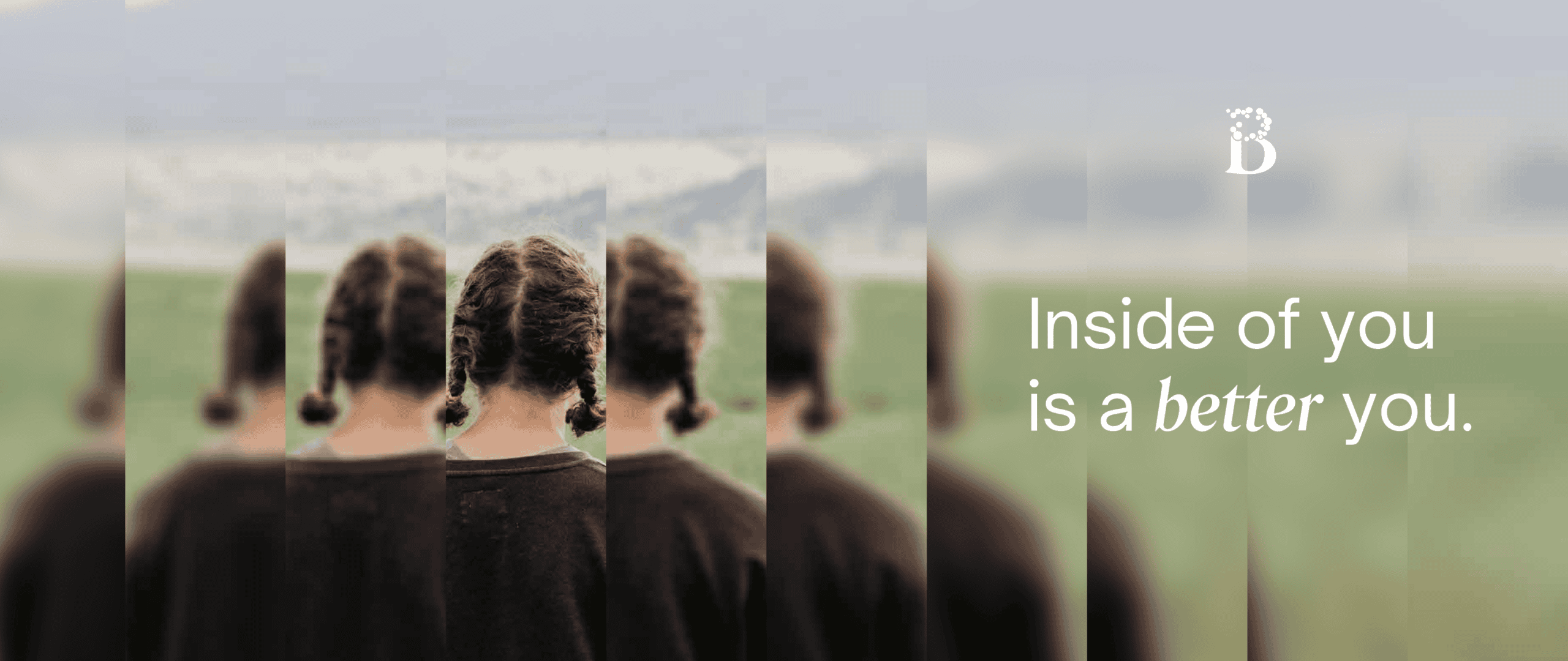
Naming & Brand Identity Betterness needed a name and identity that didn't sound like everything else — something honest, grounded, and genuinely different.
Brand Messaging
Color + Typography
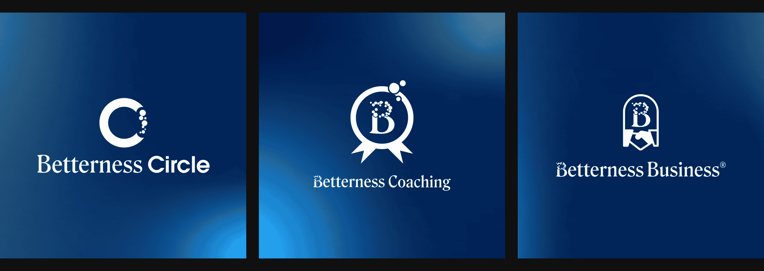
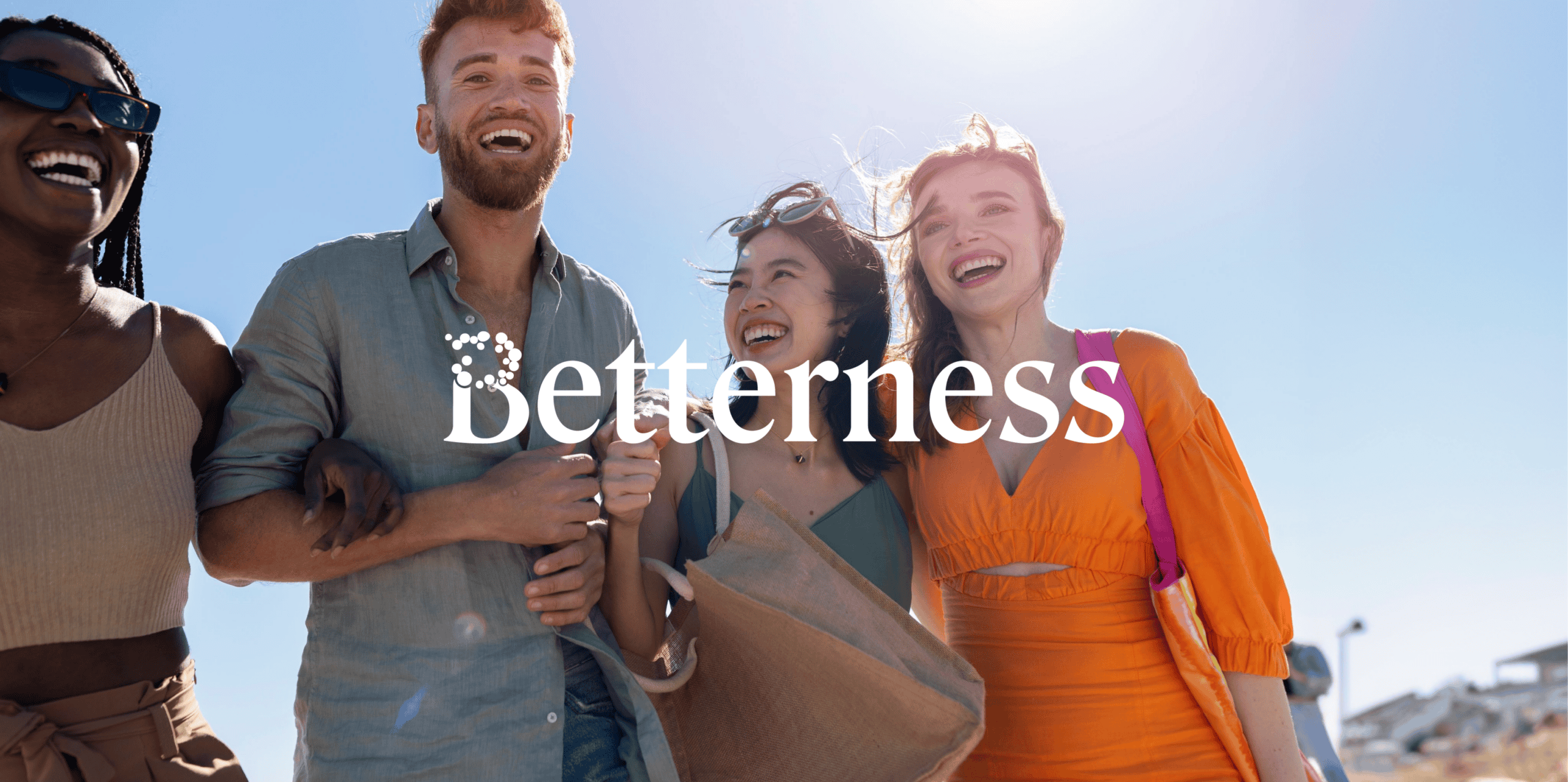
Logo + Visual Identity
Betterness needed a brand that could hold complexity without feeling heavy.
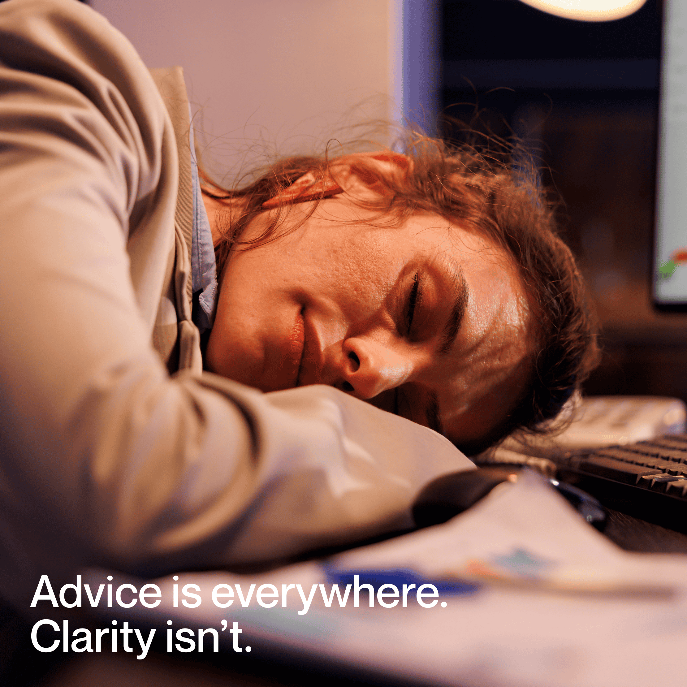
The offering sits at the intersection of clinical care, personal growth, education, and community. The identity had to feel legitimate and grounded while still being warm, hopeful, and accessible — speaking to people who are curious, cautious, and searching for clarity, without feeling clinical, trendy, or vague.
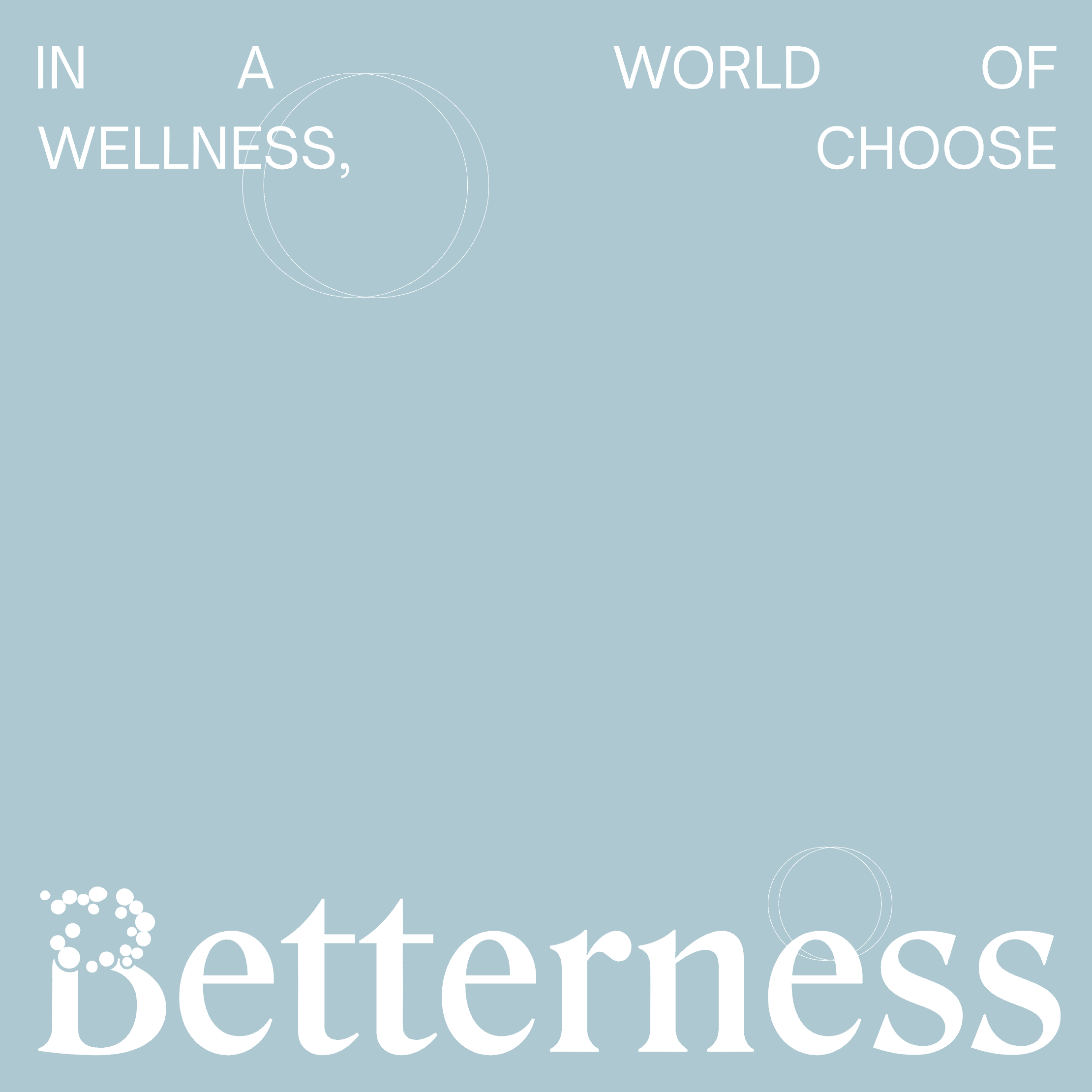
Reject the category. Define something better.
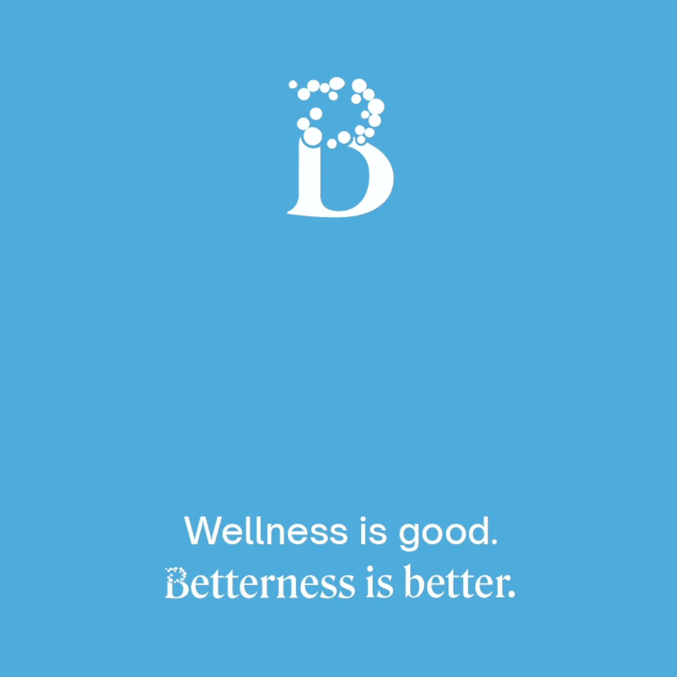
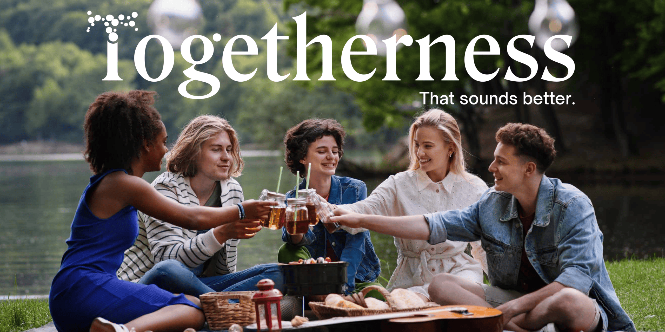
Rather than competing inside the wellness space, we looked for language that felt more direct and more human. The name Betterness is intentionally simple — familiar, but unexpected. It invites curiosity without pretending to have all the answers. The visual identity was built around clarity and connection: a logo that reflects transformation through subtle progression, a palette of calm blues and greens signaling trust and openness, and typography chosen for readability over trend. Beyond visuals, we developed a full brand system — manifesto, voice principles, taglines, and visual guidelines — giving Betterness a flexible foundation that can grow without losing its core identity.