8 Brand Guidelines Examples Every Designer Should Study
By David Herskowitz, Founder and Creative Director
Eight public brand guidelines, checked against the pages that publish them, and four Splash Creative identity systems. Identity from $15,000.
Key takeaways
- A guideline is useful when it gives the next person a value, a minimum size, and a misuse.
- The public notes stay inside the linked page: Spotify's partner logo rules, Netflix's published color values, Mailchimp's voice, Slack's tone, and NASA's 1975 manual.
- Splash Creative's published guideline projects on this page are The Shuk, Betterness, Manhattan Valley Pediatrics, and Pressed Miami.
- Brand identity is from $15,000. A website is from $15,000. Brand and website together is from $30,000.
- A focused brand identity takes 4 to 6 weeks. Full brand strategy and identity takes 8 to 12 weeks. Guidelines are part of that delivery.
Branding
A brand should make the business easier to understand.
We help businesses work out what they stand for and give that thinking a recognizable form. Positioning, identity, language, and application are developed as one connected system.
Brand identity from $15,000.
By David Herskowitz, Founder and Creative Director, Splash Creative. November 4, 2026.
A brand guidelines example is worth studying when the next person can apply it without asking. The useful ones name a value, a minimum size, and a misuse. The eight public pages below are Spotify, Apple, Netflix, Uber, Mailchimp, Slack, Airbnb, and NASA. Each note stays inside what that page says, and links it.
The four projects after those pages are Splash Creative work. The Shuk, Betterness, Manhattan Valley Pediatrics, and Pressed Miami each include guidelines in the published scope. The case study is the record. This article does not add a result the case study does not state.
What the surveys actually report
A 2016 study from Demand Metric and Lucidpress said almost all of the organizations in the study had branding guidelines, and only one-fourth had formal guidelines that were consistently enforced. Lucidpress's 2019 announcement said a survey of more than 200 organizations found that consistent branding can increase revenue by up to 33%.
Both figures come from Lucidpress's own research announcements. Lucidpress, now Marq, sells brand-template software. The numbers are what the studies reported. They are not results Splash Creative measured for a client.
Eight public examples
| Brand | What the linked page specifies | What to take from it |
|---|---|---|
| Spotify | Where the green logo may sit, an exclusion zone, minimum sizes, and misuse | Name the background, not only the color |
| Apple | Clear space, minimum size, and black or white for channel signatures | Write the exclusion zone as a number |
| Netflix | Logo color values, clear space, contrast, misuse, and a motion toolkit for partner end cards | Publish the values and the things to avoid |
| Uber | Approved logos, icons, photography, and rules for the icon and buttons | Point people at the approved files |
| Mailchimp | A voice (plainspoken, genuine, translators, dry humor) and a tone that changes with the reader | Show the voice in principles a writer can use |
| Slack | A voice list, and tone that changes with audience, context, and information | Describe the range. Leave room for the situation |
| Airbnb | A published account of the design language, including motion | Write the principles the system has to meet |
| NASA | One 1975 system, about 90 pages, for applications from stationery to vehicles | Build rules that cover the real applications |
Spotify
Spotify's partner guidelines are written for people integrating Spotify into another product. They say the green logo is the primary colorway and should be used with black, white, and non-duotoned photography. On any other background, the logo should be monochrome: black on light backgrounds, white on dark ones. The exclusion zone is half the height of the icon. The logo should not go below 70 pixels on screen or 20 mm in print. The icon should not go below 21 pixels or 6 mm. The page shows misuse, including rotating, stretching, or rebuilding the mark.
The color section names Spotify Green as the resting color. It says to choose high-contrast combinations, not to introduce colors outside the palette, and not to use over-saturated colors for CMYK printing. That page does not publish a full palette table with hex, RGB, and CMYK for every color. The lesson is still specific: a color rule that names the background is a rule someone can follow.
Apple
Apple's identity guidelines for channel affiliates and Apple-certified individuals govern how those partners use an Apple signature. They are not a public edition of Apple's own internal brand book. The minimum clear space around the signature is one-half the height of the Apple logo, measured from the top of the leaf to the lower edge. The minimum size is 8 mm in print and 35 pixels on screen, measuring the height of the logo. Signatures are black or white only.
The lesson travels even though the document is a partner rulebook. Clear space and minimum size are numbers. "Give the logo room" is not a number.
Netflix
Netflix's public logo page publishes the values. Netflix Red is RGB 229, 9, 20, hex E50914, CMYK 0, 96, 93, 2, and PMS 1795 C. Symbol Dark Red is published beside it. Clear space around the N symbol is the width of one leg of the N. Clear space around the wordmark is the width of the T. The page asks for a contrast ratio of 2.25:1 or higher when the logo sits on a background, and it shows misuse, including stretching the mark, changing its color, or placing it on a busy background. Partnership end cards are pointed to a Motion and Sonic Toolkit.
That is a logo standard with a motion reference for partner end cards. It is enough to study. A designer can copy the habit: publish the values, the clear space, the contrast, and the misuse.
Uber
Uber publishes a brand site at brand.uber.com. The public developer design guidelines point partners to approved logos, icons, photography, and app screens, and to rules for referencing Uber products, implementing buttons, and using the Uber icon.
The lesson is the handoff. A guideline that says "use the approved files" is doing a job that a description of the logo cannot do.
Mailchimp
Mailchimp's content style guide is public, and the voice section is the part worth studying. The guide names four traits: plainspoken, genuine, translators, and dry humor. Tone changes with the reader's state of mind. The page asks the writer to consider whether the reader is relieved, confused, or asking for help. Style tips that sit under the voice include active voice, plain English, and positive language.
A personality list without those sentences does not tell a writer what to do on a Tuesday. Mailchimp's page does.
Slack
Slack's brand guidelines PDF (September 2020) describes the voice as confident, witty, conversational, intelligent, friendly, helpful, and clear, concise, and human, each with a limit. Confident, never cocky. Witty, but never silly. The same section says tone varies with the audience, the context, and the information, and that Slack is not making hard rules about every phrase.
That is a useful pair of instructions. Write the voice so a stranger can hear it. Say that tone moves. Do not pretend a guideline can script every email, help article, and product notification in advance.
Airbnb
Airbnb's public example here is Karri Saarinen's account of building the design language. He describes the work as a design language for the product, with four principles: unified, universal, iconic, and conversational. Conversational, in that account, includes motion as a way the product communicates.
That is a system description a team can study: the principles the work has to satisfy.
NASA
The 1975 NASA Graphics Standards Manual, by Richard Danne and Bruce Blackburn, is the classic. WIRED, reporting on it in 2015, described a 90-page manual of graphic directives for using the system on everything from spaceships to stationery. The Standards Manual reissue is a 220-page book. It adds a foreword, an essay, the original presentation slides, and the Manager's Guide around scans of that manual. The original manual was the shorter document.
The lesson is the scope, not the page count. One system covered the applications NASA actually had. A guideline grows with the applications. It does not grow to look thorough.
What to put in the document
The eight pages point at the same checklist. Visual identity system: the 7 elements every brand needs is the longer pass at the identity. Brand guidelines template: what to include and how to build one that sticks walks the sections in order. The short version:
- Logo. Primary mark, alternate versions, minimum size, clear space, and misuse.
- Color. Every color you expect someone to match, with the values they need (hex, RGB, CMYK, or a named swatch) and the backgrounds it may sit on.
- Type. The faces, the sizes, and what to use when the licensed font is not available.
- Voice. A short description a writer can apply, plus how tone changes by situation. How to write a positioning statement is the sentence that voice has to agree with.
- Imagery. The kind of picture, if pictures carry the brand. Say what you can point at.
- The files. Templates for the places the brand actually appears, including social formats. Social media branding is the platform-by-platform version.
Visme's 2026 Brand Execution Gap report surveyed 607 brand owners and content creators at mid-market companies. It said 83% of content creators still apply brand assets by hand, even after starting from a template, and 66% of brand owners spend three or more hours a week on brand questions, reviews, and fixes. Visme sells content tools. The figures are that survey's findings. They are a reason to put templates next to the rules, not a promise that a template removes the review.
Guidelines Splash Creative has published
The public pages above are from companies with brand teams. The projects below are identity systems Splash Creative has delivered, including the guidelines. Brand identity is the service: logo, color, type, art direction, guidelines, and the applications named in the proposal. Branding is the wider practice, when the position and the language are part of the same work.
The Shuk
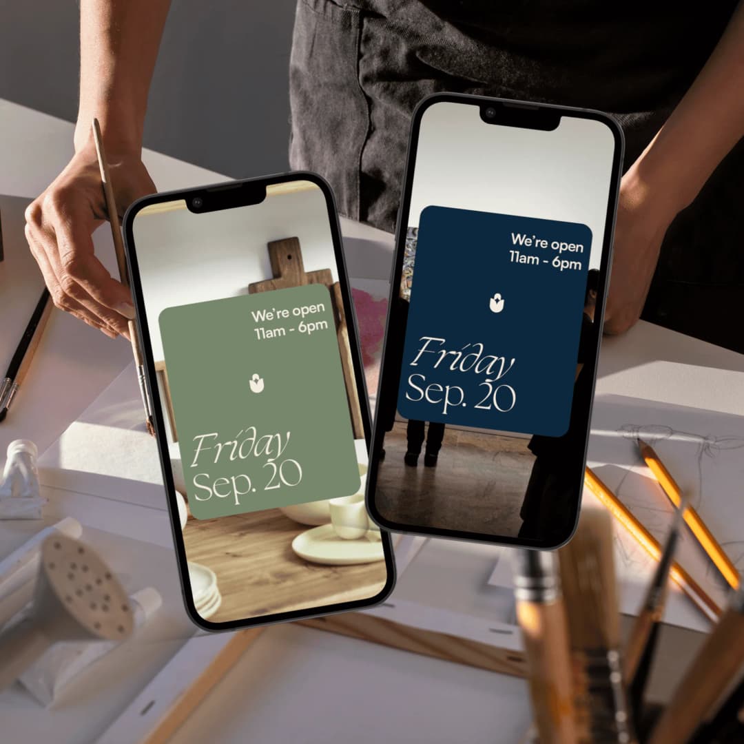
The Shuk is a creative community and arts marketplace in Englewood, New Jersey. The brand needed to work across a physical space, merchandise, print, and digital communications. The mark is a tulip-form symbol with a negative-space star at its center. It works as a standalone mark, an image mask, a repeating pattern, and a dimensional object. The palette is midnight blue, burnt orange, sage, and warm cream. The system extends into stationery, merchandise, signage, social templates, and newsletters. The published scope is identity, guidelines, merchandise, signage, social templates, and newsletter design. The case study says a single visual idea supports a broad family of applications.
Betterness
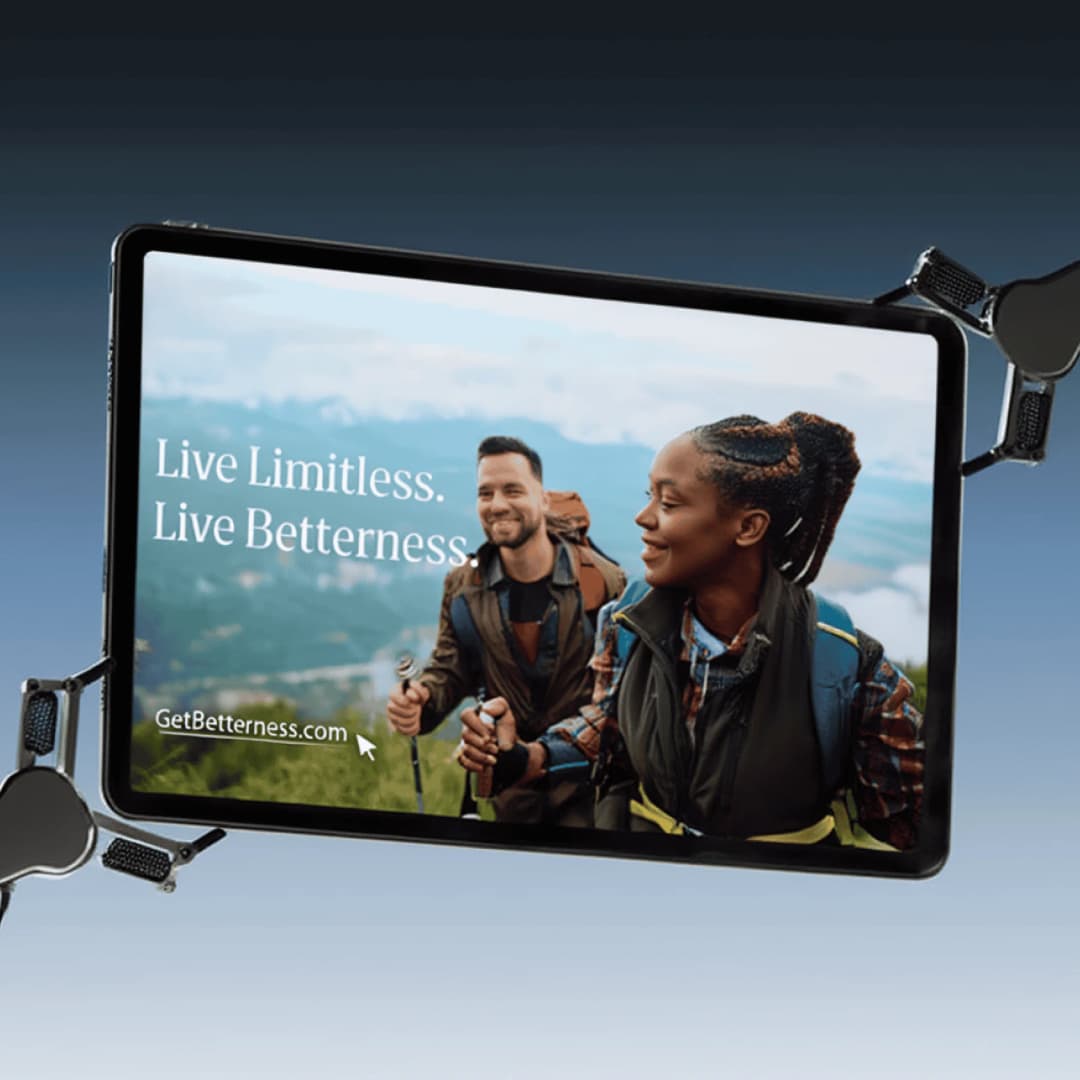
Betterness brings together clinical care, personal growth, education, and community. The brand needed to feel grounded and accessible, without becoming vague or overly clinical. The work was the name Betterness and a visual system built on subtle progression, calm blues and greens, and readable typography. A manifesto, voice principles, taglines, and guidelines connect the words to the design. The published scope is naming, identity, messaging, and guidelines. The case study says the organization has a flexible verbal and visual foundation that brings its different activities into one recognizable identity.
Manhattan Valley Pediatrics
Manhattan Valley Pediatrics wanted an identity with a warm, community-rooted approach. The founders' retro, colorful vision needed a coherent identity with a clear local character. The mark is a continuous color loop through the MVP letterforms, with a child peeking through. Yellow, orange, and pink carry into an illustrated cityscape that places the practice in the neighborhood. The published scope is identity, guidelines, and illustration. The case study says the practice has an identity and illustration system that communicate warmth through specific visual choices.

Pressed Miami
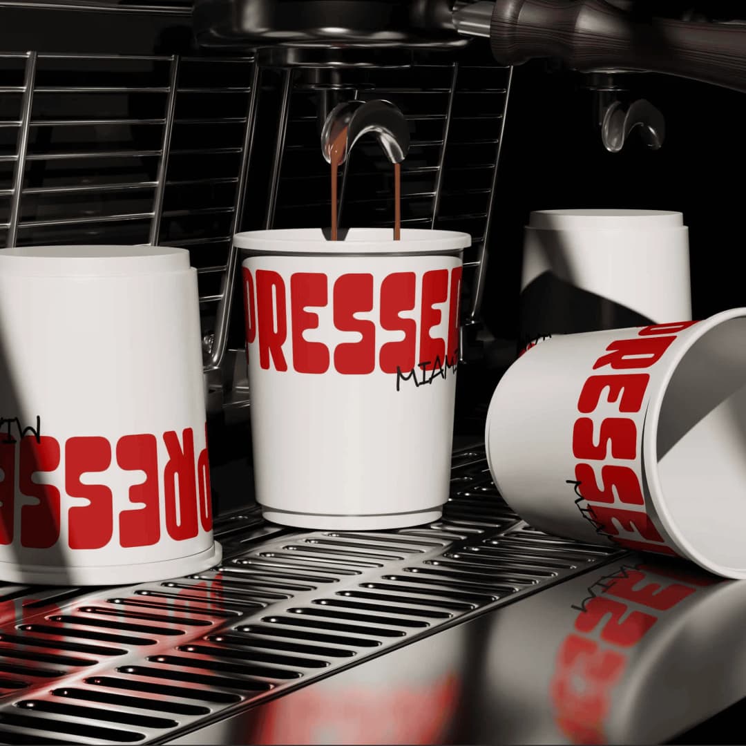
Pressed Miami serves bold food in Miami, Florida. The identity needed enough personality to travel past the storefront and into the packaging customers carry away. The system uses bold red, chunky typography, and an animated sandwich mascot. All-over pillow box packaging makes the identity part of the order, using the surface as a full expression of the brand rather than a small logo placement. The published scope is visual identity, brand guidelines, and packaging. The case study says the shop has a flexible visual language and a distinct character to carry across packaging and other brand materials.
A shorter document for a smaller brand
A founder, a practice, or a shop with one location can use the same logic at a shorter length. Write down the mark and its clear space, two to four colors with exact values, one type pairing, the words you use and the words you avoid, and templates for the formats you actually post. Web design is the next surface, when the site has to use those same rules.
VistaPrint and Wix, in their 2025 Small Business Marketing Guide, surveyed 1,000 consumers in the United States. They reported that 62% sometimes or often struggled to choose between products and services from similar small businesses. A one-page reference does not create the difference. It keeps the difference from changing every time someone else makes a file.
When to bring in a studio
A written one-pager is the right start when one person holds the visual decisions and the brand has a single offer. It gets thin when the same rules have to survive a website, packaging, a second writer, and a vendor who was not in the room. That is the work of an identity engagement. A new company that still needs the position and the identity together can start with startup branding.
Splash Creative is in Englewood, NJ. There is no New York City office. David Herskowitz leads the work. Project work is a fixed scope and a fixed fee, agreed in writing before the work starts. Brand identity is from $15,000. A website is from $15,000. Brand and website together is from $30,000. These are starting points. The proposal sets the fee for the scope.
A focused brand identity takes 4 to 6 weeks. Full brand strategy and identity takes 8 to 12 weeks. The guidelines go out with that delivery, with the working files. When a website is part of the engagement, that phase is timed in the written proposal. How long a brand identity takes is the phase-by-phase version. Pricing is where the starting points are explained. How we work is the sequence: understand the business, put the scope and the fee in writing, agree the direction, then make the work.
Frequently asked questions
Where can I find a brand guidelines template?
Brand guidelines template: what to include and how to build one that sticks walks through the sections. A template is an outline. It still needs your logo rules, color values, type, and voice written in.
What is the difference between a brand style guide and a brand book?
A style guide is the working reference: logo, color, type, voice, and the files. A brand book usually adds the story, the position, and the values around that reference. The test is whether someone can make the next decision from the document.
How long should brand guidelines be?
Long enough to answer the decisions people actually make. The original NASA Graphics Standards Manual was about 90 pages because it covered a federal agency's applications, from stationery to vehicles. The 2015 reissue is 220 pages because it adds essays and related documents around that manual. A smaller company does not need NASA's length. At Splash Creative the guidelines are part of the identity delivery: 4 to 6 weeks for a focused identity, and 8 to 12 weeks for full brand strategy and identity.
Do small businesses need formal brand guidelines?
They need a shared reference for the logo, the colors, the type, and the voice, so the next vendor is not guessing. VistaPrint and Wix reported that 62% of the consumers in their 2025 survey sometimes or often struggled to choose between products and services from similar small businesses. The guideline keeps a chosen difference consistent. The difference itself still has to be true.
How much does Splash Creative charge for brand guidelines?
Guidelines are part of the identity engagement. Brand identity is from $15,000. A website is from $15,000. Brand and website together is from $30,000. The proposal sets the fee for the scope. Project work is a fixed scope and a fixed fee, agreed in writing.
Who should use the public examples on this page?
A designer who wants to see how a specific rule gets written down: Spotify on logo color and minimum size, Netflix on published color values, Mailchimp on voice, NASA on one system across many applications. For a company that needs the system made, the Splash Creative projects above are the comparable work, and brand identity is where that engagement starts.
Have a related question?
Tell us what you're working on. We'll help determine whether there is a useful project to explore.
“Splash delivers powerful brand ID, slick websites and UX, beautiful graphic design, and intelligent software solutions. Great team, great experience, great creative partners.”