Brand GuidelinesLogo + Visual Identity
The context
Manhattan Valley Pediatrics wanted its identity to express a warm, community-rooted approach.

The question
The founders’ retro, colorful vision needed a coherent identity with a clear local character.
The decisions
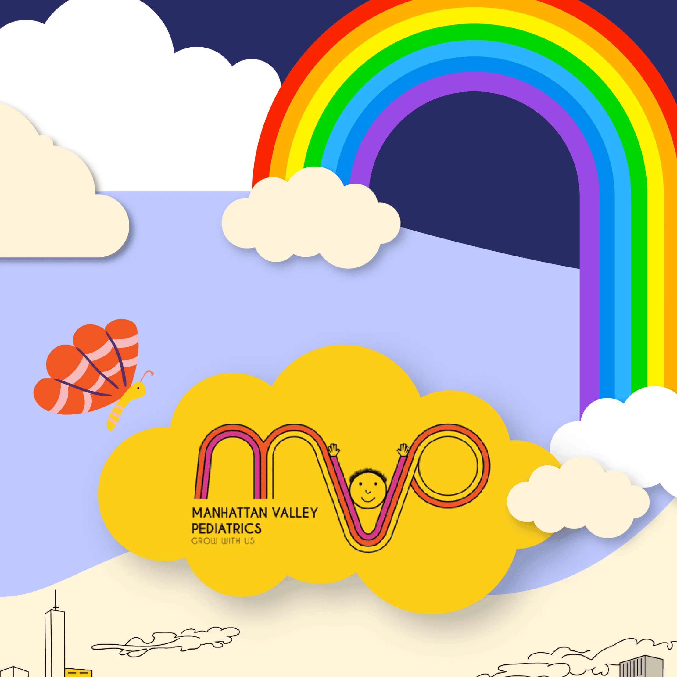
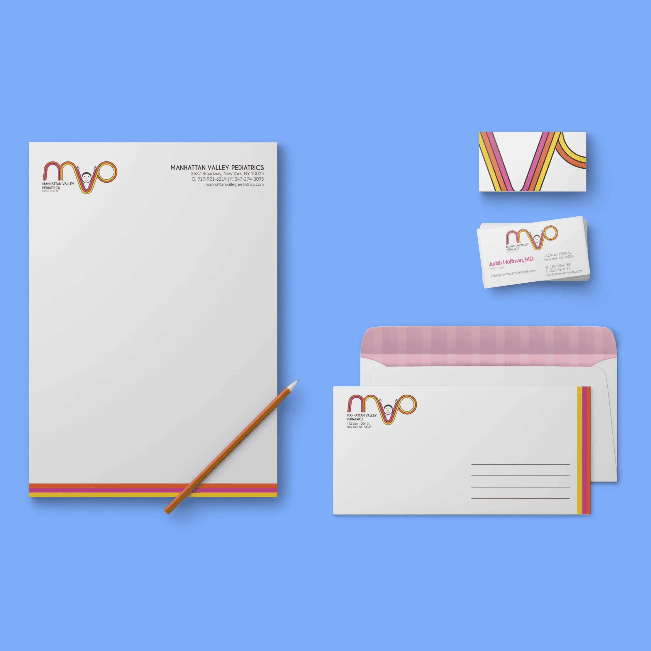
We created a continuous color loop through the MVP letterforms, with a child peeking through. Yellow, orange, and pink carry into an illustrated cityscape that places the practice within neighborhood life.

What changed
The practice has an identity and illustration system that communicate warmth through specific visual choices.