Pricing Page Examples: 8 Layouts That Convert Visitors
By David Herskowitz, Founder and Creative Director
Eight pricing page layouts, from tiered cards to a quote page, and a checklist to use. Splash Creative websites from $15,000.
Key takeaways
- Eight layouts cover most pricing pages: three-tier cards, a single plan, a usage calculator, a feature matrix, a billing toggle, a free-plus-paid split, a quote page, and named service packages.
- Label each plan by buyer, put one action above the fold, and keep the line-by-line comparison under the cards.
- Unbounce's 2024 benchmark puts the median for SaaS landing pages at 3.8%. HockeyStack's December 15, 2025 report puts the average at 3.8% for pricing pages and 5.5% for demo pages. Those are different measures.
- At Splash Creative, brand identity is from $15,000, a website is from $15,000, and brand and website together is from $30,000.
Web design
Your website should reflect how the business works.
We design and build websites that help people understand your offer, find the information that matters, and take a considered next step. Brand, content, user experience, and development inform each other.
Websites from $15,000.
By David Herskowitz, Founder and Creative Director, Splash Creative. November 12, 2026.
A pricing page works when it answers two questions before the visitor scrolls: what this costs, and what they get. Eight layouts cover most cases. Choose the one that matches how your buyers purchase, then apply the checklist below.
The four projects after the layouts are Splash Creative websites: CoverWhale, SwiftHealth, Eurotech, and MetaboliK Health. The case study is the record. This article does not add a result the case study does not state.
Why the layout matters
Visitors who open a pricing page are usually past the question of whether the product exists. They want the cost and the boundary of what it includes. Layout either answers that or buries it.
Articos states that 57% of SaaS visitors check pricing before reading the product description. That page states the figure. It does not name a study behind it, so treat it as the vendor's claim, not as a benchmark you are owed.
The eight layouts fall into three groups: self-serve tiers, usage-based or single-price pages, and quote-led pages for deals that have to be scoped. Pick the group first. Then pick the layout.
Eight layouts
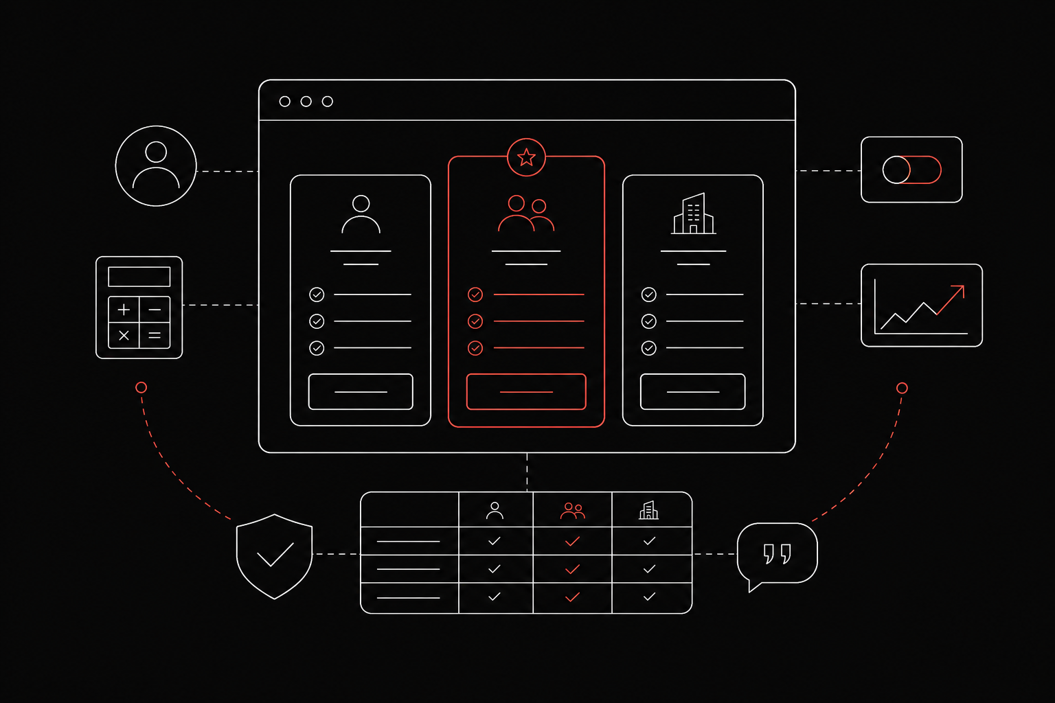
- Three-tier cards with a highlighted middle plan. The usual layout for self-serve products. Teams use the highest price as an anchor so the middle tier sits in a range, and they highlight the plan they want most buyers to choose. Use it when you have distinct buyer types and a clear upgrade path.
- Single-plan page. One price, one list of what is included, one button. Use it when the product has no meaningful tiers and the buyer only needs the cost.
- Usage-based calculator. The visitor moves a slider or enters a number, and the price updates. Use it when cost scales with volume and a flat tier would feel arbitrary.
- Feature-matrix-first. A comparison table leads the page, with plan names across the top. Use it when buyers compare capabilities line by line before they choose.
- Toggle-led cards. A monthly and annual switch sits above the cards and updates every price. Use it when annual billing is the preferred model and the savings should be visible.
- Free-plus-paid split. A free option sits beside the paid plans and is framed as the starting point. Use it when the product spreads through individual users before a team purchase.
- Contact-for-quote page. No public prices. A short explanation of how scoping works, and a form. Use it when every deal differs in scope.
- Good, better, best service packages. Three named packages with defined outcomes rather than software features. Use it when you sell services and want buyers to choose a scope.
A checklist you can apply
Use this order.
- Label each plan by buyer type. Name who it is for, such as a solo buyer, a growing team, or a large organization, so a visitor can choose without reading every line.
- Put one action above the fold. The price, or a plain note on how scoping works, and at least one button, should be visible without scrolling.
- Add a billing toggle when you offer both terms. Show monthly and annual prices so the savings are visible. Skip the toggle if you bill one way only.
- Place a comparison table below the cards. The cards stay short. The table holds the detail for people who want it.
- Put trust signals near the buttons. Logos or a short proof point next to the action address doubt at the moment of decision. Use only names and quotes you have permission to publish.
Keep plan names plain. Starter, Team, and Enterprise tell a visitor more than a clever label does.
What a conversion rate can tell you
Published figures disagree because they measure different pages. Use them as a yardstick for your own testing, not as a target.
Unbounce's 2024 Conversion Benchmark Report puts the median conversion rate for SaaS landing pages at 3.8%. That number is for landing pages in the SaaS category. It is not a pricing-page median.
HockeyStack's report, dated December 15, 2025, uses anonymized data from 80 B2B SaaS companies and more than 31 million visitors. It reports an average conversion rate of 3.8% on pricing pages and 5.5% on demo pages. HockeyStack defines that conversion as a high-intent form submission. In the same report, transparent pricing pages average 2.8% and pages without public prices average 4.6%. The report also says submissions from transparent pricing pages convert to pipeline at 17.50%, compared with 10.31% when the price is not shown. The companies in the set do not all cover the same time window.
Track your own baseline. Change one element at a time, and compare the page with itself.
Phones, button labels, and a quote path
Phones. Wide comparison tables break on a small screen. Stack the plan cards, keep the recommended plan first, and collapse feature detail into rows the visitor can open. This article does not cite a benchmark for mobile pricing tables, so test with your own traffic.
Button labels. Match the words to the plan. A free plan can say "Start free." A paid plan can say "Start trial." A custom plan can say "Talk to sales." This article does not cite a study that compares a free plan with a free trial as the pricing-page button, so choose from how your product is adopted.
Large deals. A complex scope does not fit on a card. Show the self-serve tiers, then add a separate quote path, with a short note on what happens after the form.
Which layout fits
| Your situation | Layout |
|---|---|
| Distinct buyer types, self-serve checkout | Three-tier cards with a highlighted plan |
| One product, one price | Single-plan page |
| Cost scales with volume | Usage-based calculator |
| Buyers compare features line by line | Feature-matrix-first |
| Annual billing is the priority | Toggle-led cards |
| Individuals adopt before teams buy | Free-plus-paid split |
| Every deal is scoped differently | Contact-for-quote page |
| Services with defined scopes | Good, better, best packages |
If two rows fit, combine them. Tiered cards plus a quote path for the top tier covers most mixed models. Web design is how Splash Creative builds the page around that choice. Website design and development is the scope: structure, content, design, and build.
Websites from Splash Creative
The layouts above are patterns. The projects below are websites Splash Creative has designed. Web design and development projects is the archive for that type of work. Our work is the full set. Each note stays inside the case study.
CoverWhale
CoverWhale uses data and technology to help streamline trucking insurance. The case study says the brand and website needed to make that offer understandable to people looking for practical answers.

The question on the case study is how the identity and the site could communicate speed and reliability without adding more language and complexity to the process. The case study says the work makes the offer clear and the next step easy to find. Copy prioritizes what the business does and what a visitor needs to know. Page structure and a restrained hierarchy carry that explanation from the identity into the site. The case study says the result is a clearer introduction and more direct routes into the information visitors need. The published scope is brand identity, copywriting, and website design. The case study does not report a traffic or conversion figure, and this article does not add one.
SwiftHealth
SwiftHealth brings healthcare services into customers' homes and online. The case study says the offer spans several service types, so information structure is part of the design problem.
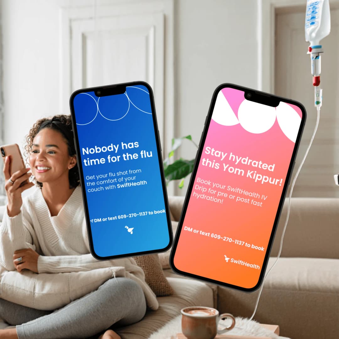
The question on the case study is how visitors could understand the options and find the next step without losing the sense of care and professionalism. The case study says pages organize information around the services and the questions visitors bring. A service menu gives options, descriptions, and booking routes a consistent structure. The visual language balances a clinical feel with an approachable tone. The case study says the brand and website provide a coherent way to explain the offer and navigate its services. The published scope is identity, messaging, copywriting, and website design. The case study does not report a booking figure, and this article does not add one.
Eurotech
Eurotech has designed ergonomic office seating for more than four decades, from task chairs to executive, conference, and specialty seating. The case study says a large catalog is easy to appreciate in a showroom and can look like rows of similar chairs online.
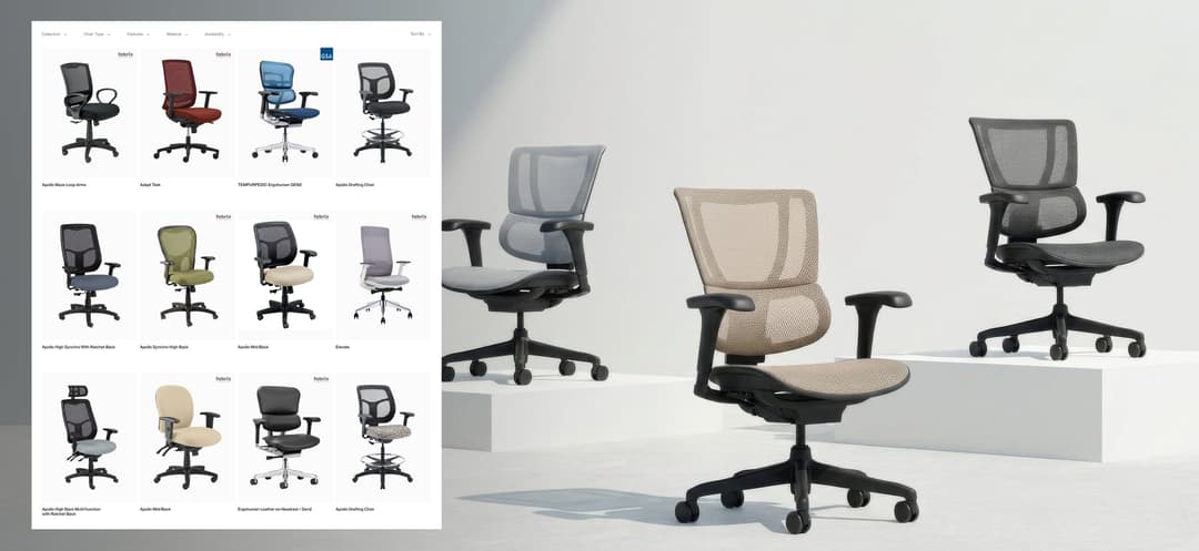
The question on the case study is how a buyer could find the right chair, and see why it is worth the price, without being a furniture expert. The case study says the website is designed around how people shop for seating. Buyers filter by collection, chair type, features, and material, then compare models. Flagship chairs get a features page that shows each adjustment in motion, and a configurator lets buyers build their own. Sales presentations for Eurotech's commercial partners use the same visual language. The case study describes a site that turns a deep catalog into a clear route to the right chair, and sales materials that carry the same story into commercial conversations. The published scope is website design and sales presentations. The case study does not report a sales figure, and this article does not add one.
MetaboliK Health
MetaboliK Health is a medical weight management platform with a subscription-based offer. The case study says the site needed to explain the program while recognizing that visitors must qualify before joining.
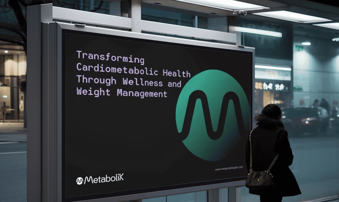
The case study says the identity uses a flowing M mark, a teal and lavender palette, and clear typography. The Shopify experience connects program information and pricing with an eligibility flow. The case study says the identity and site give the offer a consistent presentation and make qualification part of the visitor journey. The published scope is identity, guidelines, and Shopify customization. The case study does not report a signup figure, and this article does not add one.
What the work costs
Splash Creative is a branding and web studio in Englewood, NJ. There is no New York City office. David Herskowitz leads the work, with a consistent senior team from the first conversation through the work that follows.
Project work is a fixed scope and a fixed fee, agreed in writing before the work starts. These are starting points. The proposal sets the fee for the scope.
| Scope | Starting point | Timing |
|---|---|---|
| Brand identity | from $15,000 | A focused identity takes 4 to 6 weeks. Full brand strategy and identity takes 8 to 12 weeks. |
| Website | from $15,000 | Set in the written proposal |
| Brand and website | from $30,000 | The website schedule is set in the written proposal |
| Shopify store | from about $20,000 | Set in the written proposal |
| Ongoing partnership | from $2,500/month | Set in the written agreement |
Pricing is where those starting points are explained. Branding is the wider practice when the position and the site are one engagement. What a website costs is the longer page on why website quotes vary. What a Shopify store costs is the store version. How we work is the sequence: understand the business, put the scope and the fee in writing, agree the direction, then make the work. If you want to talk through a pricing page as part of a site, book a call.
Frequently asked questions
How many pricing plans should a pricing page display?
Three is the usual choice because it gives a range without a long menu. Two works when the product has a simple split. Four or more tends to slow the decision. Name each plan by buyer type so someone can choose without comparing every feature.
Why is the middle tier usually highlighted?
The middle tier is usually the plan a business wants most buyers to choose. A lower plan and a higher plan put it in a range, and the highlight marks it as the default. The highlight is a design choice. It is not a promise that more people will pick it.
What is a good conversion rate for a pricing page?
Unbounce's 2024 Conversion Benchmark Report puts the median conversion rate for SaaS landing pages at 3.8%. That figure is for landing pages, not pricing pages. HockeyStack's report of December 15, 2025, on 80 B2B SaaS companies, reports an average of 3.8% on pricing pages and 5.5% on demo pages. Compare your own baseline with itself after each change.
Should a pricing page offer a free trial or a free plan?
Match the button to how the product is adopted. A free plan fits a product that spreads through individual users. A trial fits a product that needs setup before it shows value. This article does not cite a study that compares the two as pricing-page buttons, so test them with your own visitors.
How do you handle enterprise pricing on a self-serve page?
Show the self-serve tiers, then add a separate quote path for deals that do not fit on a card. A button such as Talk to sales, with a short note on what happens after the form, is enough. Do not force a custom scope into the same card as a checkout plan.
How much does Splash Creative charge for a website?
A website is from $15,000. Brand identity is from $15,000. Brand and website together is from $30,000. A Shopify store is from about $20,000. Ongoing partnerships are from $2,500/month. These are starting points. The proposal sets the fee for the scope. Project work is a fixed scope and a fixed fee, agreed in writing. The same figures are on pricing.
Have a related question?
Tell us what you're working on. We'll help determine whether there is a useful project to explore.
“Splash delivers powerful brand ID, slick websites and UX, beautiful graphic design, and intelligent software solutions. Great team, great experience, great creative partners.”