Tech Website Design: 7 Examples That Convert Visitors
By David Herskowitz, Founder and Creative Director
Seven public tech homepages, what each first screen shows, and four Splash websites. A website is from $15,000. Brand and website together is from $30,000.
Key takeaways
- The seven examples are public homepages: Stripe, Linear, Notion, Vercel, Figma, Slack, and GitHub. Each note stays with what that page showed on November 21, 2026.
- Published studies measure type, theme, and tools. They do not measure conversion. This article does not add a conversion rate for any site.
- At Splash Creative, a website is from $15,000. Brand identity is from $15,000. Brand and website together is from $30,000.
- The four projects are CoverWhale, Luminova Biotech, SwiftHealth, and Alias Intelligence. Each note stays inside that case study.
Web design
Your website should reflect how the business works.
We design and build websites that help people understand your offer, find the information that matters, and take a considered next step. Brand, content, user experience, and development inform each other.
Websites from $15,000.
By David Herskowitz, Founder and Creative Director, Splash Creative. November 21, 2026.
A tech homepage has to answer three questions before it has a look: what the product does, who it is for, and what to do next. The seven sites below are public homepages. Each note stays with what that page showed on November 21, 2026. None of them is a Splash Creative client, and this article does not add a traffic, sign-up, or conversion figure for any of them.
Published counts of headline size, theme, and site tools are in the measurements section, each with its source. Those counts describe what the measured sites do. They do not measure what lifts conversion.
The four projects after the steps are Splash Creative websites for an InsurTech broker, a biotechnology company, a concierge healthcare platform, and an investigative firm. Web design for startups is the companion page on hiring for a launch site.
Seven tech homepages
These seven are a reading list, not a ranking. The first line in the table is the headline or title the page was serving that day.
| Company | Homepage | What a visitor can read first |
|---|---|---|
| Stripe | stripe.com | Financial infrastructure to grow your revenue, with Start now and Contact sales |
| Linear | linear.app | The product development system for teams and agents, with Sign up |
| Notion | notion.com | Where teams and agents think together, with Get Notion free |
| Vercel | vercel.com | Agentic Infrastructure, described as the autonomous stack for every app and agent |
| Figma | figma.com | The full-stack creative canvas, with Get started for free and Contact sales |
| Slack | slack.com | All your people and AI agents working together, with Get started |
| GitHub | github.com | Software still starts with you, with an email sign-up |
Any number in the notes below is one that company prints on its own homepage. This article does not treat those numbers as a benchmark, and it does not treat them as a conversion result.
Stripe
Stripe titles the page "Financial Infrastructure to Grow Your Revenue." The headline on the page is "Financial infrastructure to grow your revenue," followed by a line about accepting payments, business banking, and custom revenue models. The page offers Start now and Contact sales, and Pricing is in the navigation.
Further down, the page prints its own scale figures under "The backbone of global commerce": 135+ currencies and payment methods supported, and $1.9T in payments volume processed in 2025. Those figures are Stripe's. The habit to take is the order. The page says what the product is, offers two different next steps, and puts the company's own proof on the same page.
Linear
Linear titles the page "The system for product development." The line on the page is "The product development system for teams and agents," with "Purpose-built for planning and building products. Designed for the AI era." The navigation includes Product, Customers, Pricing, Contact, and Docs, plus Log in and Sign up. The page also shows a product view, with labels such as Pulse, Inbox, Projects, and issues.
A buyer can see the category, a way to start, and a picture of the product without a second page. This article does not report how many of those visits become accounts.
Notion
Notion opens on "Where teams and agents think together." The line under it is "Capture context, find answers, and automate tasks with AI built for your team." The actions on the page include Get Notion free and Request a demo. The page also says "The most ambitious companies run on Notion," and it prints four of its own figures: G2's number 1 knowledge base for 3 consecutive years, 100M users in over 50 countries, over 50% of YC companies, and 1.4M+ community members.
Those four lines are Notion's, printed on that page. What a smaller product can use is the structure: one sentence about the job, a free start, a demo path, and proof the company is willing to put in public.
Vercel
Vercel titles the page "Agentic Infrastructure." The page description calls it "The autonomous stack for every app and agent." The navigation lists products and tools, including the AI SDK, Next.js, and docs, plus paths for AI apps, web apps, and marketing sites.
The fetched page leads with the category name rather than a long feature list. This note stays with that title, that description, and that navigation. It does not add a claim about sign-ups.
Figma
Figma titles the page "The collaborative canvas for design, code, and AI." The headline is "The full-stack creative canvas." The line under it says to move fast on an AI-native canvas, where teammates and AI agents work in the same space with shared context. The actions include Get started for free and Contact sales. The product menu names Figma Design, FigJam, Dev Mode, Figma Slides, and other tools.
The page answers "what is this?" with the canvas, then offers a free start and a sales path. The product names do the work of a feature list.
Slack
Slack titles the page as an AI work platform. The headline is "All your people and AI agents working together." The line under it is "Slack connects your team. Slackbot multiplies what they can do." The actions include Get started, Find your plan, Request a demo, and Watch demo. The navigation includes Channels, Slack Connect, Canvas, Lists, and Slackbot. It also includes a Slack Marketplace line, "Browse over 2,600 apps."
The first screen names the people and the agent, then gives a start path and a plan path. The 2,600 figure is Slack's, in that navigation.
GitHub
GitHub opens on "Software still starts with you." The page offers an email field, Sign up for GitHub, and Download GitHub Copilot app, and it shows a product walkthrough of Copilot reviewing proposed code changes. The product menu names the repository, Copilot, Actions, Codespaces, and security tools. The page description calls GitHub an AI-powered developer platform.
The headline is about the person using the product. The next step is an account, and the product on display is the coding agent. This article does not add a figure for how often that sign-up is completed.
A start path and a sales path
The seven pages do not share one button. They share a decision about how a visitor is allowed to begin.
| Company | Start without a call | Talk to someone |
|---|---|---|
| Stripe | Start now | Contact sales |
| Linear | Sign up | Contact, in the navigation |
| Notion | Get Notion free | Request a demo |
| Figma | Get started for free | Contact sales |
| Slack | Get started | Request a demo |
| GitHub | Sign up for GitHub | Not used as the hero action on this page |
Vercel is not in that table. The HTML fetched for this article included the title, the description, and the product navigation, and it did not include a hero button label this note can quote. Use a second path only when it is a real route. Stripe, Notion, Figma, and Slack each show both. GitHub's hero is the account.
Web design is the practice of making that path obvious: the site should help someone understand the offer, find the relevant proof, and take a next step. Website design and development is the Splash Creative scope for the build.
What published studies measured
Three public write-ups count design choices on large sets of sites. They are linked here because the figures are theirs. None of them reports a conversion rate, a lift, or a winning A/B test. This article does not add one.
| Source | What was measured | Figures this article uses |
|---|---|---|
| BrowserMoon, November 2026 | 196 SaaS and AI homepages, loaded at 1440 by 900 pixels. 22 of 218 attempted sites were left out. | Median desktop headline 64px. Half of sites fall between 52px and 72px. 75% use negative letter spacing. On a phone-sized screen, the median headline is 40px, and half fall between 32px and 44px. |
| Norrly, updated July 6, 2026 | 358 award-level sites across many categories, not a tech-only set. | 82% use a light theme by default (295 light, 63 dark). Median H1 is 60px where it could be measured (n=286). 85% of headlines measured for tracking use negative letter spacing (n=173). |
| we hate vanilla, fetched September 28, 2026 | 705 reachable homepages from the Y Combinator Winter, Spring, Summer, and Fall 2026 batches. HTML only. JavaScript was not run. | 346 homepages (49.1%) run on Next.js. 22.1% have no social share image. Framer is 40 sites (5.7%). Webflow is 14 sites (2.0%). |
The 64px median and the 82% light theme come from different studies. BrowserMoon's set is SaaS and AI homepages, and its dark share is 36%. Norrly's set is award-level sites in many categories, and its median H1 is 60px, not 64px. Quoting them as one finding mixes two samples.
The Y Combinator count is about tools and page basics, not about which tool converts. Next.js is the most common builder in that report. Framer and Webflow together are 7.7% of those homepages, which is a small share, not most of the rest. Splash Creative's published website work is WordPress and Shopify. The platform for a Splash project is the one named in the proposal. Shopify is the store work.
BrowserMoon also reports that "Get started" is the most common button text in its set, included on 21% of the buttons it measured, and that 30% of buttons mention "free." That is a count of labels. It is not a test of which label produces more qualified sign-ups.
How to build a tech website
Build the page in the order a buyer evaluates it. What it does, how to start, why the claim is believable, and whether the page still works on a phone.
- Name the outcome in the first line. A stranger should be able to repeat what the product does. "Financial infrastructure to grow your revenue" and "Software still starts with you" are headlines from the pages above. "The next-generation platform" is not a headline until it says the outcome. Keep the line short enough to hold at a large size. BrowserMoon's desktop median is 64px, with half of its sites between 52px and 72px, and 75% of those headlines use negative letter spacing. That is a description of the set, not a rule that raises conversion.
- Give the page one primary action. Stripe pairs Start now with Contact sales. Notion pairs Get Notion free with Request a demo. One of those is the primary action. The other is quieter. Word the label as the result of the click, and use the same label in the header and the first screen.
- Put proof next to the action. Stripe prints its own volume figures. Notion prints its own user figures. Linear shows the product. Use proof you can stand behind: a real customer, a real screen, or a figure you already publish. Do not borrow another company's number, and do not invent a quote.
- Pick light or dark for a reason. Norrly's award-level set is mostly light (82%). BrowserMoon's SaaS and AI set is 36% dark. A security tool or a developer product can make dark feel native. A text-heavy page for a non-technical buyer usually reads more easily in light. Check contrast on body text, buttons, and forms either way.
- Check the phone and the share card. BrowserMoon's phone pass on the same 196 sites reports a median headline of 40px, with half between 32px and 44px. Read your own headline and button on a phone before launch. The Y Combinator report found that 22.1% of those homepages have no social share image, so a pasted link has no preview. Set a share image, a title, and a description.
After launch, compare the page with its own baseline: visits that reach the primary action, and whether those people were the buyers you wanted. A shorter headline or a clearer label is a change you can check. This article does not publish a conversion rate for that change.
Startup branding is the page for a company that still needs the name, the position, and the launch site in one scope. Branding is the wider practice. Brand identity is the identity engagement on its own.
Websites from Splash Creative
The steps above are a way to read a tech homepage. The projects below are websites Splash Creative has designed. Web design and development projects is the archive. Custom site design is the service tag. Our work is the full set. Each note stays inside the case study. None of these pages states a traffic or sales figure, and this article does not add one.
CoverWhale
CoverWhale is an InsurTech broker that uses data and technology to streamline trucking insurance. The case study says the company needed a brand and a website that could communicate speed and reliability to an audience with no patience for friction, and that every touchpoint had to feel clear and credible from the first second.

The case study says the brand and the website were built around one idea: make it fast, make it clear. It says the identity projects confidence and precision, and that the site moves people to what they need, without jargon or extra steps. Copy and design are described as working together to earn trust quickly. The published services are copywriting, custom site design, and logo and visual identity. The case study does not report a traffic or conversion figure, and this article does not add one.
Luminova Biotech
Luminova Biotech is a biotechnology company in New York. The case study says it develops solutions in agriculture, anti-aging, and longevity, including NSF-funded technology that harnesses light to enhance plant growth and mitochondrial function. It says the existing materials struggled to translate that research for investors and partners, and that the brand, the deck, and the website needed to work together.
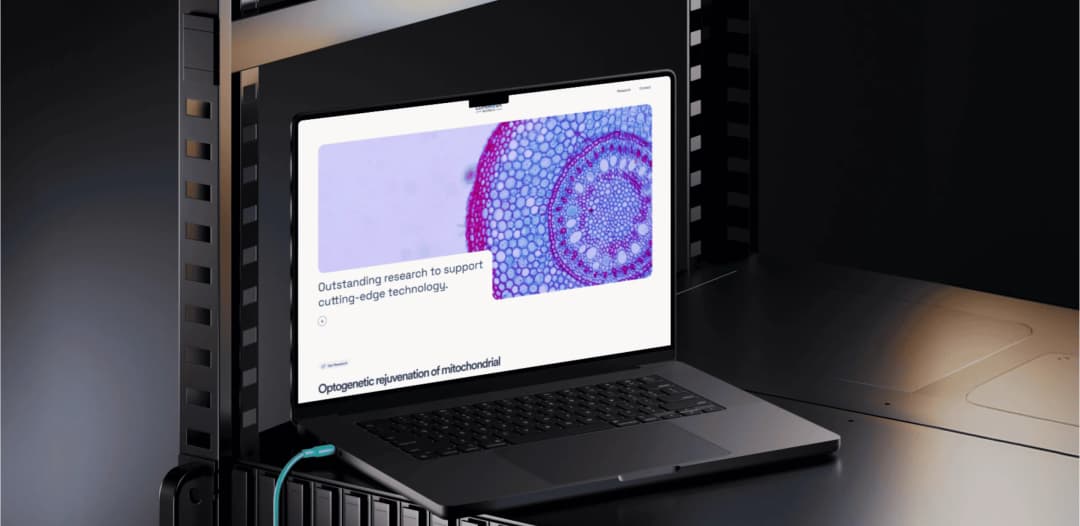
The case study says the identity is clean, precise, and confident. It says the investor deck was rebuilt with a system for charts, graphics, and data so the research reads as a narrative. It says the website brings the identity and the story into one place. The published services are custom site design, logo and visual identity, and presentations and pitch decks. The case study does not report a fundraising figure, and this article does not add one.
SwiftHealth
SwiftHealth is a concierge healthcare platform. The case study describes mobile IV therapy, in-home medical care, telehealth visits, at-home blood draws, and GLP-1 programs, delivered across New Jersey and New York City. It says people have to understand the offer and trust it enough to book, and that the audience includes several kinds of patients who need the page to feel specific.
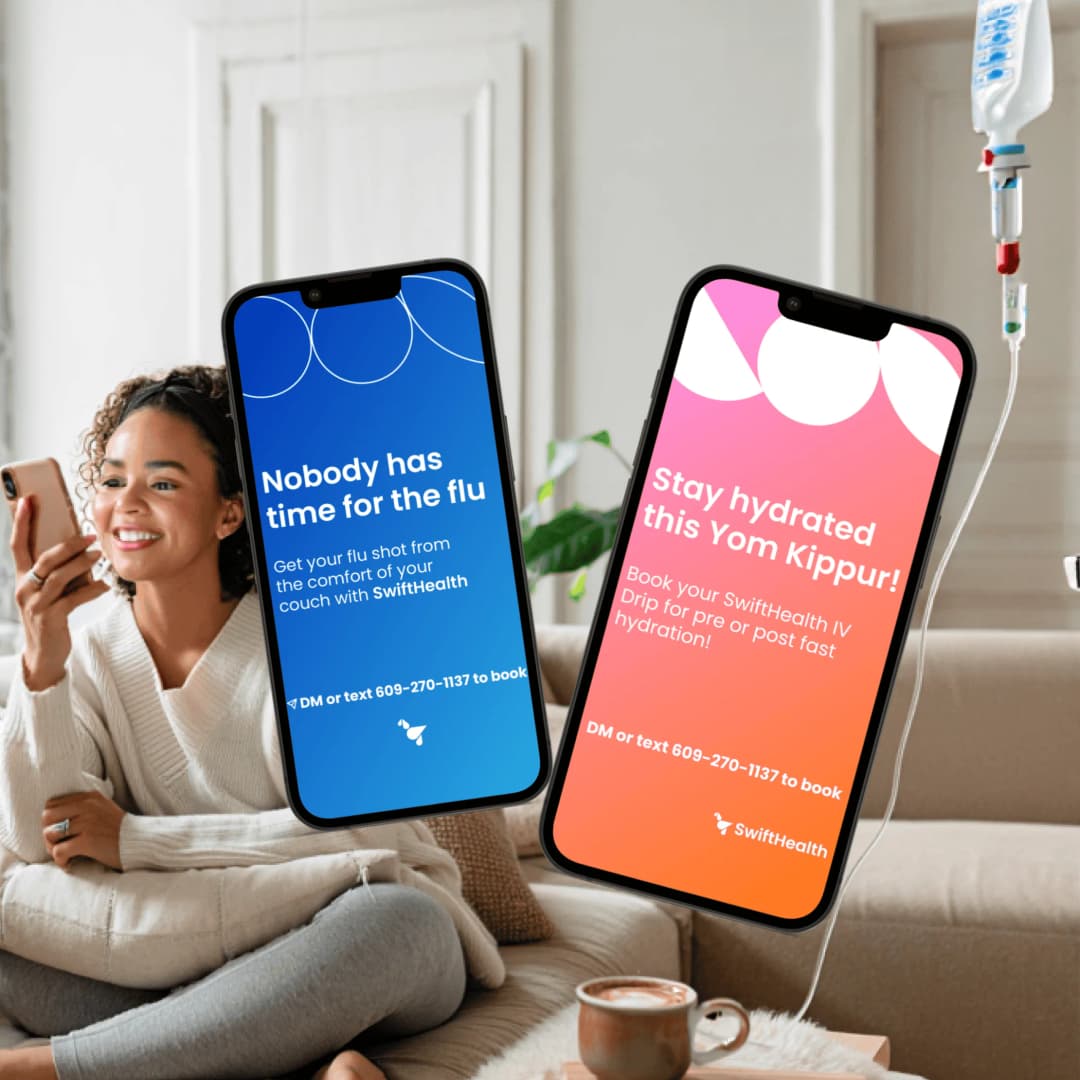
The case study says the site is organized around how people think: by symptom, by service, and by how much time they have. It says the IV menu is treated as a catalog, with each drip named, described, and priced so a visitor can choose. It says the booking flow is part of that path. The published services include custom site design, landing pages, mobile-first design, and copywriting. The case study does not report a booking figure, and this article does not add one.
Alias Intelligence
Alias Intelligence delivers due diligence, background screening, and investigative services for clients in high-stakes settings. The case study says the previous website used abstract visuals and generic language, so it did not clearly explain the work, how the services operate, or what sets the firm apart. It says visitors had to work too hard to understand the value.
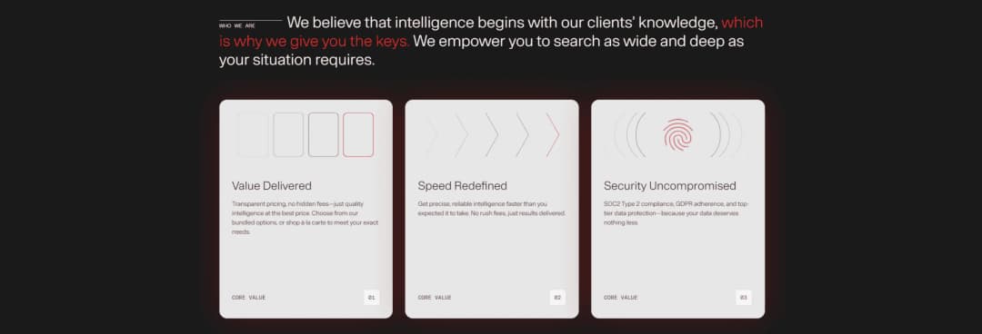
The case study says the site was rebuilt around clarity. Content was rewritten to put real benefits ahead of buzzwords, and the structure follows how clients evaluate investigative services. It describes a clear hierarchy, a restrained design, and trust signals early on the page. The published service is custom site design. The case study does not report an inquiry figure, and this article does not add one.
What the work costs
Splash Creative is a branding and web design agency at 34 S Dean St, Suite 206, Englewood, NJ 07631. There is no New York City office. David Herskowitz leads the work, with a consistent senior team from the first conversation through the work that follows. The studio serves New York City and Northern New Jersey, and remote clients in the US and worldwide.
Project work is a fixed scope and a fixed fee, agreed in writing before the work starts. These are starting points. The proposal sets the fee for the scope.
| Scope | Starting point | Timing |
|---|---|---|
| Website | from $15,000 | Set in the written proposal |
| Brand identity | from $15,000 | A focused identity takes 4 to 6 weeks. Full brand strategy and identity takes 8 to 12 weeks. |
| Brand and website | from $30,000 | The website schedule is set in the written proposal |
| Shopify store | from about $20,000 | Set in the written proposal |
| Ongoing partnership | from $2,500/month | Set in the written agreement |
Pricing is where those starting points are explained. What a website costs is the longer page on why website quotes vary. Brand identity is the identity engagement on its own. Branding is the wider practice when the position and the site are one scope. How we work is the sequence: understand the business, put the scope and the fee in writing, agree the direction, then make the work.
A tech marketing site uses the website floor, from $15,000. Brand and website together, from $30,000, is the scope when the identity is not finished and the website is how people will meet the company. If you want to talk through a build, book a call and tell us what you are working on.
Frequently asked questions
What do these tech homepages have in common?
On November 21, 2026, Stripe, Linear, Notion, Figma, Slack, and GitHub each opened with a line about the product, plus a way to start or a way to talk. Vercel's public title is Agentic Infrastructure. The notes in this article stay with those pages. They are not a ranking, and they are not a conversion study.
Do large headlines and a light theme raise conversion?
No study linked here measures that. BrowserMoon measured type on 196 SaaS and AI homepages. Norrly measured theme and type on 358 award-level sites. we hate vanilla counted tools and share images on 705 Y Combinator 2026 homepages. Use those counts as a description of what those sites do, then test your own page against your own traffic.
Should a tech website be light or dark?
Norrly reports that 295 of 358 award-level sites (82%) use a light theme by default. BrowserMoon, on a different set of 196 SaaS and AI homepages, reports that 36% are dark. Pick the theme a reader can use, and check contrast on text, buttons, and forms. Neither figure is a conversion rate.
What should the button say?
Match the label to the step. The pages in this article use labels such as Start now, Sign up, Get Notion free, Get started for free, and Get started. BrowserMoon reports that Get started is the most common button text in its 196-site set (21% of buttons include it). That is a count of wording, not a test of which phrase wins.
How much does Splash Creative charge for a tech website?
A website is from $15,000. Brand identity is from $15,000. Brand and website together is from $30,000. A Shopify store is from about $20,000. Ongoing partnerships are from $2,500/month. These are starting points. The proposal sets the fee for the scope. Project work is a fixed scope and a fixed fee, agreed in writing. The same figures are on pricing.
When should a startup hire a web design studio?
Hire when the site has to explain a product that is still being named, and the team cannot do the design and the build in the same scope. Web design is that practice, from $15,000. Website design and development is the engagement. If the identity is also open, brand and website together is from $30,000. Startup branding is the page for a company at a launch or a raise.
Have a related question?
Tell us what you're working on. We'll help determine whether there is a useful project to explore.
“Splash delivers powerful brand ID, slick websites and UX, beautiful graphic design, and intelligent software solutions. Great team, great experience, great creative partners.”