Fashion Logo Maker: Design One That Sells Your Brand
By David Herskowitz, Founder and Creative Director
How to design a fashion logo that still reads on a woven label, a garment, and a screen. What Splash Creative actually made for fashion, jewelry, and consumer brands, and what a brand identity costs.
Key takeaways
- A fashion logo has to read at the size of a woven label, on a garment, and on a screen. Design at that size, not only on a large artboard.
- Pick the category first. A mark that suits streetwear will fight a bridal or luxury label, and the reverse is also true.
- A shared symbol (a hanger, a needle, a crown) is a starting point, not a trademark strategy. Search the USPTO database before you commit, and get legal advice before you file.
- Splash Creative's related work on this page is Bettertap, Isaac Mizrahi New York, Huug, and LoveLab. Only Bettertap is an identity and logo project. The others are campaign or commerce work for fashion and consumer brands.
- Brand identity at Splash Creative is from $15,000. A website is from $15,000. Brand and website together is from $30,000. A logo file by itself is not a separate published price.
Branding
A brand should make the business easier to understand.
We help businesses work out what they stand for and give that thinking a recognizable form. Positioning, identity, language, and application are developed as one connected system.
Brand identity from $15,000.
By David Herskowitz, Founder and Creative Director, Splash Creative. Updated November 3, 2026.
A fashion logo has one job before it has a style: it has to be recognized on a woven label, a garment, a hang tag, and a screen, including at a size where fine detail disappears. The steps below are the decisions that make that possible. They are category, format, a mark you can actually own, type that survives production, a short color list, and the files a factory can use.
The project pictures are real Splash Creative work. One of them is a logo and identity for a consumer product. The others are campaign or commerce work for fashion and jewelry brands. They are labeled that way on purpose. A case study is not a logo just because the brand is in fashion.
What the logo has to survive
In clothing, the logo is a production object. It is embroidered, woven, stamped, printed on a tag, and posted as a square. Those surfaces punish thin lines, tight letterspacing, gradients, and any mark that only works in full color on a white screen.
Decide the following before you open a file:
- The smallest size it must remain legible. A one-inch label is a fair test for most apparel.
- The materials: embroidery, a woven label, a screen print, a foil stamp, a digital avatar.
- Whether it has to work in one color. If it falls apart in black only, color is hiding a weak mark.
- The name. A logo cannot rescue a name people cannot say or spell.
Those constraints are the brief. Taste comes after them. Brand identity is the larger job this logo sits inside: the mark, the type, the color, and the rules for using them. Branding is that system plus the position it comes from.
Start with the category, then the format
Fashion is not one look. The mark that helps a streetwear label will work against a bridal house, and a luxury wordmark will look lost on a performance tight. Name the category in the customer's language before you pick a style.
- Streetwear. A heavy wordmark or a patch-like symbol, built to read on a chest or a cap.
- Luxury and contemporary. Usually type, often a serif or a quiet sans, with very little else. Monograms are common because the name is already known, or is meant to become known as initials.
- Labels that lead with materials or ethics. The risk is a leaf, a hand, or a yarn ball that every other label in the aisle already uses. If the values are real, the mark still has to be specific.
- Activewear. It has to work small, on a moving body, often embroidered. Geometry and a short name do that better than a detailed illustration.
Then pick a format:
- Wordmark. The name, in lettering that belongs to the brand. Best when the name is the asset you need people to remember.
- Symbol. A mark with no words. Useful once the name is already known, and on buttons, embroidery, and avatars.
- Both, locked up. The usual right answer for a new brand. Use the full lockup where there is room. Use the symbol only where the name would not fit, and only after the name has had a chance to be learned.
Do not pick the format from a template gallery. Pick it from where the mark has to live in the first season.
Symbols, and the problem with the obvious ones
Hangers, needles, scissors, crowns, and dress silhouettes show up constantly because they say "clothing" in a second. They also look like each other. A mark that only says the category is a weak name for a brand.
Push the symbol until it could not be swapped onto another label. Combine it with the lettering. Abstract it until the story is yours and the picture is not a clip-art object. Then search. The U.S. Patent and Trademark Office keeps a public trademark database. International Class 25 covers clothing. A search is a practical check for collisions. It is not a clearance opinion, and this article is not legal advice. If you are going to file, talk to a trademark lawyer before you spend the season building on the mark.
A generator will hand you a hanger faster than this process will. It is drawing from the same pool of familiar shapes as every other person using it. Speed is the feature. Distinctiveness is the thing you give up.
Type that still reads on a label
Sans serif type is the safer default on a small woven label, because the strokes stay even and the counters stay open. A serif can be the right choice for a luxury or heritage name, and it fails when the thin strokes drop out in embroidery or ink. Test the actual letters at label size. Print them. If you can, embroider a sample. What looks elegant at display size and muddy at an inch is not a fashion logo yet. It is a headline.
Custom lettering, even a modest change to a typeface you have licensed for modification, is what keeps the name from looking like the same free font on the next brand over. A license matters. "Free for personal use" is not a license to print a clothing line. Read it, or pick a face you can use commercially and alter if the license allows.
The type decision is a production decision. It is also the identity. Packaging and print is where a lot of apparel brands find this out, on the label, the bag, and the hang tag, not in a deck.
Color, kept short on purpose
Every extra color is another screen, another thread, or another registration problem. Build the mark so it works in one color first. Then add a second color only if the mark needs it. Black and white will cover more grounds, more fabrics, and more seasons than a palette that only works on the moodboard.
Specify production colors, not a screenshot. Pantone, or the thread and ink your factory actually runs, is how the mark stays the same across a cutter in one country and a website in another. Check the color on the real stock. Kraft, nylon, and a coated hang tag will not match your monitor.
Files a factory can use
Export the logo as files, not as a single pretty picture.
- A vector master (AI, EPS, or SVG) in full color, and a one-color version for embroidery and foil.
- A PNG with a transparent background for the site, social, and email.
- A PDF for vendors who will not take a native design file.
Keep the versions in one folder, named by format and color. The test is whether someone else on the team can find the one-color vector the night before a production deadline. A fashion logo PNG is the digital file. It is not a substitute for the vector.
What a fashion logo costs
A generator is cheap because it is not an identity. A freelancer can draw a mark. Neither of those is a published Splash Creative price, and this page does not invent a market average for them.
Splash Creative publishes three starting points. Brand identity, which is the logo, the color, the type, and the guidelines, is from $15,000. A website is from $15,000. Brand strategy, identity, and a website together are from $30,000. There is no separate published price for a logo file on its own. The fee for a project is the one in the written proposal. Splash Creative agrees a fixed scope and a fixed fee before design starts. The same figures are on pricing.
That identity scope is the right comparison when the mark has to hold up on a label, a site, and a season of content, and when the position should be decided before the drawing starts. It is the wrong comparison when you need a temporary lockup for a side project this week. Say which one you are buying.
David Herskowitz, Founder and Creative Director, leads the work. The studio is at 34 S Dean St, Suite 206, Englewood, NJ 07631. There is no New York City office. Splash Creative serves New York City and North Jersey.
Work for fashion and consumer brands
These are published Splash Creative projects. Only one of them is a logo and visual identity. The others are campaign or commerce work, and they are labeled that way.
Bettertap
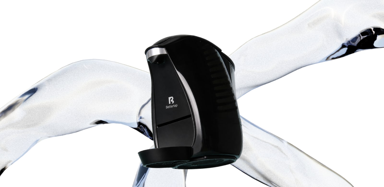
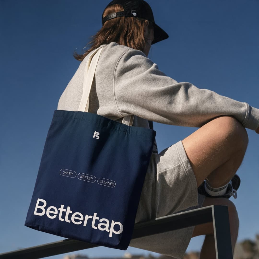
Bettertap is a countertop water system. The project is a logo, color, type, guidelines, a Shopify site, and social templates. The machine in the picture at the top carries the mark. It is the closest example on this page of a logo that had to live on a physical product, not only in a feed. It is not a clothing brand.
Isaac Mizrahi New York
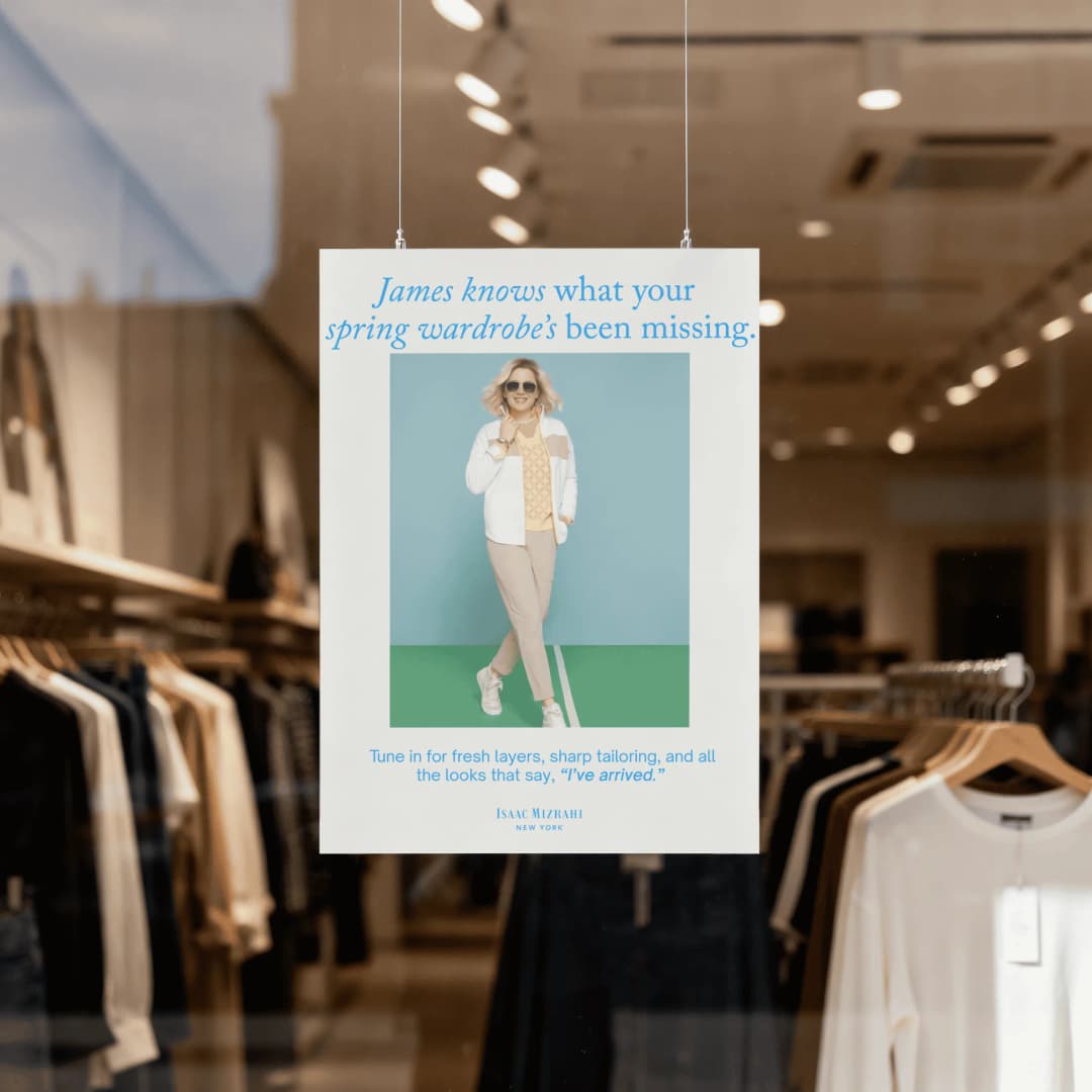
Isaac Mizrahi New York is fashion. The Splash Creative project is campaign advertising and copy, including frames for a live QVC event. It shows how an existing fashion name looks in the work. It is not a logo design project, and this article does not claim one.
Huug
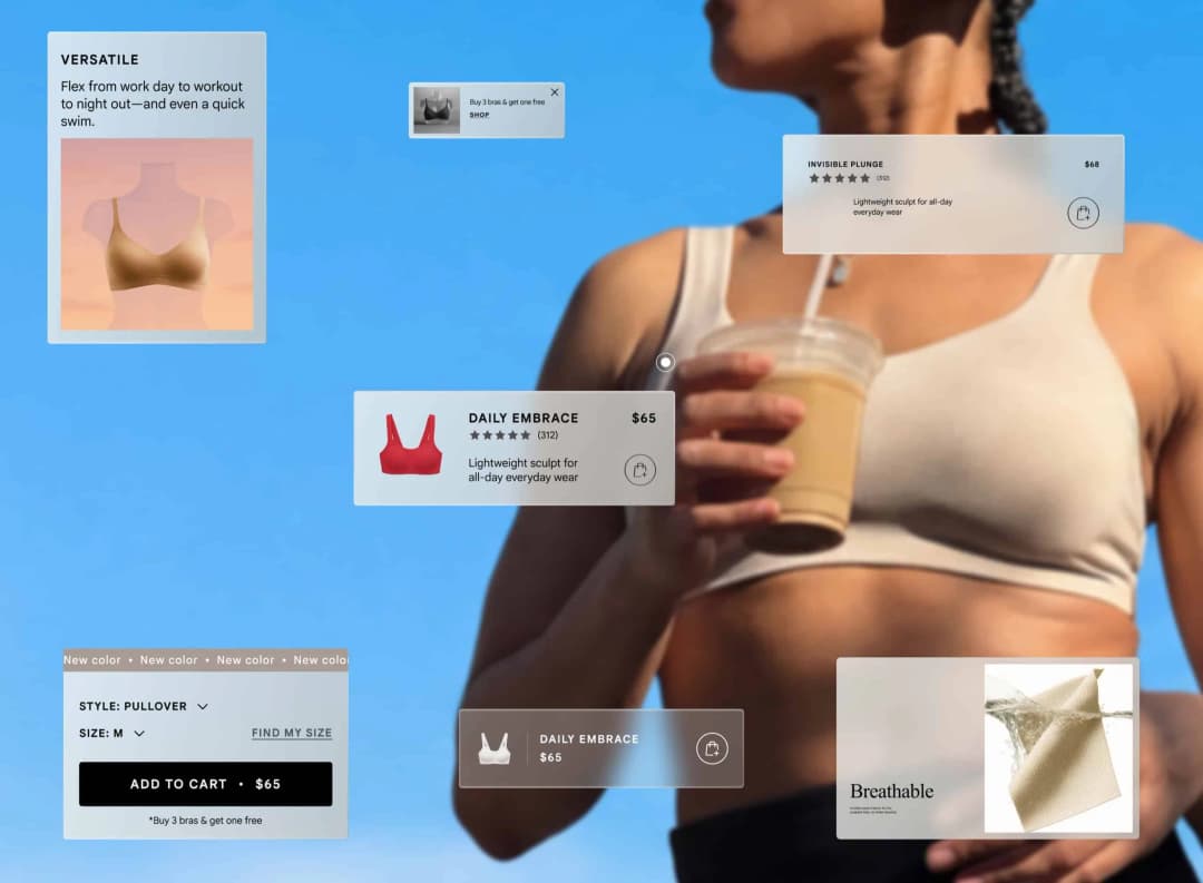
Huug is an intimates brand. The project is Shopify, Klaviyo email, and copy. It is commerce and language for a clothing brand, not a new identity system.
LoveLab
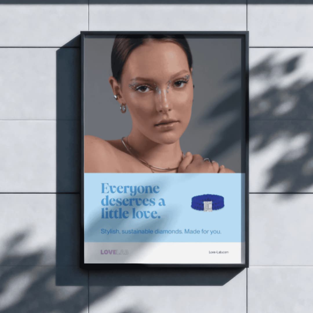
LoveLab is a lab-grown diamond jewelry brand. The project is a launch campaign: ads and copy. Jewelry shares the problem of a small mark on a physical object, and of a campaign that has to feel like the product. The case study is the campaign, not a logo system.
If the job is the identity itself, start with brand identity. If the job is the identity and the site the collection will sell on, start with branding and web design. Print the mark small, check it in one color, and search the trademark database before you refine it any further.
Frequently asked questions
How do I make a logo that works on a small woven label?
Draw it at the size it will be printed, about an inch wide, before you fall in love with it on a large screen. Use simple letterforms, keep the strokes heavy enough to embroider, and skip gradients and hairline serifs. If it fails at label size, it is not done.
What is a fashion logo PNG, and when do I need one?
A PNG is a pixel file. Use it for a site, a social avatar, or an email. Manufacturers, embroiderers, and printers need a vector file (SVG, AI, or EPS) that can scale. Export both, plus a one-color version, and keep them in one folder.
Can I trademark a logo from a generator?
You can apply. A generator does not make the mark yours, and a mark that looks like one already on the register can be refused. Search the USPTO trademark database first. Filing is a legal step. This article is not legal advice.
Where should I look for fashion logo references without copying them?
Look at registered marks in the USPTO database, International Class 25 for clothing, and at brands actually selling in your category. Use them to see the conventions, then leave the conventions. A design gallery is a poor source, because the same examples circulate.
What is the difference between a wordmark and a symbol for a clothing brand?
A wordmark is the name in its own lettering. A symbol is a mark with no name. A new brand usually needs both, locked up together, because the name still has to be learned. The symbol can stand alone later, on a button or a label, once people know it.
Have a related question?
Tell us what you're working on. We'll help determine whether there is a useful project to explore.
“Splash delivers powerful brand ID, slick websites and UX, beautiful graphic design, and intelligent software solutions. Great team, great experience, great creative partners.”