
Wise Family Pastures: Packaging and Photography That Finally Match the Product
Wise Family Pastures is a kosher organic meat and poultry brand founded in 1992 with a loyal following and decades of reputation. The packaging and photography weren’t keeping up with the quality of the product inside. Splash Creative redesigned both.

Wise Family Pastures has been delivering pasture-raised, organic kosher meat and poultry since 1992. The brand has a loyal following, a genuine commitment to quality, and a decades-long reputation built on the product itself. What it didn’t have was packaging and photography that matched.
In retail, shelf presence is everything. A product that looks generic gets treated as generic, regardless of what’s inside. Wise Family Pastures had the story and the standards. The visual identity wasn’t telling either.
The Work: Packaging Redesign and Product Photography
Splash Creative redesigned the packaging across every SKU, bringing warmth, clarity, and a premium feel that communicates quality and trust at a glance. The new packaging positions Wise Family Pastures where it belongs: among the premium, values-driven food brands that consumers who care about what’s in their food actively seek out.
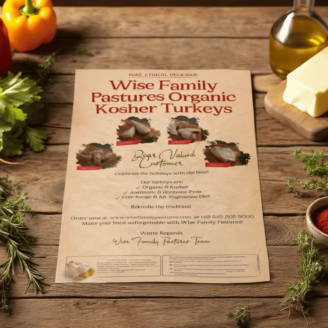
The photoshoot gave the brand a visual library of product and lifestyle imagery that finally reflects the care and craft behind the product. Real food, real quality, presented in a way that earns its price point on the shelf and online.
Together, the work brings the brand’s external presentation in line with the internal reality, and gives Wise Family Pastures the visual foundation to grow into new retail channels and new audiences.
FAQ
Does Splash Creative handle packaging design and food photography?
Yes, packaging design and creative direction for product photography are both part of our scope. For food and CPG brands, packaging is often the highest-impact brand touchpoint. It’s what makes the decision at the shelf or in the online cart. We approach packaging the same way we approach all brand work: strategy first, then design that earns its place in context.
If your packaging isn’t reflecting the quality of your product, let’s talk.