8 Hotel Logo Approaches That Build Guest Trust
By David Herskowitz, Founder and Creative Director
Eight hotel logo approaches, from wordmarks to script marks, and four Splash Creative identity systems. Brand identity from $15,000.
By David Herskowitz, Founder and Creative Director, Splash Creative. November 5, 2026.
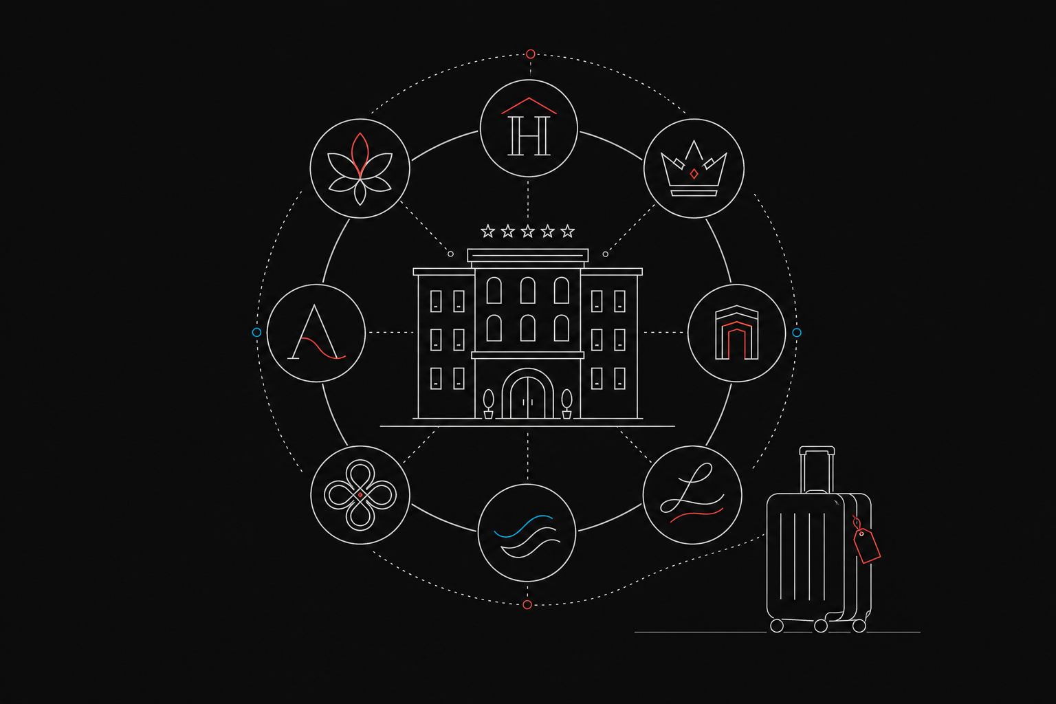
A guest often sees the hotel logo before the hotel: as a thumbnail on a booking site, or as a mark on a sign. The eight approaches below are ways of building that mark. They are approaches, not eight named hotel logos. Each note says what the approach is for and where it fails when it gets small.
The four projects after the approaches are Splash Creative identity systems: The Shuk, Betterness, Manhattan Valley Pediatrics, and Pressed Miami. None of them is a hotel. Each one is a mark that had to hold up on more than one surface. The case study is the record. This article does not add a result the case study does not state.
Eight approaches
| Approach | Best for | What it signals | Where it fails |
|---|---|---|---|
| Serif wordmark | A property whose name can carry the brand | Tradition and stability | Hairline strokes vanish on a phone |
| Sans-serif wordmark | Properties that show up mostly on booking screens | Clarity | A plain geometric face can look generic |
| Spaced capitals wordmark | Premium properties that want restraint | Discretion | It needs size. Tight spacing looks busy |
| Single-letter monogram | A short initial that can stand alone | A compact, ownable mark | A plain letter can look like anyone's |
| Interlocking monogram | Two or three initials | Craft | Overlap turns into a smudge when small |
| Crest emblem | Historic or resort properties | Permanence | Fine detail disappears at thumbnail size |
| Badge emblem | Keycards, towels, and signs | A compact stamp | The name inside can become too small to read |
| Script mark | A welcoming, broad-appeal property | Warmth | Thin strokes blur in a thumbnail |
A symbol taken from the setting (a coastline, a plant, a doorway) or a hand-drawn line can sit inside any of these. It is a way of drawing the mark, not a ninth approach. If the symbol needs a caption to be understood, it is an illustration, not a logo.
Wordmarks
A wordmark puts the name in type and skips the symbol. It works when the name is distinctive enough to carry the brand. The letterforms do the work, so the weight, the spacing, and the smallest size you will use all have to be decided on purpose.
1. The serif wordmark
Classic serif letterforms read as established. That suits a city hotel that wants to look settled. Keep the weight medium. Hairline strokes disappear on a phone screen and on a sign seen from across the street.
2. The sans-serif wordmark
A geometric sans-serif reads as clear and current, and it scales well, which helps a property that appears mostly as a listing thumbnail. The risk is blandness. Spacing and proportion are what keep it from looking like a default font.
3. The spaced capitals wordmark
Wide letter-spacing in all capitals reads as restrained. Tight spacing feels busy. Generous spacing feels confident, and it needs a larger size to stay readable. If the name is long, this approach is usually the wrong one.
Monograms
A monogram uses the hotel's initials as the mark. It can sit alone on an app icon, a keycard, or a social avatar, with the full name set beside it when there is room. It fails when the letters could belong to any other property.
4. The single-letter monogram
One initial, drawn with care, holds up at small sizes because there is little to lose. Its weakness is distinctiveness. A plain letter can look like any other initial. The drawing of that letter has to be specific to the property, or the monogram is just a letter.
5. The interlocking monogram
Two or three initials joined together suggest craft. Done well, the join looks considered. Done poorly, the overlap becomes a blot at thumbnail size. Draw the small version first. If the join only works when the mark is large, it is not finished.
Emblems and a script mark
An emblem places the name inside a crest, seal, or badge. A script mark sets the name, or a single letter, in a written form. Both can feel specific. Both lose that specificity when the detail is finer than the size it will be seen at.
6. The crest emblem
Shields, laurels, and heraldic detail signal history. That suits a grand or historic property, or a resort that wants to feel permanent. A detailed crest needs a simpler version for thumbnails and app icons, or the fine lines disappear and the crest becomes a gray spot.
7. The badge emblem
A circle or a rectangle with the name inside is a stamp. It works on keycards, towels, and signs because the shape is compact. The name inside is the part that fails: if it is not readable at thumbnail size, the badge is a shape with an unreadable caption. Test it at that size before you commit.
8. The script mark
A script, or a friendly lowercase wordmark, reads as welcoming. It fits a property aimed at a broad audience more than one aimed at discretion. Thin strokes are the failure. At thumbnail size the silhouette of the letter has to carry the mark, because the thin parts of the script will not.
Color and type
Color and type should match the feeling you want a guest to have before they arrive. They also have to survive in one color, on a photograph, and at the size of a listing thumbnail.
Luxury properties tend to use deep navy, black, charcoal, and muted gold, with type that looks considered at large sizes. Mass-market properties tend to use brighter greens, oranges, and reds, with rounder, friendlier type. Blue is a familiar choice because people already connect it with reliability. That familiarity is also the risk: a blue logo can sit next to other blue logos and disappear. Color psychology in branding is the longer pass at matching color to a position.
Type has to be read first. A thin, high-contrast serif can look elegant on a sign and break up on a phone. A heavy display face can feel friendly and cheap at a luxury price. Pick the face that stays clear at the smallest size you will use. If beauty and legibility conflict, legibility wins. Visual identity system: the 7 elements every brand needs covers the rest of the system the type has to agree with.
A thumbnail and a sign
A hotel logo has to work at both extremes: a small listing thumbnail and a large exterior sign. Run this check before you approve a design.
- Small-size test. Shrink the logo to roughly the size of a phone thumbnail. If the name or the mark is no longer readable, simplify it.
- One-color test. Convert the logo to a single flat color. If it loses its shape, the design depends on color or a gradient.
- Light and dark test. Place it on white, on black, and on a mid-tone photo. Make a reversed version if the main one fails.
- Listing crop. Booking platforms crop images differently. Place the logo inside each crop you actually use and confirm nothing important is cut off.
- App icon. Put the mark in a rounded square at home-screen size. If it needs more than one simple shape or letter to be recognized, it will not work as an icon.
- Sign distance. View it at sign proportions from across a room. Thin strokes and tight spacing fail first.
How to decide
Start with what you want a guest to feel, then pick the approach that can carry that feeling at the smallest size.
- Name three feelings. Calm, welcomed, impressed, at home. Every later choice gets checked against that list.
- Pick the approach. A long name usually calls for a wordmark. A short, distinctive set of initials can carry a monogram. A property that wants to look historic can carry an emblem, if you also draw the simple version.
- Choose color for the feeling, then test it in one color. It has to survive on a keycard and a phone thumbnail. Building a brand from scratch covers the decisions that come before the logo.
- Pick type that stays readable at thumbnail size. If the elegant face fails the small-size test, it is the wrong face.
Brand identity is the engagement those decisions belong to: the mark, the color, the type, and the rules for using them. A logo file on its own is not that system. Brand guidelines examples shows what those rules look like when they are specific enough for the next person to follow.
Identity systems from Splash Creative
The approaches above are types. The projects below are identity systems Splash Creative has delivered. Branding is the wider practice, when the position and the language are part of the same work. Logo and visual identity projects is the archive. Web design is the next surface, when the site has to use the same rules.
The Shuk
The Shuk is a creative community and arts marketplace in Englewood, New Jersey. The case study says the brand had to live on a building facade, a tote bag, a hoodie, a social post, and a newsletter. The mark is a tulip-form symbol with a negative-space star at its center. The case study describes it as a mark, an image mask, a repeating pattern, and a 3D object. The palette is midnight blue, burnt orange, sage, and warm cream. The applications named in the case study are stationery, merchandise (hoodies, tees, totes, notebooks, stickers), signage and facade, social templates, and newsletter design.
Betterness
Betterness brings together clinical care, personal growth, education, and community. The case study says the identity had to feel legitimate and grounded, and still warm, hopeful, and accessible, without feeling clinical, trendy, or vague. The work was the name Betterness and a logo built on subtle progression, with calm blues and greens and type chosen for readability. The case study also names a manifesto, voice principles, taglines, and visual guidelines.
Manhattan Valley Pediatrics
Manhattan Valley Pediatrics is a pediatric practice in upper Manhattan. The case study says the founders wanted a warm, colorful, community-rooted, distinctly retro identity: nothing clinical, nothing corporate, and nothing with sharp edges. The mark is a continuous color loop through the MVP letterforms, with a child peeking through. The palette is yellow, orange, and pink. The case study also describes a custom illustrated cityscape that places the practice in the neighborhood, drawn as an apartment building rather than a storefront.
Pressed Miami
Pressed Miami is a sandwich shop in Miami, Florida. The case study says the identity needed enough personality to build a following, and that the packaging had to work as a functional wrap and as a walking advertisement. The system uses bold red, chunky type, and an animated sandwich character. The case study describes all-over pillow box packaging that puts the brand on the whole box.
What the work costs
A hotel logo, on its own, is not a separate Splash Creative product. It is part of an identity engagement: the mark, the color and type, and the rules for signs, listings, and screens. The complete guide to brand identity design explains that scope.
Splash Creative is in Englewood, NJ. There is no New York City office. David Herskowitz leads the work. Project work is a fixed scope and a fixed fee, agreed in writing before the work starts. Brand identity is from $15,000. A website is from $15,000. Brand and website together is from $30,000. These are starting points. The proposal sets the fee for the scope.
A focused brand identity takes 4 to 6 weeks. Full brand strategy and identity takes 8 to 12 weeks. The guidelines go out with that delivery, with the working files. When a website is part of the engagement, that phase is timed in the written proposal. How long a brand identity takes is the phase-by-phase version. Pricing is where the starting points are explained. How we work is the sequence: understand the business, put the scope and the fee in writing, agree the direction, then make the work.
This article does not claim a booking-rate result for a logo. The case studies above describe the identity that was delivered. They do not report a change in bookings.
Frequently asked questions
Are these eight famous hotel logos?
No. They are eight approaches: three wordmarks, two monograms, two emblems, and a script mark. A real hotel's logo can use one of them. This page does not present them as eight named brands.
How does a hotel logo affect guest trust?
It is often the first impression, on a listing thumbnail or a sign, before the photos, the reviews, or the rate. A clear mark can make a listing easier to recognize. It cannot repair weak photos, poor reviews, or a rate that does not fit the property.
What is the difference between a monogram and an emblem?
A monogram uses the initials as the mark. An emblem places the name inside a crest, seal, or badge. Monograms usually hold up better at small sizes because they have less detail to lose. Emblems can carry more of a sense of history, and they need a simpler version for thumbnails.
How do you test a logo for a phone and for a sign?
Shrink it to thumbnail size, convert it to one flat color, and place it on white, black, and a photograph. Check it inside a rounded app icon and inside the listing crops you use. Then look at it at sign proportions from across a room. Thin strokes and tight spacing fail first.
How much does Splash Creative charge for a hotel logo, and how long does it take?
A logo is part of the identity engagement, not a separate fee. Brand identity is from $15,000. A website is from $15,000. Brand and website together is from $30,000. The proposal sets the fee for the scope. A focused brand identity takes 4 to 6 weeks. Full brand strategy and identity takes 8 to 12 weeks.
Have a related question?
Tell us what you're working on. We'll help determine whether there is a useful project to explore.
“Splash delivers powerful brand ID, slick websites and UX, beautiful graphic design, and intelligent software solutions. Great team, great experience, great creative partners.”