Creative Agency Websites: Five Steps That Make Them Work
By David Herskowitz, Founder and Creative Director
Five steps for a creative agency website, from the positioning line to a next step for each visitor, plus four Splash Creative sites. Websites from $15,000.
Key takeaways
- A creative agency website has to say who it serves, show proof in the first screen, and give each visitor a next step. Style comes after those decisions.
- Minimal, bold, and interactive are ways of looking. None of them rescues a vague headline or a menu a visitor cannot follow.
- A case study names the client, the problem, and the approach. It states a result only when that result is already in the project record.
- At Splash Creative, a website is from $15,000. Brand identity is from $15,000. Brand and website together is from $30,000. A Shopify store is from about $20,000.
Web design
Your website should reflect how the business works.
We design and build websites that help people understand your offer, find the information that matters, and take a considered next step. Brand, content, user experience, and development inform each other.
Websites from $15,000.
By David Herskowitz, Founder and Creative Director, Splash Creative. November 8, 2026.
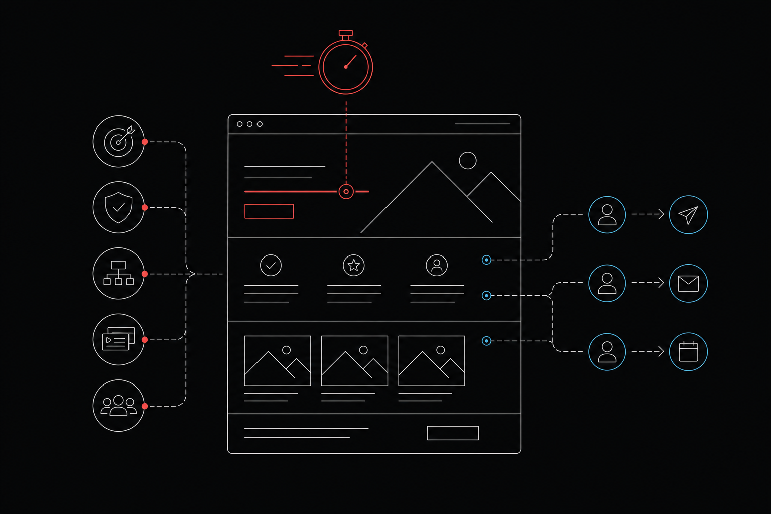
A creative agency website has one job before it has a style: a visitor should be able to tell who you serve, see proof, and find a next step. The five steps below are how to do that. They are a planning sequence, not a gallery of nine sites.
The four projects after the steps are Splash Creative websites: BioNurture, CoverWhale, Agus Holdings, and Eurotech. The case study is the record. This article does not add a result the case study does not state.
The five steps
| Step | What to build | Done when |
|---|---|---|
| 1. Positioning | One or two sentences naming the client and the work | A stranger can repeat both after five seconds |
| 2. Proof | Two to four projects, and client names, in the first screen | Evidence is visible before any scrolling |
| 3. Structure | A clear path and labels, tested on a phone | A visitor can reach the work and the contact route |
| 4. Case studies | Client, problem, and approach on each project page | The page shows decisions, and only a documented result |
| 5. Next steps | Separate routes for prospects, candidates, and press | Every page offers a way forward |
Style is the last decision. Three looks show up often, and none of them is the point:
- Minimal. White space, a tight grid, and a few large images. The work has to carry the page.
- Bold. Large type, saturated color, and strong contrast. The voice has to be backed by the portfolio.
- Interactive. Motion and scroll-driven storytelling. The interaction has to stay out of the way of the content.
A quiet site with a vague headline fails. A loud site fails when nobody can find the contact page. Brand identity is the system the site has to follow when the mark, the type, and the color are part of the same work. Branding is that system plus the position it comes from.
1. Write a positioning statement a stranger can repeat
Write one or two sentences that name who you serve and what you do for them, and put them at the top of the homepage in plain text. A slogan, a reel, or a line like "We create experiences that matter" does not tell a visitor whether you work with companies like theirs.
Build it in three moves:
- Name the client. Use words a buyer would use: founders of product companies, professional services firms, a practice, a store.
- Name the work. State what you actually make: brand identity, websites, packaging, a store. Use the words your buyers type into search.
- Name the difference. Add one specific reason to choose you. Skip any claim a competitor could paste onto their own homepage.
Then test it. Show the headline to someone outside the team for five seconds and ask what you do and who you do it for. If they cannot answer both, rewrite it.
Keep the statement in text, not trapped inside an image or a video, so a search engine and a screen reader can read it. Place it in the first screen. Brand strategy is the work of deciding that sentence when the position itself is still open.
2. Put proof in the first screen
A positioning statement makes a claim. Proof is what makes a visitor stay. Put it in the first screen: selected work, client names, and outcomes stated in words you can document.
Three kinds of proof hold up there:
- Selected work. Show two to four projects, not twenty. Pick the ones that match the clients you want more of. Each one needs a clear image, the client's name, and a short line on what you did.
- Client names. A row of logos, or one sentence naming clients, answers "have they done this before" without a click. Name a client only when they have agreed to be named.
- Outcomes in words. Describe a result plainly, and only when you can document it. Leave out a number you cannot back up.
The menu is for depth. The first screen is for the evidence. One weak image there does more harm than leaving a fourth project off that screen. If a project's imagery is not strong enough to lead with, save it for the portfolio page. Our work is the set of projects Splash Creative has published.
3. Structure the homepage so a visitor can follow it
Build one path: positioning, then proof, then portfolio, then contact. Use navigation labels a visitor understands without thinking. The creativity belongs in the work and the visual style.
A large archive still needs a way to browse. Pentagram's public work page lists recent projects and filters them by discipline and by sector. The archive also keeps individual project pages. Two of those pages are the New York City Ballet identity, by partner Paula Scher, and the MIT Media Lab identity, by partner Michael Bierut. The filters do the sorting.
Each look handles that path differently:
- Minimal. A short list of navigation items, a simple layout, and one clear action per screen.
- Bold. Large type sets the hierarchy, so the order of sections has to be especially clear.
- Interactive. Motion can guide the eye. A visitor still has to be able to skip it and reach the content.
Motion, a dark theme, and custom type are reasonable when they serve reading. Custom type that loads slowly, motion that stutters on a phone, and low-contrast body text all add friction. The site has to work on a phone. Test every effect on a mid-range phone before you approve it.
A single long page can still work. The risk is that the visitor never leaves it, so the case studies and the contact route have to be obvious on that page. Give each project a link to its own page.
Platform choice follows those decisions. Webflow, Framer, and WordPress can each carry a clear agency site. The right pick depends on who will update the content and how much custom interaction you need. Web design is how Splash Creative approaches the site. Website design and development is the scope: structure, content, design, and build, with the platform named in the proposal.
4. Tell each project as a case study
Lead with the work, and let the point of view explain it. A grid of polished images shows what you made. It does not show whether you can solve the visitor's problem. Build each project page in this order:
- The client. Name them and say what they do, plainly.
- The problem. State the business tension in one tight paragraph. Describe the problem, not the brief you were handed.
- The approach. Explain what you did and why. Show the decisions.
- The result. Say what changed, in words, and only when you can document it.
Keep each section short. Two paragraphs for the problem and two for the approach is plenty. The writing should match the brand it describes.
Put the philosophy in the work, not in place of it. One sentence of point of view in the positioning statement, a short page on how you work, and the reasoning inside each case study carry it. If the portfolio is thin because the studio is new, or because the best work is under an NDA, lead with a sharper point of view and a small number of well-documented projects. Three strong pages beat twelve thumbnails.
5. Give each visitor a next step
Prospects, people looking for a job, and press arrive with different goals. One generic "Contact" button serves none of them well.
- Prospects. A visible action in the header and at the end of every case study, named for what happens next: "Schedule a call" or "Start a project." Say who they will talk to.
- Candidates. A careers link in the footer, kept off the project-inquiry path so applications stay out of the sales inbox.
- Press and partners. A short page with a contact, a company description, and downloadable logos.
Place the prospect's action where the decision happens, which is after a visitor has read a case study, and also in the header. Every page needs a way forward.
Track your own baseline: inquiries per month, which pages those visitors viewed first, and where they left. Compare that baseline with itself after each change. This article does not quote a target conversion rate for agency sites.
Websites from Splash Creative
The steps above are a way to plan a site. The projects below are websites Splash Creative has designed. Web design and development projects is the archive for that type of work. Custom site design is the service tag. Each note below stays inside the case study.
BioNurture
BioNurture is a physician-led oncology and hematology practice founded by Dr. Arisha Patel. The case study says members have ongoing access to a board-certified specialist for cancer prevention, survivorship, and blood health, alongside the doctors they already see, and that membership is limited each year.
The case study says the website explains the model before it asks for anything: what the practice covers, how it approaches testing, and what membership includes. The copy is described as plain and careful. The same case study names the identity that the site uses: sage, sand, and warm neutrals, a light serif italic with a clean grotesque, and a star mark used across signage, merchandise, and the website.
CoverWhale
CoverWhale is an InsurTech broker. The case study says the company uses data and technology to streamline trucking insurance, and that it needed a brand and a website that could communicate speed and reliability.
The case study says the identity projects confidence and precision, and that the site is built to move a visitor to what they need, without jargon or extra steps. Copy and design are described as working together. The published services are copywriting, custom site design, and logo and visual identity. The case study does not report a traffic or conversion figure, and this article does not add one.
Agus Holdings
Agus Holdings is a family-run real estate investment and development firm focused on retail and mixed-use properties. The case study says the previous website presented properties in a single, uninterrupted scroll, with no hierarchy or context, so a visitor could not grasp scale, focus, or geographic breadth.
The case study says the new site reorganizes the portfolio so scale, geography, and focus are visible, and that the navigation supports exploration rather than one linear path. The published service is custom site design.
Eurotech
Eurotech has designed ergonomic office seating for more than four decades, from task chairs to executive, conference, and specialty seating. The case study says a large catalog is easy to appreciate in a showroom and can look like rows of similar chairs online.
The case study says the website is designed around how people shop for seating. Buyers filter by collection, chair type, features, and material, then compare models. Flagship chairs get a features page that shows each adjustment in motion, and a configurator lets buyers build their own. The same case study says sales presentations for Eurotech's commercial partners use the same visual language. The published services are custom site design, presentations and pitch decks, and brochures and sales materials.
What the work costs
Splash Creative is a branding and web studio in Englewood, NJ. There is no New York City office. David Herskowitz leads the work, with a consistent senior team from the first conversation through the work that follows.
Project work is a fixed scope and a fixed fee, agreed in writing before the work starts. These are starting points. The proposal sets the fee for the scope.
| Scope | Starting point | Timing |
|---|---|---|
| Website | from $15,000 | Set in the written proposal |
| Brand identity | from $15,000 | A focused identity takes 4 to 6 weeks. Full brand strategy and identity takes 8 to 12 weeks. |
| Brand and website | from $30,000 | The website schedule is set in the written proposal |
| Shopify store | from about $20,000 | Set in the written proposal |
| Ongoing partnership | from $2,500 a month | Set in the written agreement |
Pricing is where those starting points are explained. What a website costs is the longer page on why quotes vary. What a Shopify store costs is the store version. Shopify is the store work. How long a brand identity takes is the phase-by-phase version of the identity timeline. When a website is part of the engagement, that phase is timed in the written proposal.
Hire it out, or build it in-house
Build it in-house when the team has the design and development skills, the time, and enough distance from its own work to describe what a buyer needs to hear. Hire it out when any of those is missing. The usual gap is the distance. A site written by the people closest to the work tends to describe what the studio does, in the studio's own language.
Brand identity agency vs. in-house design is the longer comparison. How we work is Splash Creative's sequence: understand the business, put the scope and the fee in writing, agree the direction, then make the work.
Frequently asked questions
How much does a creative agency website cost?
At Splash Creative, a website is from $15,000. Brand identity is from $15,000. Brand and website together is from $30,000. A Shopify store is from about $20,000. Ongoing partnerships are from $2,500 a month. These are starting points. The proposal sets the fee for the scope. Project work is a fixed scope and a fixed fee, agreed in writing. The same figures are on pricing.
Should an agency website lead with the portfolio or the philosophy?
Lead with the work. A visitor came to judge it. Carry the point of view in the positioning statement, on a short how-we-work page, and in the reasoning inside each case study. A philosophy with no work behind it is a claim.
Which platform is best for a creative agency website?
Webflow, Framer, and WordPress can each carry a clear site. The right one depends on who will update it and how much custom interaction you need. Splash Creative designs and builds websites, including WordPress and Shopify. The platform is named in the written proposal. Web design is that scope.
Do creative agency websites need to work on mobile?
Yes. The site has to work on a phone. Test type, motion, and contrast on a mid-range phone before you approve them. An effect that stutters on a phone is a reason to cut the effect.
How many case studies should an agency site show?
Fewer than a long grid of thin thumbnails. Two to four projects in the first screen, and a handful of pages that each name the client, the problem, and the approach. Choose projects that match the clients you want more of.
What is a good conversion rate for an agency website?
Track your own baseline: inquiries per month, the pages those visitors viewed first, and where others left. Compare that baseline with itself after each change. This article does not quote a target rate for agency sites.
Have a related question?
Tell us what you're working on. We'll help determine whether there is a useful project to explore.
“Splash delivers powerful brand ID, slick websites and UX, beautiful graphic design, and intelligent software solutions. Great team, great experience, great creative partners.”