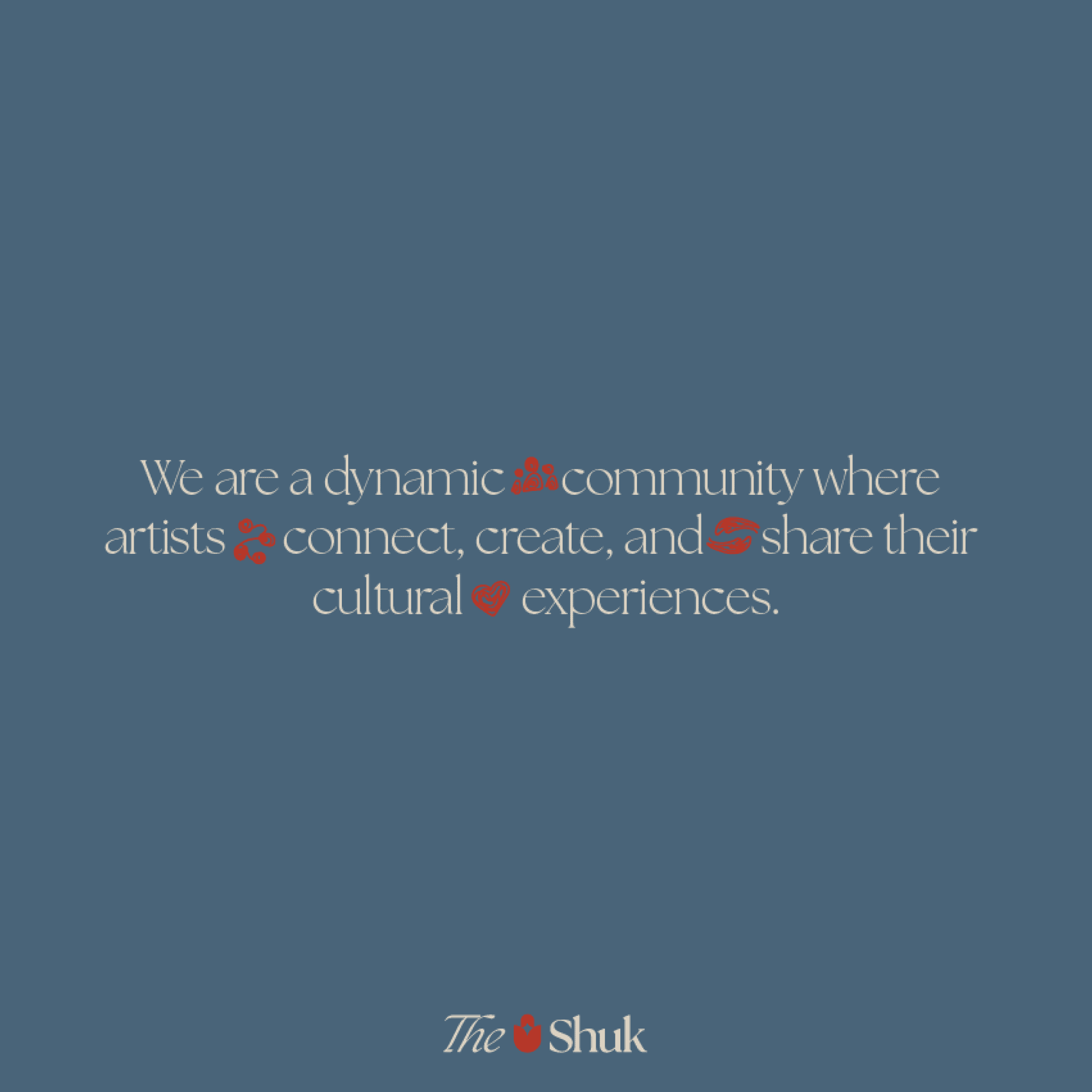
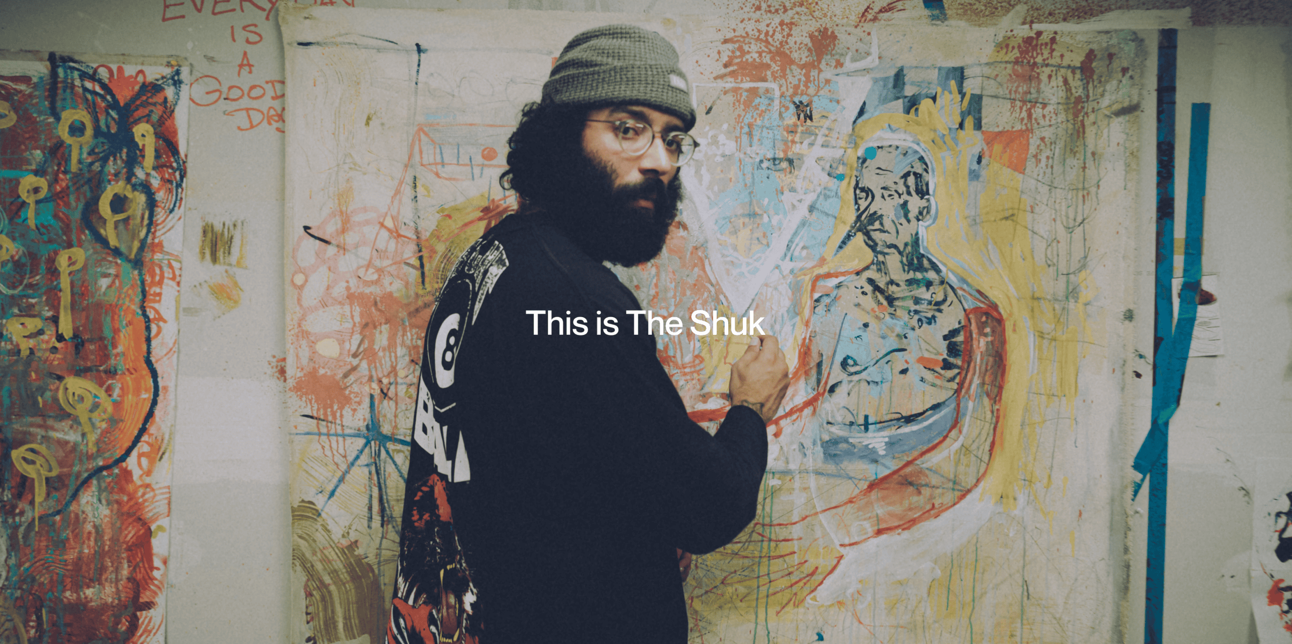
(About Project) The Shuk is a creative community and arts marketplace based in Englewood, NJ -- a physical and digital platform where artists connect, create, and share their cultural experiences.
Brand Messaging
Color + Typography
Logo + Visual Identity
Marketing Materials
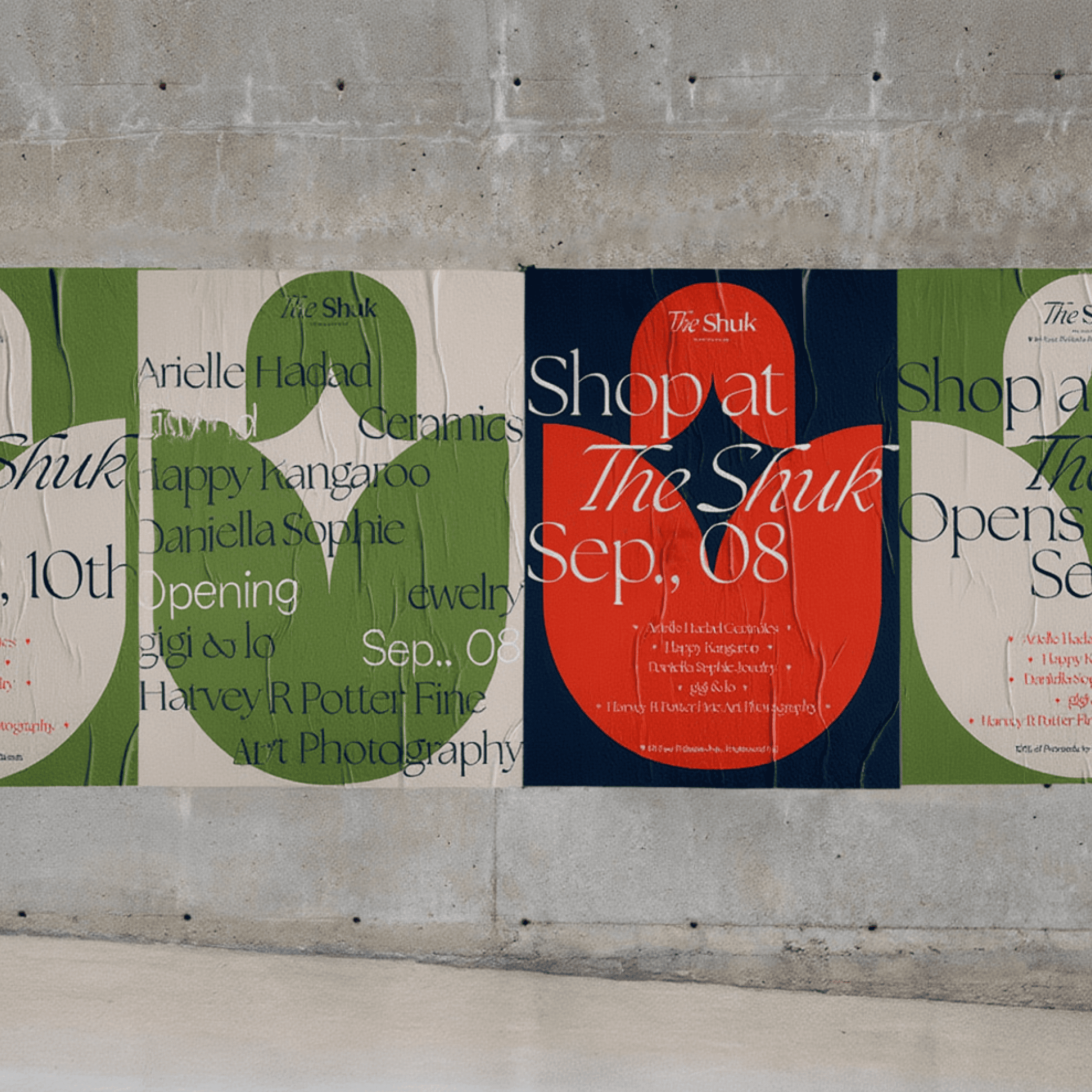
Print Collateral + Signage
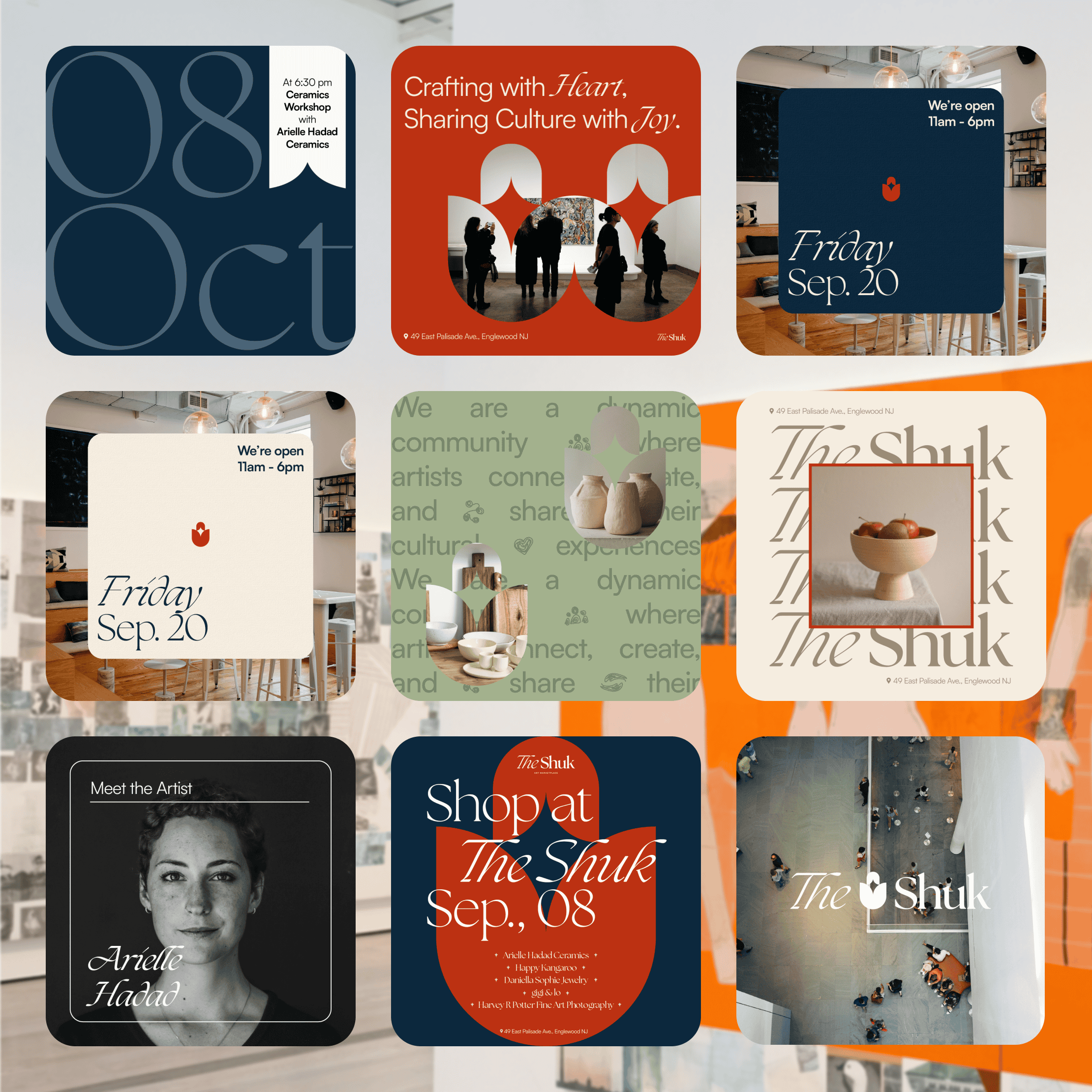
Social Media Graphics + Templates
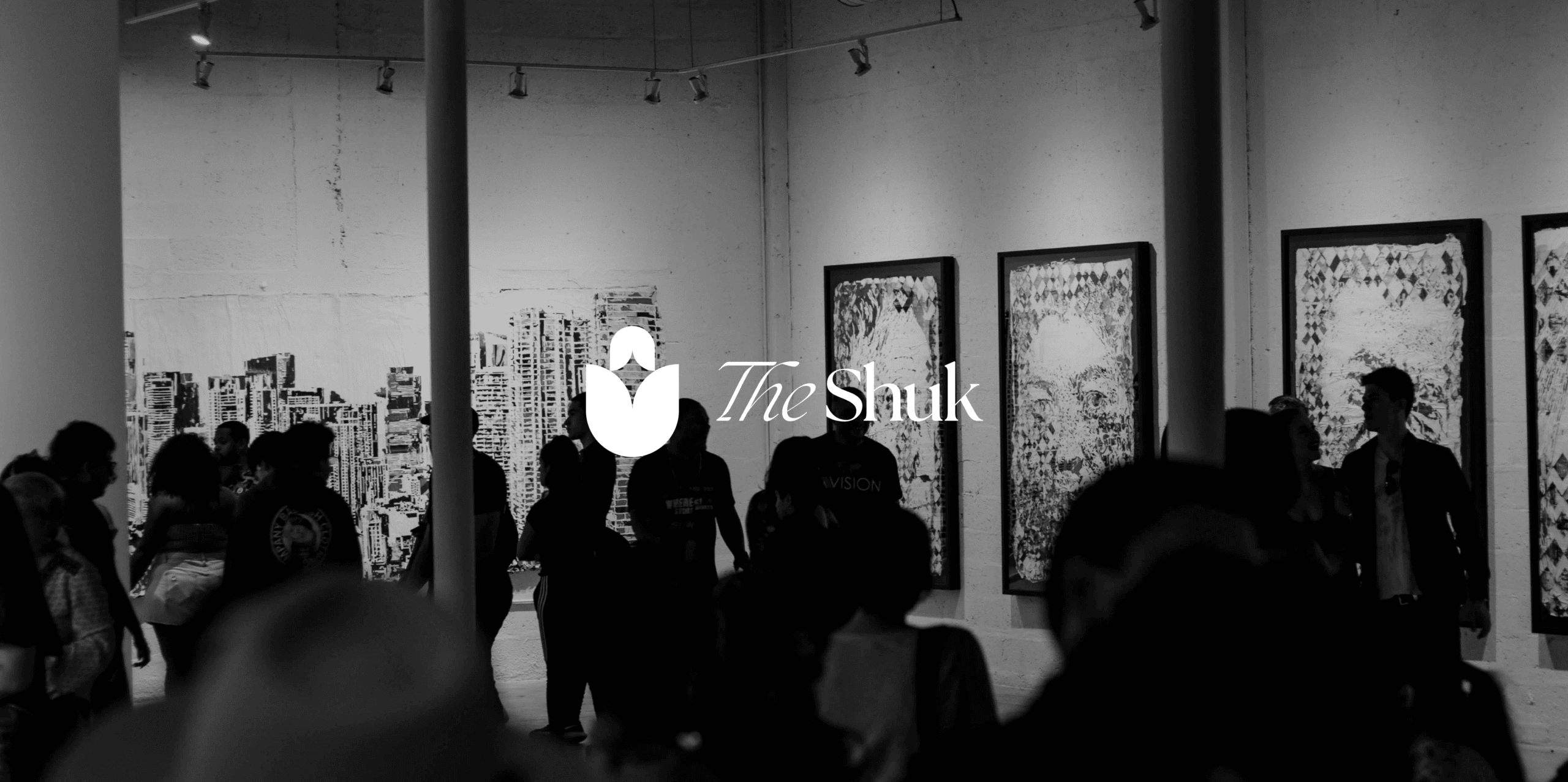
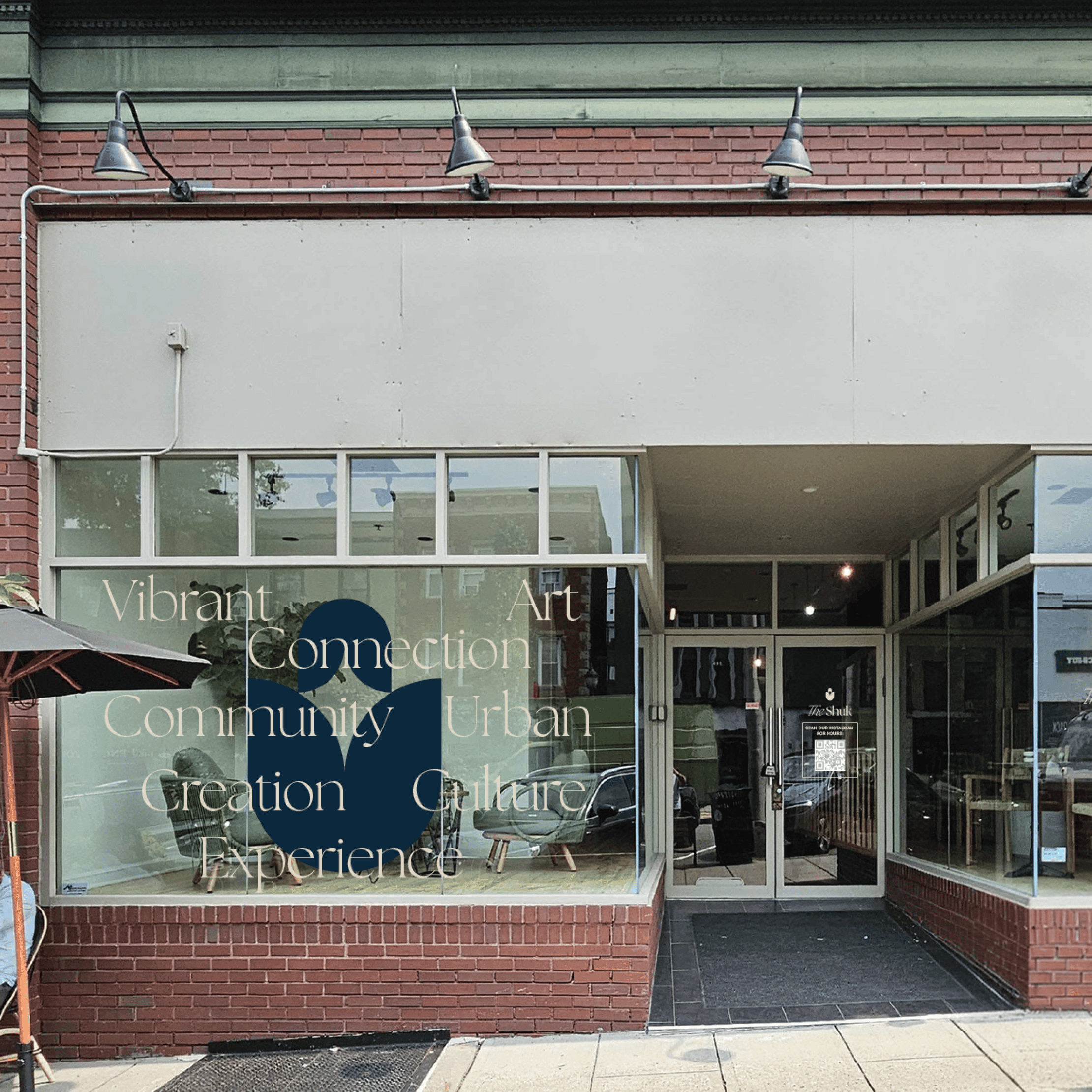
A creative community with a big vision needed a brand that could live everywhere -- on a building facade, a tote bag, a hoodie, a social post, and a newsletter -- and feel completely at home in all of it.
The Shuk isn't just a store or a gallery. It's a movement. That kind of brand has to be bold enough to anchor a physical space, flexible enough to work across merchandise and digital touchpoints, and warm enough to actually feel like community.
The identity had to do a lot -- without ever feeling overworked.
We built a brand system that's immediately iconic and endlessly versatile.
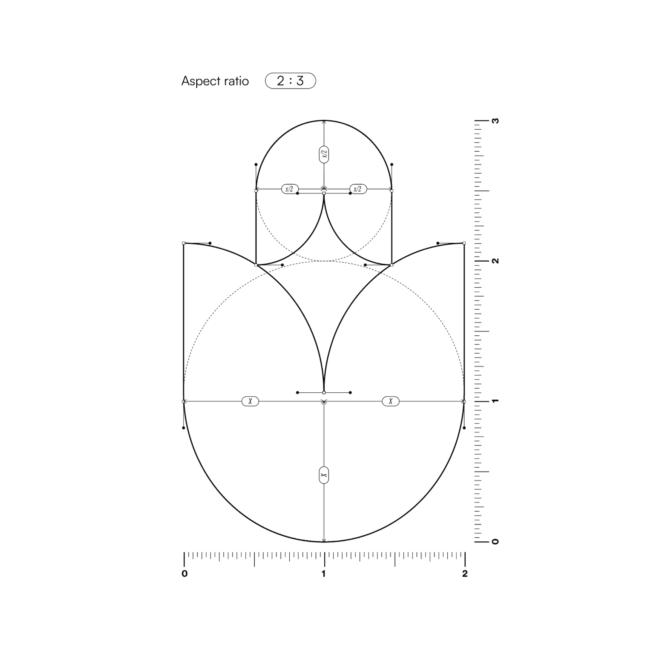
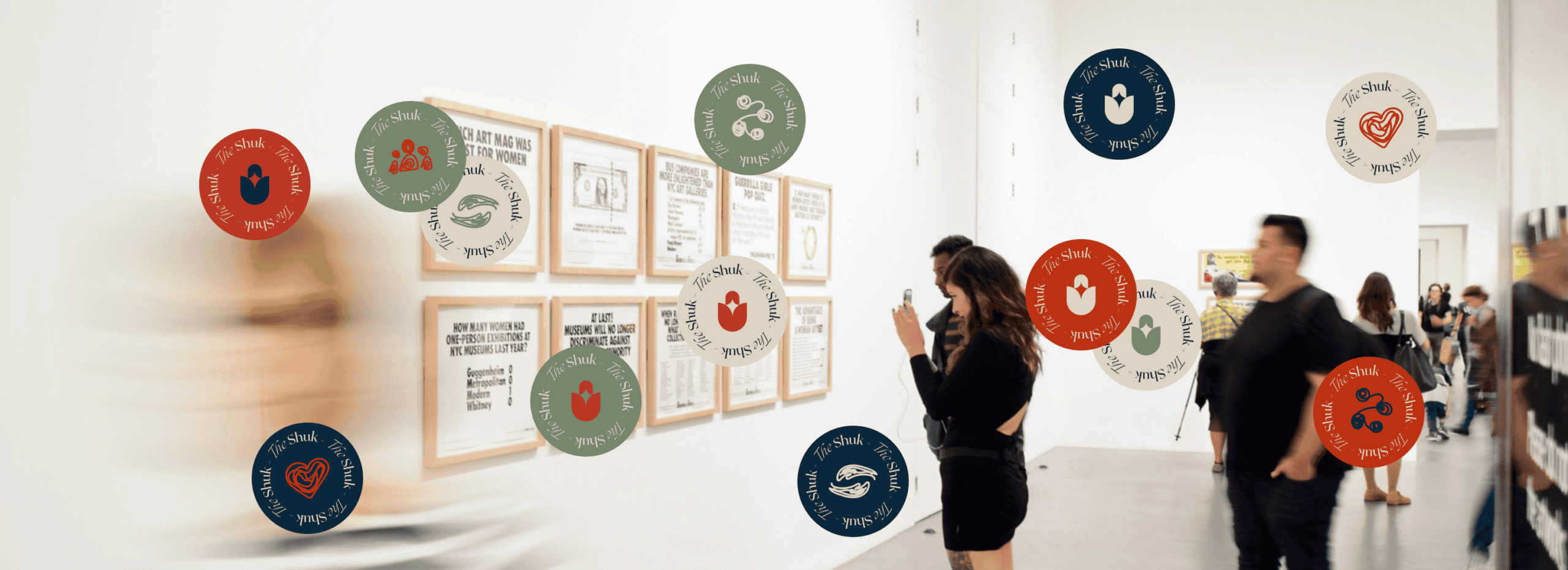
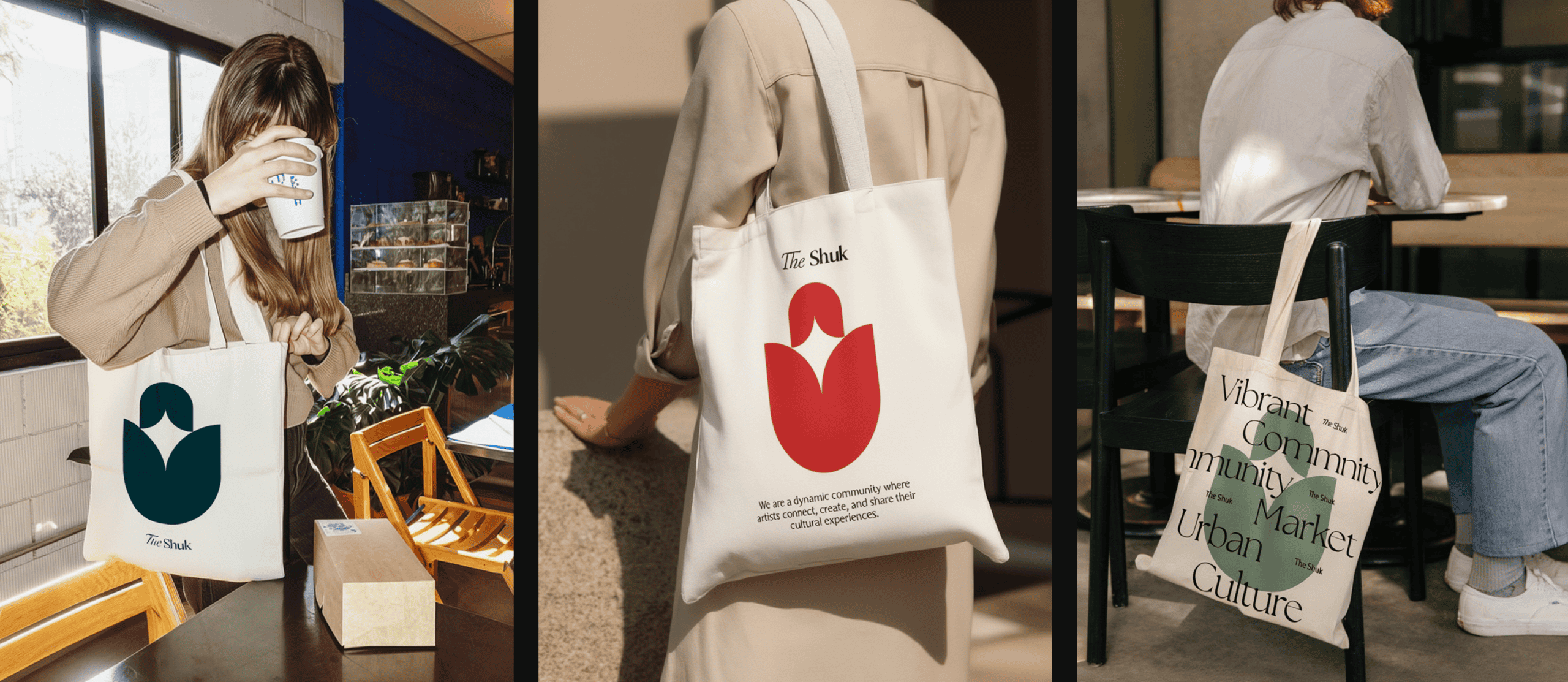
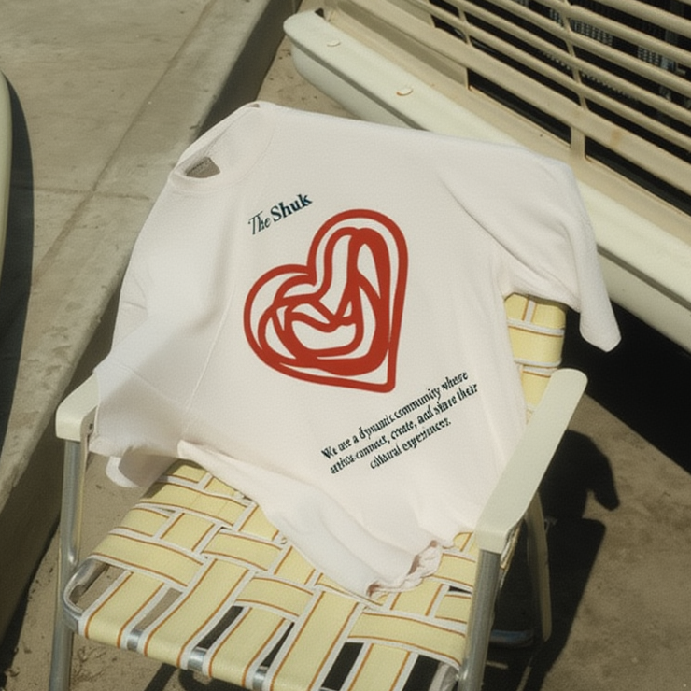
The logo is a tulip-form symbol with a negative-space star at its center -- bold, minimal, and unmistakably The Shuk. It works as a mark, as an image mask, as a repeating pattern on tissue paper and packaging, as a 3D object. The palette -- midnight blue, burnt orange, sage, and warm cream -- is earthy and sophisticated, grounded in the same creative energy as the community it represents.
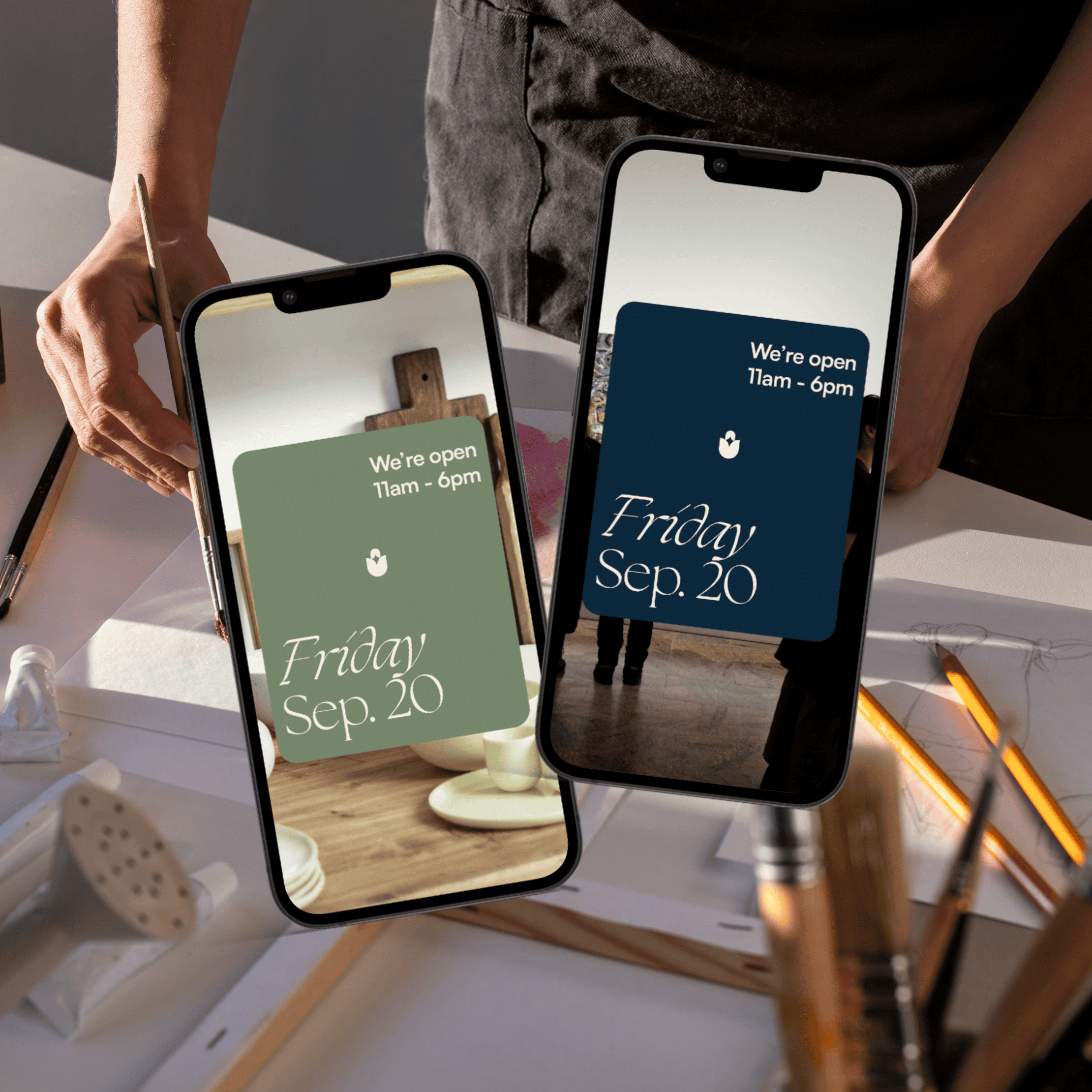
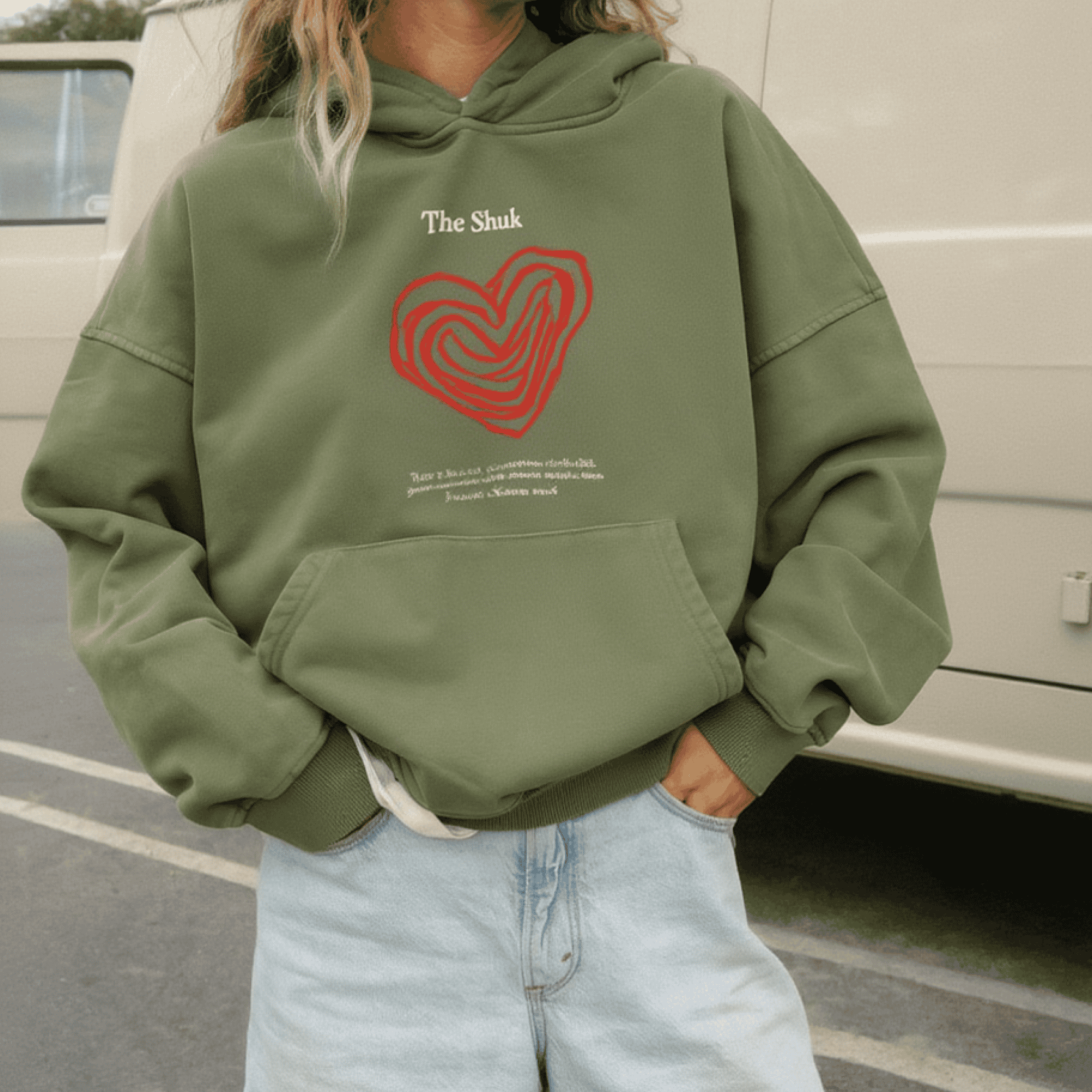
From there, the system was built to stretch: business cards in three color ways, a full stationery suite, merchandise (hoodies, tees, totes, notebooks, stickers), signage and facade applications, social media templates, and newsletter design -- all cohesive, all carrying the same energy.


Studio
Content & Publishing, Digital Media, Media & Entertainment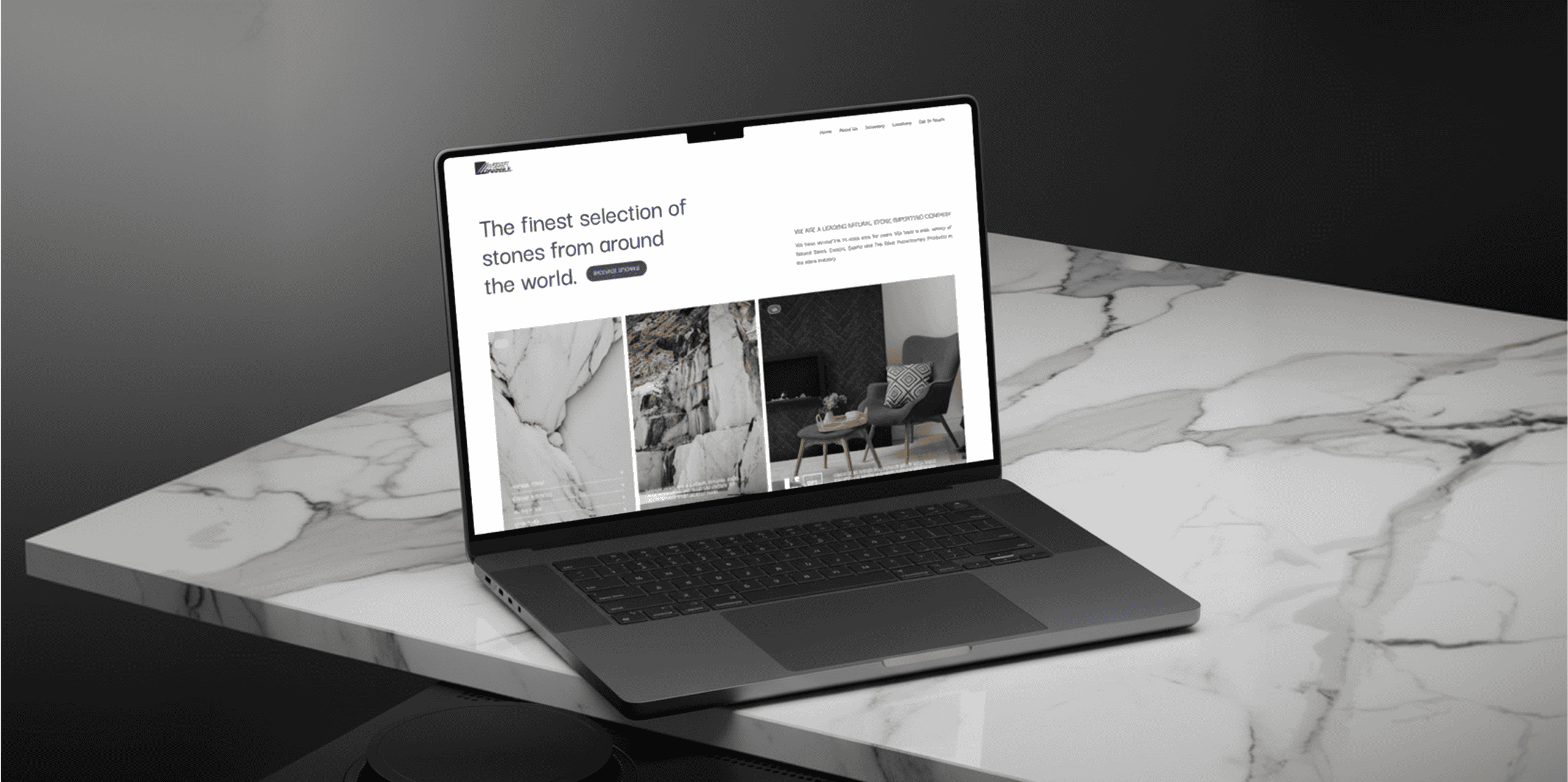
Everest Marble
E-Commerce, Online Retail