In life sciences and biotechnology, the hardest communication problem isn’t explaining what you do. It’s making what you do feel as significant to an outsider as it actually is.
Luminova Biotech had developed genuinely cutting-edge technology — NSF-funded research harnessing light to enhance plant growth and mitochondrial function, with applications spanning agriculture, anti-aging, and longevity. The science was real, the funding was there, and the potential was significant. What was missing was the ability to communicate any of it in a way that investors and partners could quickly grasp and get excited about.
Their existing materials — brand, website, pitch deck — weren’t doing the work. The science was complex. The presentation was generic. The gap between what Luminova had built and how they were presenting it was costing them in every room they walked into.
Splash Creative built the brand, website, and investor deck from scratch. Here’s how.
The Challenge: Making Complex Science Immediately Compelling
Biotech and life sciences brands face a specific communication problem. The audience — investors, research partners, institutional buyers — is sophisticated enough to spot oversimplification, but busy enough that they won’t wade through dense technical explanation to find the value proposition.
The brand, the deck, and the website all had to accomplish the same thing: translate highly complex research into something credible, clear, and compelling without losing the scientific integrity that gives the work its weight.
That’s a precise creative brief. Too simple and you lose the scientists. Too technical and you lose the investors. The window is narrow and finding it requires understanding both the science and the audience simultaneously.
The Approach: Credibility Through Design, Clarity Through Structure
Brand Identity
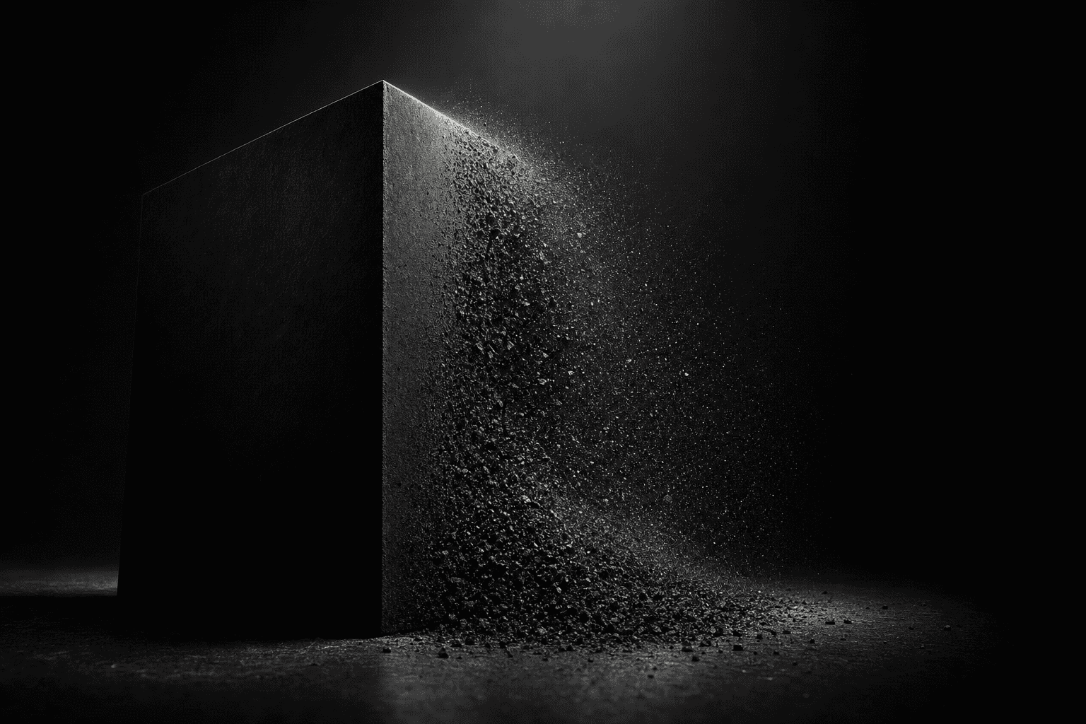
The Luminova brand identity was built around the visual language of light — the technology’s core mechanism — translated into a precise, modern identity system. The goal was a brand that felt scientifically credible without being sterile, and visually distinctive without being trendy.
In life sciences, brand longevity matters. The identity was built to look sharp in 2026 and hold up in 2031. Strong typographic choices, a palette that communicated precision and innovation, and a mark that could carry weight on a pitch deck, a research paper, and a website equally.
Website
The Luminova website was built as a business tool, not a digital brochure. The architecture was designed around how investors and partners actually evaluate a biotech company — technology overview, scientific credibility, team, applications, and market opportunity — in the order that builds confidence most efficiently.
Copy was written to be simultaneously accurate and accessible. Technical enough to satisfy a scientist, clear enough to excite a fund manager. Every page was structured to move the right visitor toward the right next step without requiring them to do the work of connecting the dots themselves.
Investor Deck
The pitch deck is where the most complex communication challenge lives — dense market data, financial projections, technology explanation, and competitive positioning all need to coexist in a format that a partner can scan in 90 seconds and want to dig into further.
Splash Creative designed the Luminova deck around information hierarchy: what does an investor need to believe first, what do they need to understand second, and what do they need to see to be convinced. The design does quiet organizational work — directing attention, separating primary from supporting information, making complex proformas readable without oversimplifying them.
The result is a deck that holds up in a partner meeting and communicates clearly on its own when it’s forwarded to a colleague who wasn’t in the room.
What This Project Demonstrates
The Luminova engagement demonstrates one of Splash Creative’s strongest capabilities: translating complex, technical subject matter into brand and communications assets that work for multiple audiences simultaneously.
In life sciences and biotech, most creative agencies either produce work that’s visually sophisticated but scientifically superficial, or technically accurate but dull enough that it fails to generate the excitement that moves investors to act. The right work does both — and it requires creative direction that genuinely engages with the science rather than decorating around it.
Frequently Asked Questions
Does Splash Creative work with biotech and life sciences companies?
Yes — across brand identity, websites, and investor materials. Life sciences is a category where the stakes of communication failure are high and the tolerance for generic work is zero. We understand the specific credibility requirements of the category and how to build assets that work for both scientific and investor audiences.
Can Splash Creative handle investor deck design alongside brand and web work?
Yes — and for early-stage companies especially, having brand, website, and deck come from the same team matters. Investors notice when these materials feel inconsistent. A cohesive visual and verbal identity across every touchpoint communicates organizational competence before a word is spoken.
How do you write copy for a technical audience without losing the science?
By doing the work to understand the science before writing anything. We spend real time with the technical team — understanding the research, the methodology, the competitive advantage — and then find the layer of the communication that’s accurate, clear, and compelling simultaneously. The goal is never to dumb it down. It’s to find the frame that makes the complexity land rather than obscure.
If you’re a biotech or life sciences company with materials that don’t reflect the quality of your science, let’s talk.